
Recommended
More Related Content
What's hot
Viewers also liked
Similar to OCR Media Studies – AS Level Music Magazine Production
Similar to OCR Media Studies – AS Level Music Magazine Production (20)
More from forrestsmyth
More from forrestsmyth (6)
Recently uploaded
Recently uploaded (20)
OCR Media Studies – AS Level Music Magazine Production
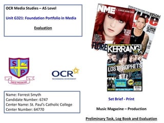
- 1. OCR Media Studies – AS Level Unit G321: Foundation Portfolio in Media Evaluation Name: Forrest Smyth Candidate Number: 6747 Center Name: St. Paul’s Catholic College Center Number: 64770 Set Brief - Print Music Magazine – Production Preliminary Task, Log Book and Evaluation
- 2. In what ways does your Media product use, develop or challenge forms and conventions of real media products? My magazine, across the 4-pages, ‘repeats’ (Steve Neale) codes and conventions from magazines such as ‘kerrange’ and ‘Rolling Stone’ as my inspiration as I tried to replicate their codes and conventions in my magazine. I mainly used Rolling Stone magazines colour scheme as I used the colours red, black and white thought my magazine as well as similar fonts to keep continuity in my magazine. For my front cover I made sure that I had the main features/conventions such as: - Bar code - Date - Price - Issue number - a unique selling point - Main image + Headline - Cover lines - Masthead - Strapline. For my contents I kept to the conventions by adding in: - Page numbers - Posters - Pub lines - Web Address/Social networking sites I did this for convergence, so my readers can access the same information but in formats that they may find easier to access or use. For my double page I used a different photo but of the same star appeal (Daniel Lawrence) with a plan background so that it would reflect the conventions of a music magazine. I made the questions and answers very clear to read so as to make it easier to differentiate from. I did this by clearly showing who was the interviewer and interviewee by the use of the initials. Also I made them different colours. I have also appropriately credited work to the Photographer, Stylist and Editor in small text as is orthodox for a magazine . I put this at the end of the interview. Finally I added social networking logo’s as well as an other form of convergence; a promotion online so that readers could go online a read or listen to the full interview.
- 3. How does your media product represent particular social groups? The denotation of the representation is the action of speaking or acting on behalf of someone or the stat of being so represented. When I was making the magazine I used different materials that would appeal to different social groups e.g. ‘Emos’, ‘Punks’, ‘Goths’ etc. however if I changed my magazine so that it appealed to more social groups my magazine would have been more successful as I would have had a larger audience that would have been interested to pick one up and buy it. Since the genre I decided to pick was Rock, it did have a fairly large audience I found this out as I did a questionnaire to find out what type of magazine would sell the best. Rock was the highest voted closely followed by Pop. I ensured that the bands that I had picked related mainly to rock but also slightly also to pop. I did this by picking bands that have crossed over and have worked with some pop artist, I did this in hope that some of my audience would recognise them and pick up a copy this widens my audience. One social group for my magazine could be workers where their job is repetitive, this is because of this magazine could act as a diversion (Katz) as they could get away from the worry and stress of their work. Rock is seen as a modern genre of music this means that another social group would be teenagers and it can help them into becoming ‘Social climbers’ (Maslow). They would be able to see what the ‘stars’ (Richard Dyer) get up to in their daily routines. The magazine across the 4-pages, helps to represent the male starts in a positive way due to the lighting that I used on the front cover. I wanted to get a lot of light onto the picture because it would show Daniels softer side. Also he was dressed in Christmas things to draw the readers in and also to empathises the fact that it was a Christmas issue.
- 4. What kind of media institution (Publisher) might distribute your media product and why? From the research that was completed pre-production, I found that Bauer Media group may publish ‘Tune In’ because they are brilliant in creating ‘personal relationships’ (Katz) with their readers and I really believe that my magazine does this well especially with my editorial. Also my magazine has a lot of synergy and cross-media convergence which will allow the readers to access the content in many different ways since I have social networking sites in association with my magazine, and this is made very obvious on al my 4 pages. The similarities of my magazine to ‘Kerrang’(such as the way in which the promotions are displayed) also ‘signifies’ (De Saussure) that Bauer may think about distributing my magazine because with similar codes and conventions that sell Kerrang displayed for a different music sub- genre may be something of interest to the publishing group.
- 5. Who would be the audience for your media product and why? Well according to Hartley’s 7 subjectivies I have aimed my target audience at the age 15-25 as it ranges it gives me a larger audience meaning I will be able to have more purchases of the magazine. Also according to Maslow’s hierarchy of needs, ‘social climbers’ makes up a large amount of the audience as they would try and gain as much information as they possibly can; this allows my magazine to inform and educate (Katz) on everything that is going on in the rock industry. The working class (Karl Marx) is targeted since they would be able to afford and purchase the magazine as well as appreciate the diversion (Katz) it offers from a day to day life.
- 6. How did you attract/address your audience? To attract and address my target audience I have made sure that I have a few Unique Selling Points (USP). To do this I used language that relates to my target audience and also used words such as ‘Exclusive’ because they are words that are very direct and intriguing to make the readers feel that they are finding out new information that cant be found anywhere else. Codes and conventions such as having the editorial on the contents pages helped as it gave the readers an insight on who wrote the magazine and it makes the readers feel more part of ‘Beat’. This makes the audience want to pick up the next issue of the magazine as they will feel more of a community and connected.
- 7. What have you learnt about technologies from the process of constructing this product? To make and construct my media product called ‘Beat’ I used the software called Adobe Photoshop CS4, this was the first time that I had used this software therefore it took me a while to get used to it however I now feel more confident in using it. I decided to use this software because it had many different tools and filters which allowed me to design my magazine the way I wanted to. Also it gives me the option of using whatever font I wanted and what colour I decided. In Photoshop it allows you to make many different layers making it easier to arrange and place photos, fonts etc.. Around the page. As I became more confident in Photoshop I started to learn many different shortcuts such as cmd + j to duplicate layers. This allowed me to do different tasks much quicker and also allowed me to edit layers with a back up incase anything went wrong I still had the original.
- 8. Photography Planning – Front Cover • When it came to making my front cover, I had to think of a front cover that related to my magazine and also match my colour scheme (Red, White and Green) so that my magazine would be more appealing to my target audience. Also because the issue that I made was a Christmas issue I made my Star Appeal wear something that related to Christmas by making him wear a Christmas Hat. However at the same time I made sure that the model still looked Rock I did this by making him wear a tattoo sleeve and also have a guitar. His clothing was also dark so that he would attract social groups such as punks and Goths.
- 9. Analyzing my Front Cover Main Image Mast Head Date and Issue Barcode Price Cover Lines Webpage Social Media’s
- 10. Analysing my Double Page spread Interview Main Image Website Page Number Editor Photographer Stylist Drop Down Letter The interview Issue Masthead