Kisan Call Centre - To harness potential of ICT in Agriculture by answer farm...
Evaluation
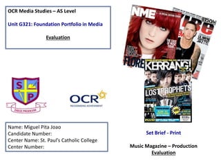
1. OCR Media Studies – AS Level
Unit G321: Foundation Portfolio in Media
Evaluation
Name: Miguel Pita Joao
Candidate Number:
Center Name: St. Paul’s Catholic College
Center Number:
Set Brief - Print
Music Magazine – Production
Evaluation
2. 1. In what ways does your Media product use, develop or challenge forms and conventions or
real media products?
The magazine, across the 4-pages ‘repeats’ Steve Neale codes and conventions from VIBE magazine as my inspiration and as
style models I added parts from the codes and convention's from of vibe magazine . Theses include having a Bright stand
out heading that grabs the audiences attention, and also keeping the colour scheme the same thought my magazine which
is Red and a Creamy Grey, simple but effective and similar fonts thought my magazine so It looks professional and sleek. In
my front cover I made sure I had the main features/ conventions such as a -
• Bar code
• Date/price
• My selling point( my contest to win Ed Sheeran tickets and my heading of “sound army” because it stands out with the
colour and the type of font.)
• Cover lines
• Masthead
• Strapline
For my contents page I added boarders around my text and also bordered my picture of me for the editorial to make it look
more professional, I also kept the colour scheme and added page numbers, my web address-social networking sites for the
magazine ( Facebook and Twitter). I also added a main picture of the three people I will be interviewing on the double page
spread, and I incorporated the heading so It looks more effective.
My double page spread changed a lot, I had to change my three separate pictures and make a new one with all three people
in it together so it looks better and I left the three separate picture with the introduction to each artist. I also had to make
changes on the layout of my double page spread like take out the bordering of the interviews to make it looks sleek and well
finished and also change the font to match my front cover and contents page. I also added the word “ exclusive to my
double page spread at the top next the title “ sound army” so it looks ore professional and tell the audience that it’s a one
of a kind and that you need to buy it because its exclusive and special.
3. 2. How does your media product represent particular social groups?
I have chosen a variety of type s of music ( acoustic, pop and rap ) so it appeals to a bigger audience. The social group I was
going for is a mixture of people that enjoy rap (Chris brown), Hip-hop (Taylor swift) and acoustic music (Ed Sheeran) so it
appeals to a variety of social groups, and I think this is effective because its not just for one type of person so anyone could
buy it and enjoy reading it which is effective because therefore I would sell more copies. Although since ‘rock’ came in close
second with the questionnaire, my magazine will feature a rock theme font for my title of a spiky font which shows the
rocky side of it but is still about pop, rap and acoustic and that relates to why I picked the title “ sound army because it’s an
army of different artist and music types coming together to make sound. Also my competition of winning a ticket to Ed
sheeran will help my social group to like my magazine more and in a way force them to buy it because Edsheeran is very
popular these days.
Also since Pop, rap and is seen as quite music genre that has lyrics commonly to do with ‘Love’, ‘ problems’ and ‘life', it is a
good type of music to listen to.
4. 3. What kind of media institution might distribute your media product and why?
“Bauer Media is a multi-platform UK-based media Group consisting of many companies collected around two main divisions
– Magazines and Radio - widely recognized and rewarded as being industry innovators.
Our business is built on influential media brands with millions of personal relationships with engaged readers and listeners.
Our strategy is to connect audiences with excellent content through our broad multi-touch point brand platforms, wherever
and whenever and however they want. Our wide portfolio of influential brands gives us advantages over pure play
magazine or radio competitors.”
http://www.bauermedia.co.uk/about
From the research that I have done , I would look at Bauer Media group publish ‘Tune In’ because they are good in creating
‘personal relationships’ (Katz) with their readers and I really believe that my magazine does this well especially with my
editorial.
5. 4. Who would be the audience for your magazine?
According to Hartley’s seven subjectivities, the target audience for my magazine would be for the age range of 14 to 25
especially for Men because I have included Chris Brown, Ed Sheeran and Taylor swift so more men will be interested in this
magazine then women because there is only Taylor swift (Hartley). According to Katz’ Uses & Gratifications theory females
would find it much easier to create ‘personal relationships’ with them, however it may still appeal to the male (Hartley)
gender as the images of the females could act as an attractant as females are often objectified for the pleasure of the male
audience (Male Gaze- Laura Mulvey).
According to Maslow’s hierarchy of needs, ‘social climbers’ would make up a large amount of the readership since they
would try and seek as much information as possible so they were ‘informed’ and ‘educated’(Katz) on everything that was
new. Also the working proletariat class (Karl Marx) would really be targeted since they would be able to afford the magazine
as well as appreciate the ‘diversion’ (Katz) it offers from day to day life.
In conclusion I think I will stick to Men around the age of 14 to 25 because it applies to my magazine and language content
more effectively with men at that age.
6. 5. How did you attract/address your audience
In order to attract my target audience I decided to have quite a lot of Unique Selling Points
that are easy to see, because from my results (From questionnaire) I found out that USP’s and
promotions are a big appeal to the audience and is often the reason they will pick a magazine
up.
I also used specific language to attract consumers. like on my double page spread I used
‘exclusive’ and on my front cover I used ‘win’ ‘free’ for the Ed Sheeran tickets and this type of
language makes the consumers more interested in my magazine and makes my magazine more
attractive.
The inclusion of codes & conventions such as having an editorial in the contents page helped
to appeal to the target audience because, with the direct address in the letter, with second
person words such as “you” and the inclusive “we’s” make the readers feel a part of something
and they may develop a personal relationship with the magazine and feel involved and special
in a way. Like ‘ you could win the tickets!’.
7. 6. What have you learnt about technologies from the process of constructing
the product.
The software used to make the media title which was ‘Sound Army’ was Adobe Photoshop CS4. I didn’t have much
experience on Photoshop because I've never really used it in school so I did struggle at the start a lot and I needed
guidance and support from the students and my teacher who helped me out a lot with using Photoshop , editing the
pictures, making sure I did it properly and that it looked nice.
I also used the software because it has many tools to make my work as good as possible like the crop tool, the sharpen tool
used to make pictures look better and increase the image quality, also on my main image I changed the lighting which is
possible on Photoshop so that was very effective because it gave the image light and more depth and detail it also made it
stand out more on the magazine.
To choose my font I used http://cooltext.com/ and I looked for a while and picked the right font that I thought would work,
keeping in mind the age, target and my magazine content when picking one and I think I choose the right on because it
gives off a powerful and harsh feel to it with a suttle background colour contrasting on the colour red of my heading really
makes it stand out and attract my target audience.
In conclusion, I have learnt to effectively alter images so that they are conventional as well as learning the art of making the
text fit around the images while at the same time being clear.
8. 7. Looking back at your preliminary task, what do you think you have learnt in
the progression from it to the full product.
I think that I have learnt a lot of things during this process of completing my final task, like In Photoshop I
have improved my skills which is shown in the editing of my photos and the way my magazine is presented. I
think I used my time well towards the end of the project by staying back after college and completing my
feed back in lessons, I’ve put a lot of effort in this magazine because this is the first time I’ve taken Media
and I'm very proud of the work I’ve done, maybe with some more training in Photoshop I could of made my
magazine look more professional. I think my creativity has improved a lot with the way I’ve presented my
work.
There is evidence of my progression that I feel happy with how I met the demand of the production process,
for example meeting the deadlines set up for each part of the magazine as well as attending to corrections
and feedback that the teacher gave me. In conclusion I think that I have improved in my skills in Photoshop
and produced a good magazine for my ability of work and knowledge.
13. Analyzing my Front Cover
Main sized picture
to attract
customers
Colour scheme is
represented
Story lines
Social media
14. Analyzing my Contents Page
Editorial picture
Neatly presented
Master head
Colour scheme
15. Analyzing my Double Page spread
Interview
Neatly presented
Main image
Effect font that grabs attention with the colour
Colour scheme is
carried onto this page
16. Audience Audio Feedback -
Forth interview
Second Interview
Front cover
Contents page
Double page spread
Third interview
First Interview
Or visit my Sound
cloud account-
https://soundcloud.co
m/you/tracks
https://soundcloud.com/you/tracks