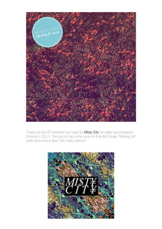
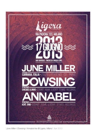
Download to read offline


![“Egle - Egle”, album cover 2015
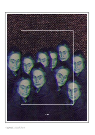
“Reunion - NOBODY MATTERS [single]”, album cover 2014](https://image.slidesharecdn.com/portfoliostampa2-150511154102-lva1-app6891/85/Updated-Portfolio-31-320.jpg)
![“Marie Byrd Land Band - This In All About Our Place & Time [EP]”, album cover 2015](https://image.slidesharecdn.com/portfoliostampa2-150511154102-lva1-app6891/85/Updated-Portfolio-32-320.jpg)

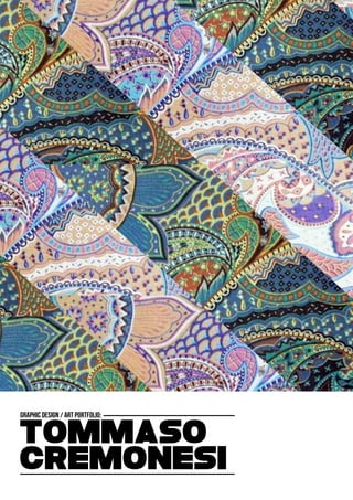
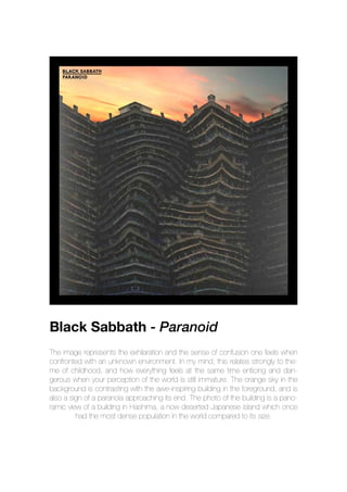
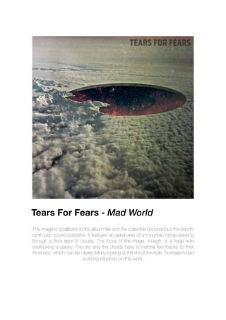
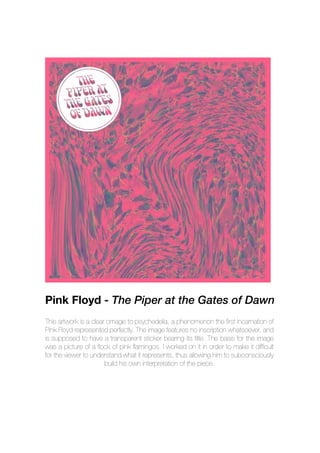
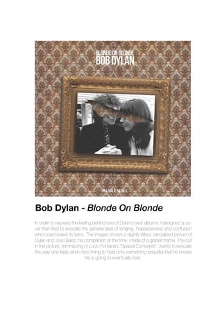
This document provides biographical information about Tommaso Cremonesi and examples of his graphic design work. It discusses his education and background in graphic art and music. Examples shown include album covers and posters he has designed for bands, using psychedelic and surreal styles featuring textures, patterns and digital manipulation of images. It also describes an app he designed called Booklet to display digital album artworks while listening to music.


