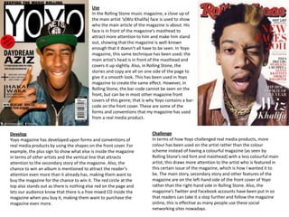
1. Use
In the Rolling Stone music magazine, a close up of
the main artist ‘s(Wiz Khalifa) face is used to show
who the main article of the magazine is about. His
face is in front of the magazine’s masthead to
attract more attention to him and make him stand
out, showing that the magazine is well-known
enough that it doesn’t all have to be seen. In Yoyo
magazine, this same technique has been used; the
main artist’s head is in front of the masthead and
covers it up slightly. Also, in Rolling Stone, the
stories and copy are all on one side of the page to
give it a smooth look. This has been used in Yoyo
magazine to create the same effect. However, in
Rolling Stone, the bar-code cannot be seen on the
front, but can be in most other magazine front
covers of this genre; that is why Yoyo contains a bar-
code on the front cover. These are some of the
forms and conventions that my magazine has used
from a real media product.
Develop Challenge
Yoyo magazine has developed upon forms and conventions of In terms of how Yoyo challenged real media products, more
real media products by using the shapes on the front cover. For colour has been used on the artist rather than the colour
example, the plus sign to show what else is inside the magazine scheme instead of having a colourful magazine (as seen by
in terms of other artists and the vertical line that attracts Rolling Stone’s red font and masthead) with a less colourful main
attention to the secondary story of the magazine. Also, the artist; this draws more attention to the artist who is featured in
chance to win an album is mentioned to attract the reader’s this certain issue of the magazine, which is how I wanted it to
attention even more than it already has, making them want to be. The main story, secondary story and other features of the
buy the magazine for the chance to win it. The red circle at the magazine are on the left-hand side of the front cover of Yoyo
top also stands out as there is nothing else red on the page and rather than the right-hand side in Rolling Stone. Also, the
lets our audience know that there is a free mixed CD inside the magazine’s Twitter and Facebook accounts have been put in so
magazine when you buy it, making them want to purchase the that readers can take it a step further and follow the magazine
magazine even more. online, this is effective as many people use these social
networking sites nowadays.
2. Use
In the Q contents page, the title saying
“contents” stands out as it is at the top
of the page. The image linked with the
main story is also in big and is the first
thing you see when you look at the
contents page due to its size and
prominence amongst everything else.
Smaller images are also used to link
with secondary stories and the colour
scheme follows the same colours as
the front cover of the magazine.
Features and regulars are shown in the
contents page to show what is inside
the issue and what is expected from
the magazine. These have all been
done in Yoyo’s contents page and this
is how forms and conventions have
been used in my media product from a
real media product.
Develop Challenge
Yoyo magazine develops conventions and forms of a real In Q magazine, the contents page is spread over two
media product by only having one thing that sticks out as a pages rather than using only one, which most other
certain colour which is in a similar position on the page as in magazines of this genre have done. Yoyo magazine has
the front cover. Each story is in its own box with a caption challenged this as it has been created on only a single
giving a brief description about what the story is about. There page, conforming to the more common contents pages of
is only two stories as these are the ones featured in that issue magazines from the hip-hop music genre. The regulars of
of the magazine rather than in the Q magazine where lots Yoyo magazine are also in their own box rather than on
more stories have their own picture. As Yoyo’s contents is only the opposite side to the features, which is how it is in Q
on one page, this is why that has been done so that the page magazine.
does not get too overcrowded.
3. Use
The double page spread of Yoyo is quite similar to the double page spread of
the Streetz magazine in terms of spacing and positioning on the page. The page
numbers are in the same place at the bottom left-hand corner of each
page, the name of the magazine has been placed at the top left of each page, a
floating quote is at the top left of the right page, and the pictures and article
are in the same place along with the title and introduction to the article in a
block on the left page. This has been done because the real media product
double page spread appealed to me and made me think that this is how I
would like mine to turn out, with the same effectiveness. This is how Yoyo has
used forms and conventions from a real media product.
Develop
Yoyo has developed forms and conventions of a real media product by adding a background behind the floating
quote to make it stand out further amongst the other features of the article rather than using a different
coloured font like how the Streetz magazine has done. This would have diverted from the colour scheme of
Yoyo magazine as three colours have already been used, so I developed this feature in a way that worked for my
magazine, with the same effect that has been created in the Streetz magazine.
Challenge
Yoyo has challenged some conventions and forms of this real
media product by using a long-shot of the artist with a shadow
behind him to take up a similar amount of space as the medium-
shot of Lupe Fiasco has done. Also a different image than the
secondary image on the Streetz double page spread page has been
used to connote how ‘down-to-earth’ the artist in my magazine’s
main story is; adding to the effectiveness and dynamics of the
article.