
Recommended
More Related Content
What's hot
What's hot (18)
Similar to Media Title Presentation
Similar to Media Title Presentation (20)
Recently uploaded
Recently uploaded (20)
Media Title Presentation
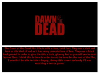
- 1. The Dawn of the Dead film title is with a clear, bold font. They use a dark red font as this kind of red as it has many connotations of fear. They use a black background in order to give the title a dark, gloomy feel as you will see in most horror films. I think this is done in order to set the tone for the rest of the film, I wouldn't be able to take a happy, cheery title screen seriously if I was watching a horror genre.
- 2. The Sixth Sense film title is with a spooky, mysterious font which isn’t wrote in clear text and some letters are hard to read. I think the font has mysterious connotations and foreshadows possible mystery and confusion during the film. The black background is notorious in all horror films as it adds the most darkness and tension to the title. I have also noted the writing is blurry and not clear, this was done deliberately to have a cloudy, blurry look to the title.
- 3. The Dawn of the Dead film title is with a clear, bold font. They use a dark red font as this kind of red as it has many connotations of fear. There is gaps and faded letters in the title for scary effect and looks something like one of the films characters has had an effect on the title. Like the other two titles, it follows the trend of having a dark, gloomy title as the title for the film.