SlideShare a Scribd company logo
1 of 5
Download to read offline
How Responsive Is Your Testing?
To accelerate business digitization, organizations need to ensure a
seamless user experience across diverse channels, one that starts with
a fresh perspective on application testing that takes into account the
proliferating form factors in today’s responsive design world.
Executive Summary
In today’s quickly digitizing world, consumers
spend an inordinate amount of time on multiple
digital screens, from handy smartphones and
tablets through desktop computers and Internet-
enabled television. The choice of the screen is
mostly driven by the context and availability, and
is often sequential in nature.
Though the nexus of most digital interactions is
the smartphone, many consumers find it com-
fortable and efficient to switch between multiple
screens when carrying out and/or completing a
transaction. Figure 1 depicts Google’s findings on
industry-wise sequential screening initiated from
mobile devices.1
cognizant 20-20 insights | june 2015
• Cognizant 20-20 Insights
Multiscreen World Across Industries
Started on
Smartphone
Continued
on a PC
Continued
on a
Tablet
Searching
for info
Shopping
online
Planning
a Trip
Managing
Financees
Social
Networking
Watching an
Online Video
Browsing
the internet
65% 63% 65% 47% 59% 66% 56%
60% 58% 61% 45% 56% 58% 48%
4% 5% 4% 3% 3% 8% 8%
Figure 1
cognizant 20-20 insights 2
Though screen sequence varies with each
industry, the need to follow users — not devices
— is becoming the rule rather than the exception,
guiding consumer-facing companies to a new
paradigm of user experience that focuses on
screens. Google’s recent move to make Chrome
its default browser across screens, as well as
Apple’s Continuity initiative2
as seen on the iOS
8 and OS X Yosemite platforms, reconfirm the
importance of the world of multiscreens.
This white paper offers guidance on ways QA
organizations can more effectively test new
responsive designed applications to ensure a con-
sistency of user experience across form factors
and screen sizes.
Responsive Web Design
With the multiscreen environment gaining signifi-
cance, responsive Web design (RWD), based on
HTML 5 and JQuery, is gaining popularity. While
companies in businesses as varied as informa-
tion/media, energy/utilities, insurance, manu-
facturing/logistics and healthcare have already
commenced their RWD journeys, leading players
in the retail and banking/financial services sectors
are earnestly charting plans to migrate their large
existing code base to RWD as they embrace the
new era of digital experience.
RWD is a simple, single-source-code approach to
development that targets multiscreen delivery
based on the media query (or screen width). Based
on this screen width, the browser content not only
customizes itself, but also can be customized end
to end such as to show or hide content. Figure 2
illustrates how the app layout can be customized
to accommodate different screen sizes.3
Layout Based on Media Query
Sizing Up RWD Breakpoints
Header
Nav
Main Aside
Footer
Header
Nav
Main
Aside
Footer
Desktop Mobile
Tablets
Mobile
@media only screen and (min-device-width : 768px)
and (max-device-width: 1024px) {
/* Styles*/
}
1
2
3
4
5
@media only screen and (min-device-width : 320px)
and (max-device-width: 480px) {
/* Styles*/
}
1
2
3
4
5
Common Breakpoints
Target
Devices
Smartphones Smartphones
Tablets,
Nook/Kindle
Tablets,
low-resolution laptops
and desktops
Tablets,
laptops,
desktops
Laptops and
desktops
1281px1025px801px600px480px320px
Min-device-width
Figure 2
Figure 3
Typically, customization happens at breakpoints. Desktops, tablets and smartphones are considered to
be the design standard breakpoints (see Figure 3). Through fluidic design concepts, RWD pages can be
sized to accommodate any screen size among the breakpoints.
RWD QA
Responsive
Web Design Pages
Integration
Testing
Cross-Browser
& Critical
Business Flows
Regression
Cycle
Performance/
Accessibility
Testing
Production
Go Live
■ Secondary Devices (Smartphones & Tablets)■ Primary Devices (Desktop)
■ ■
■
■
■
■
cognizant 20-20 insights 3
Impact of RWD on Testing
RWD charts a new dimension in application devel-
opment and testing. The target application is
meant for the desktop, tablet and smartphone,
and hence it demands careful identification of
test cases and a smarter design approach. Though
the application’s content may be the same, the
placement within the layout or menu typically
varies based on the device’s screen width. As a
best practice, it is crucial to tag the test cases
and, if need be, the test steps to the breakpoints.
RWD projects are usually executed with a
two-tier approach, emphasizing user interface
(UI) elements and layout. In this process, the
wireframes and HTML design and layout are
created first, followed by the integration of the
system. This approach mandates that testers
should be involved in the earlier phases of devel-
opment to ensure the correctness of UI as per the
defined breakpoints.
During this first phase, the screens are validated
for the respective pixel matrix of the identified
breakpoints. Content delivery is dependent on the
media query – not the user agent – so the majority
of UI-specific testing can be performed on the
desktop browser by resizing. After ironing out the
initial UI issues with reference to the breakpoints,
it is recommended to verify the screens on the
actual smartphone browsers. This is because a
smartphone browser does not work the same way
as a desktop browser does.
Given the fluidic design of the Web pages, the
right selection of mobile devices plays a vital role
to identify bugs associated with the logic built in
for breakpoints. Ideally, the selection of devices
is based on the defined breakpoints, and the
market share of the device and mobile OS version.
Given the same content is verified on multiple
browsers during the UI validation phase, powerful
browser utility tools are required to reduce the
testing effort.
System Integration Testing Approach
Figure 4
The second phase of testing is when the built
HTML pages are integrated to deliver function-
alities. Since the source code is similar among
various breakpoints, it is recommended that
end-to-end functional testing is conducted on the
desktop, while regression testing or a day-in-the-
life scenario is tested on the other breakpoints.
However, the testing approach can be revalidated
by carefully identifying the integration failure
across breakpoints through appropriate metrics.
In addition to UI and integration testing, the
single-code-base nature of RWD projects places
performance testing on center stage. Although
there are many development guidelines such as
the mobile-first approach to make responsive
pages lightweight, it is crucial to validate per-
formance KPIs, especially on smartphones. It is
recommended that three-staged performance
testing of responsive Web pages be carried out
on a smartphone to enable the ultimate seamless
user experience.
The New Dimension of
Automation Testing
Similar to any smartphone or a tablet applica-
tion, in a responsive design there is a need to
perform repeated testing across a wide range of
device combinations. In addition to smartphones
and tablets, it is also necessary to run the same
test cases across various combinations including
Microsoft Windows, Apple Mac and browsers
such as Google Chrome, Apple Safari, Microsoft
Internet Explorer and Mozilla Firefox. With these
exhaustive combinations to be verified for
the same code base, QA organizations should
consider automating the effort to boost their
return on investment. However, the success of
automation is highly dependent on the test tool
of choice.
The automation tool landscape is highly polarized
to support either desktop or smartphone
browsers. In RWD, however, it is important that
the target tool supports browsers for either
platform. Another key deciding factor for the
selection of the apt automation tool is the fact
that the script is reusable between mobile and
desktop browsers. Technically, industry-standard
tools support automation through image or
optical character recognition (OCR) techniques or
object identification.
Image or OCR tools automation scripts are
reusable to a large extent across devices and can
easily verify the UI elements that include text
overlap and wrong image dimensions – elements
that are crucial in an RWD project. However, such
tool(s) might not be efficient if they are unable to
scale images for different screen resolutions.
In the case of object-based tools, execution is
primarily driven through the objects and can
be used for functional verification, whereas UI
validation might not be efficient. A text overlap
situation or the layout (where an object is placed
in the page) might prove difficult to be validated
if proper frameworks are not implemented. In
either case, it is necessary to ensure that the
scripts offer easy maintenance and seamless
UI element validation. Although automation
brings efficiency and reduces RWD project costs,
successful adoption of such tools depends on
the particular tool chosen and the elements that
require verification in various breakpoints.
Looking Forward
In many ways, RWD may seem similar to tradition-
al Web development. However, the single code
base across desktops, tablets and smartphones
demands that QA organizations embrace a fresh
perspective to testing – from test case design to
tool selection. While the two-tier approach for
development requires tools that can be adopted
in the early development phases, RWD’s fluidic
design will succeed only if the right automation
tool is selected.
In RWD projects, focused test design, UI testing,
integration testing, performance, automation
and careful implementation of best practices can
deliver increased efficiency, enabling QA teams to
meet timelines and cost savings estimates.
cognizant 20-20 insights 4
Footnotes
1	 The New Multi-screen World: Understanding Cross-platform Consumer Behavior, Slide 20,
https://ssl.gstatic.com/think/docs/the-new-multi-screen-world-study_research-studies.pdf.
2	 Continuity is Apple’s umbrella-term for key features that allow OS X and iOS to
“connect like never before.”
3	 http://www.smashingmagazine.com/2013/05/29/the-state-of-responsive-web-design/.
About Cognizant
Cognizant (NASDAQ: CTSH) is a leading provider of information technology, consulting, and business
process outsourcing services, dedicated to helping the world’s leading companies build stronger busi-
nesses. Headquartered in Teaneck, New Jersey (U.S.), Cognizant combines a passion for client satisfac-
tion, technology innovation, deep industry and business process expertise, and a global, collaborative
workforce that embodies the future of work. With over 100 development and delivery centers worldwide
and approximately 217,700 employees as of March 31, 2015, Cognizant is a member of the NASDAQ-100,
the S&P 500, the Forbes Global 2000, and the Fortune 500 and is ranked among the top performing and
fastest growing companies in the world. Visit us online at www.cognizant.com or follow us on Twitter: Cognizant.
World Headquarters
500 Frank W. Burr Blvd.
Teaneck, NJ 07666 USA
Phone: +1 201 801 0233
Fax: +1 201 801 0243
Toll Free: +1 888 937 3277
Email: inquiry@cognizant.com
European Headquarters
1 Kingdom Street
Paddington Central
London W2 6BD
Phone: +44 (0) 20 7297 7600
Fax: +44 (0) 20 7121 0102
Email: infouk@cognizant.com
India Operations Headquarters
#5/535, Old Mahabalipuram Road
Okkiyam Pettai, Thoraipakkam
Chennai, 600 096 India
Phone: +91 (0) 44 4209 6000
Fax: +91 (0) 44 4209 6060
Email: inquiryindia@cognizant.com
­­© Copyright 2015, Cognizant. All rights reserved. No part of this document may be reproduced, stored in a retrieval system, transmitted in any form or by any
means, electronic, mechanical, photocopying, recording, or otherwise, without the express written permission from Cognizant. The information contained herein is
subject to change without notice. All other trademarks mentioned herein are the property of their respective owners.
About the Author
Subbiah Muthiah is an Associate Director within Cognizant’s Quality Engineering & Assurance (QE&A)
Practice’s Technology Center of Excellence (CoE), where he is responsible for techno-business develop-
ment and building quality assurance for digital services, connected devices, wearables and telematics.
Subbiah has more than 14 years of relevant industry experience with in-depth knowledge across the mobile
stack — from the application to protocol layer. He holds a bachelor’s degree in engineering from Annamalai
University, Chennai, Tamil Nadu, India. Subbiah can be reached at Subbiah.Muthiah@cognizant.com.

More Related Content

What's hot

Mobile app development converted
Mobile app development convertedMobile app development converted
Mobile app development converted
Sandy Gupta
 
Responsive Web Design vs. Mobile Web App: What is best for Enterprise - Whit...
Responsive Web Design vs. Mobile Web App:  What is best for Enterprise - Whit...Responsive Web Design vs. Mobile Web App:  What is best for Enterprise - Whit...
Responsive Web Design vs. Mobile Web App: What is best for Enterprise - Whit...
RapidValue
 
Enough_Software_Guide_16thEdition_Web
Enough_Software_Guide_16thEdition_WebEnough_Software_Guide_16thEdition_Web
Enough_Software_Guide_16thEdition_Web
Marco Tabor
 
Voice gate mobile group presentation v1.1
Voice gate mobile group presentation  v1.1Voice gate mobile group presentation  v1.1
Voice gate mobile group presentation v1.1
voicegateindia
 

What's hot (19)

[IJCT-V3I2P36] Authors: Amarbir Singh
[IJCT-V3I2P36] Authors: Amarbir Singh[IJCT-V3I2P36] Authors: Amarbir Singh
[IJCT-V3I2P36] Authors: Amarbir Singh
 
Application modernization
Application modernizationApplication modernization
Application modernization
 
Mobile app development converted
Mobile app development convertedMobile app development converted
Mobile app development converted
 
7 Factors to Consider While Developing Mobile Apps
7 Factors to Consider While Developing Mobile Apps7 Factors to Consider While Developing Mobile Apps
7 Factors to Consider While Developing Mobile Apps
 
Responsive Web Design vs. Mobile Web App: What is best for Enterprise - Whit...
Responsive Web Design vs. Mobile Web App:  What is best for Enterprise - Whit...Responsive Web Design vs. Mobile Web App:  What is best for Enterprise - Whit...
Responsive Web Design vs. Mobile Web App: What is best for Enterprise - Whit...
 
Mobile Web vs. Native apps
Mobile Web vs. Native appsMobile Web vs. Native apps
Mobile Web vs. Native apps
 
Product personification parag model to
Product personification parag model toProduct personification parag model to
Product personification parag model to
 
MADP - Mobile Application Development Platform - CRE8 Brasil MEAP
MADP - Mobile Application Development Platform - CRE8 Brasil MEAPMADP - Mobile Application Development Platform - CRE8 Brasil MEAP
MADP - Mobile Application Development Platform - CRE8 Brasil MEAP
 
IBM Worklight - Enterprise level mobile development and management
IBM Worklight - Enterprise level mobile development and managementIBM Worklight - Enterprise level mobile development and management
IBM Worklight - Enterprise level mobile development and management
 
Essential Guide to Becoming A Mobile App Rock Star - part III - Consumer-faci...
Essential Guide to Becoming A Mobile App Rock Star - part III - Consumer-faci...Essential Guide to Becoming A Mobile App Rock Star - part III - Consumer-faci...
Essential Guide to Becoming A Mobile App Rock Star - part III - Consumer-faci...
 
Somnath Resume
Somnath ResumeSomnath Resume
Somnath Resume
 
Importance of Mobile App Architecture For Mobile App Development
Importance of Mobile App Architecture For Mobile App DevelopmentImportance of Mobile App Architecture For Mobile App Development
Importance of Mobile App Architecture For Mobile App Development
 
Mobile Enterprise Application Platform: A solution to myriad challenges in en...
Mobile Enterprise Application Platform: A solution to myriad challenges in en...Mobile Enterprise Application Platform: A solution to myriad challenges in en...
Mobile Enterprise Application Platform: A solution to myriad challenges in en...
 
Essential Guide to Becoming A Mobile App Rock Star - part III - Enterprise Apps
Essential Guide to Becoming A Mobile App Rock Star - part III - Enterprise AppsEssential Guide to Becoming A Mobile App Rock Star - part III - Enterprise Apps
Essential Guide to Becoming A Mobile App Rock Star - part III - Enterprise Apps
 
Mobile Developer's Guide To The Galaxy, 15th edition
Mobile Developer's Guide To The Galaxy, 15th editionMobile Developer's Guide To The Galaxy, 15th edition
Mobile Developer's Guide To The Galaxy, 15th edition
 
Enough_Software_Guide_16thEdition_Web
Enough_Software_Guide_16thEdition_WebEnough_Software_Guide_16thEdition_Web
Enough_Software_Guide_16thEdition_Web
 
Voice gate mobile group presentation v1.1
Voice gate mobile group presentation  v1.1Voice gate mobile group presentation  v1.1
Voice gate mobile group presentation v1.1
 
Pocket app
Pocket appPocket app
Pocket app
 
Why should enterprises need a Mobile Enterprise Application Platform
Why should enterprises need a Mobile Enterprise Application PlatformWhy should enterprises need a Mobile Enterprise Application Platform
Why should enterprises need a Mobile Enterprise Application Platform
 

Viewers also liked

Viewers also liked (17)

Mitigating Supply Chain Risk: Planning Around Port Disruptions
Mitigating Supply Chain Risk: Planning Around Port DisruptionsMitigating Supply Chain Risk: Planning Around Port Disruptions
Mitigating Supply Chain Risk: Planning Around Port Disruptions
 
Wearable Technology: Automotive's Next Digital Frontier
Wearable Technology: Automotive's Next Digital FrontierWearable Technology: Automotive's Next Digital Frontier
Wearable Technology: Automotive's Next Digital Frontier
 
Kidnap and ransom insurance at an inflection point
Kidnap and ransom insurance at an inflection pointKidnap and ransom insurance at an inflection point
Kidnap and ransom insurance at an inflection point
 
Harnessing Social and Mobile to Court the Digital Consumer
Harnessing Social and Mobile to Court the Digital ConsumerHarnessing Social and Mobile to Court the Digital Consumer
Harnessing Social and Mobile to Court the Digital Consumer
 
Streamlining Submission Intake in Commercial Underwriting for Middle Market S...
Streamlining Submission Intake in Commercial Underwriting for Middle Market S...Streamlining Submission Intake in Commercial Underwriting for Middle Market S...
Streamlining Submission Intake in Commercial Underwriting for Middle Market S...
 
The Last Word: Enabling the Digitally Enhanced Business
The Last Word: Enabling the Digitally Enhanced BusinessThe Last Word: Enabling the Digitally Enhanced Business
The Last Word: Enabling the Digitally Enhanced Business
 
Digital Process Acupuncture: How Small Changes Can Heal Business, and Spark B...
Digital Process Acupuncture: How Small Changes Can Heal Business, and Spark B...Digital Process Acupuncture: How Small Changes Can Heal Business, and Spark B...
Digital Process Acupuncture: How Small Changes Can Heal Business, and Spark B...
 
Connected Home Readiness and Maturity Assessment
Connected Home Readiness and Maturity AssessmentConnected Home Readiness and Maturity Assessment
Connected Home Readiness and Maturity Assessment
 
Stepping Up to the Challenges of Digital Marketing
Stepping Up to the Challenges of Digital MarketingStepping Up to the Challenges of Digital Marketing
Stepping Up to the Challenges of Digital Marketing
 
Business Assurance: The Quality Implications of Digital Transformation
Business Assurance: The Quality Implications of Digital TransformationBusiness Assurance: The Quality Implications of Digital Transformation
Business Assurance: The Quality Implications of Digital Transformation
 
The Consumer Halo in Media and Entertainment
The Consumer Halo in Media and EntertainmentThe Consumer Halo in Media and Entertainment
The Consumer Halo in Media and Entertainment
 
Digital Game-Changers for the Communication Service Provider Industry
Digital Game-Changers for the Communication Service Provider IndustryDigital Game-Changers for the Communication Service Provider Industry
Digital Game-Changers for the Communication Service Provider Industry
 
4 Reasons To Rethink Your BYOD Strategy
4 Reasons To Rethink Your BYOD Strategy4 Reasons To Rethink Your BYOD Strategy
4 Reasons To Rethink Your BYOD Strategy
 
Asia-Pacific’s Digital Story: It’s All About Growth
Asia-Pacific’s Digital Story: It’s All About GrowthAsia-Pacific’s Digital Story: It’s All About Growth
Asia-Pacific’s Digital Story: It’s All About Growth
 
6 Powerful Steps To Speed-Up Manufacturing's Digital Transformation
6 Powerful Steps To Speed-Up Manufacturing's Digital Transformation6 Powerful Steps To Speed-Up Manufacturing's Digital Transformation
6 Powerful Steps To Speed-Up Manufacturing's Digital Transformation
 
Connected Shipping: Riding the Wave of E-Commerce
Connected Shipping: Riding the Wave of E-CommerceConnected Shipping: Riding the Wave of E-Commerce
Connected Shipping: Riding the Wave of E-Commerce
 
50 Ways To Understand The Digital Customer Experience
50 Ways To Understand The Digital Customer Experience50 Ways To Understand The Digital Customer Experience
50 Ways To Understand The Digital Customer Experience
 

Similar to How Responsive Is Your Testing?

Enabling Continuous Quality in Mobile App Development
Enabling Continuous Quality in Mobile App DevelopmentEnabling Continuous Quality in Mobile App Development
Enabling Continuous Quality in Mobile App Development
Matthew Young
 

Similar to How Responsive Is Your Testing? (20)

A Complete Guide to Testing Responsive Websites
A Complete Guide to Testing Responsive WebsitesA Complete Guide to Testing Responsive Websites
A Complete Guide to Testing Responsive Websites
 
Scube's mobile application development
Scube's mobile application developmentScube's mobile application development
Scube's mobile application development
 
Whitepaper: Responsive Test - A test framework to cover it all
Whitepaper: Responsive Test - A test framework to cover it allWhitepaper: Responsive Test - A test framework to cover it all
Whitepaper: Responsive Test - A test framework to cover it all
 
User Interface Design for Web and Mobile Devices
User Interface Design for Web and Mobile DevicesUser Interface Design for Web and Mobile Devices
User Interface Design for Web and Mobile Devices
 
Future-Proofing the Web: Choosing the Optimal Mobile Design Strategy
Future-Proofing the Web: Choosing the Optimal Mobile Design StrategyFuture-Proofing the Web: Choosing the Optimal Mobile Design Strategy
Future-Proofing the Web: Choosing the Optimal Mobile Design Strategy
 
Difference between Mobile and Web App testing
Difference between Mobile and Web App testingDifference between Mobile and Web App testing
Difference between Mobile and Web App testing
 
Selecting the Right Mobile Test Automation Strategy: Challenges and Principles
Selecting the Right Mobile Test Automation Strategy: Challenges and PrinciplesSelecting the Right Mobile Test Automation Strategy: Challenges and Principles
Selecting the Right Mobile Test Automation Strategy: Challenges and Principles
 
MAGE PROCESSING BASED BILLING STRUCTURE USING EDGE COMPUTING AND REACTJS
MAGE PROCESSING BASED BILLING STRUCTURE USING EDGE COMPUTING AND REACTJSMAGE PROCESSING BASED BILLING STRUCTURE USING EDGE COMPUTING AND REACTJS
MAGE PROCESSING BASED BILLING STRUCTURE USING EDGE COMPUTING AND REACTJS
 
How does Cross Browser testing improve the User Experience.pdf
How does Cross Browser testing improve the User Experience.pdfHow does Cross Browser testing improve the User Experience.pdf
How does Cross Browser testing improve the User Experience.pdf
 
Quality Assurance and mobile applications!
Quality Assurance and mobile applications!Quality Assurance and mobile applications!
Quality Assurance and mobile applications!
 
Mobility Solutions - Development of Hybrid Mobile Applications with HTML
Mobility Solutions - Development of Hybrid Mobile Applications with HTMLMobility Solutions - Development of Hybrid Mobile Applications with HTML
Mobility Solutions - Development of Hybrid Mobile Applications with HTML
 
App Architecture for Efficient Mobile App Development.pdf
App Architecture for Efficient Mobile App Development.pdfApp Architecture for Efficient Mobile App Development.pdf
App Architecture for Efficient Mobile App Development.pdf
 
Ijcet 06 09_002
Ijcet 06 09_002Ijcet 06 09_002
Ijcet 06 09_002
 
Cross browser Testing on Mobile Devices
Cross browser Testing on Mobile DevicesCross browser Testing on Mobile Devices
Cross browser Testing on Mobile Devices
 
Decide if PhoneGap is for you as your mobile platform selection
Decide if PhoneGap is for you as your mobile platform selectionDecide if PhoneGap is for you as your mobile platform selection
Decide if PhoneGap is for you as your mobile platform selection
 
How to Maximize User Experience with Effective Front-End Technology Choices
How to Maximize User Experience with Effective Front-End Technology ChoicesHow to Maximize User Experience with Effective Front-End Technology Choices
How to Maximize User Experience with Effective Front-End Technology Choices
 
Enabling Continuous Quality in Mobile App Development
Enabling Continuous Quality in Mobile App DevelopmentEnabling Continuous Quality in Mobile App Development
Enabling Continuous Quality in Mobile App Development
 
Fundamentals of Mobile App Development Technology
Fundamentals of Mobile App Development TechnologyFundamentals of Mobile App Development Technology
Fundamentals of Mobile App Development Technology
 
Top Five Secrets for a Successful Enterprise Mobile QA Automation Strategy
Top Five Secrets for a Successful Enterprise Mobile QA Automation StrategyTop Five Secrets for a Successful Enterprise Mobile QA Automation Strategy
Top Five Secrets for a Successful Enterprise Mobile QA Automation Strategy
 
The Future of App Development: Trends in No Code App Builders
The Future of App Development: Trends in No Code App BuildersThe Future of App Development: Trends in No Code App Builders
The Future of App Development: Trends in No Code App Builders
 

More from Cognizant

More from Cognizant (20)

Using Adaptive Scrum to Tame Process Reverse Engineering in Data Analytics Pr...
Using Adaptive Scrum to Tame Process Reverse Engineering in Data Analytics Pr...Using Adaptive Scrum to Tame Process Reverse Engineering in Data Analytics Pr...
Using Adaptive Scrum to Tame Process Reverse Engineering in Data Analytics Pr...
 
Data Modernization: Breaking the AI Vicious Cycle for Superior Decision-making
Data Modernization: Breaking the AI Vicious Cycle for Superior Decision-makingData Modernization: Breaking the AI Vicious Cycle for Superior Decision-making
Data Modernization: Breaking the AI Vicious Cycle for Superior Decision-making
 
It Takes an Ecosystem: How Technology Companies Deliver Exceptional Experiences
It Takes an Ecosystem: How Technology Companies Deliver Exceptional ExperiencesIt Takes an Ecosystem: How Technology Companies Deliver Exceptional Experiences
It Takes an Ecosystem: How Technology Companies Deliver Exceptional Experiences
 
Intuition Engineered
Intuition EngineeredIntuition Engineered
Intuition Engineered
 
The Work Ahead: Transportation and Logistics Delivering on the Digital-Physic...
The Work Ahead: Transportation and Logistics Delivering on the Digital-Physic...The Work Ahead: Transportation and Logistics Delivering on the Digital-Physic...
The Work Ahead: Transportation and Logistics Delivering on the Digital-Physic...
 
Enhancing Desirability: Five Considerations for Winning Digital Initiatives
Enhancing Desirability: Five Considerations for Winning Digital InitiativesEnhancing Desirability: Five Considerations for Winning Digital Initiatives
Enhancing Desirability: Five Considerations for Winning Digital Initiatives
 
The Work Ahead in Manufacturing: Fulfilling the Agility Mandate
The Work Ahead in Manufacturing: Fulfilling the Agility MandateThe Work Ahead in Manufacturing: Fulfilling the Agility Mandate
The Work Ahead in Manufacturing: Fulfilling the Agility Mandate
 
The Work Ahead in Higher Education: Repaving the Road for the Employees of To...
The Work Ahead in Higher Education: Repaving the Road for the Employees of To...The Work Ahead in Higher Education: Repaving the Road for the Employees of To...
The Work Ahead in Higher Education: Repaving the Road for the Employees of To...
 
Engineering the Next-Gen Digital Claims Organisation for Australian General I...
Engineering the Next-Gen Digital Claims Organisation for Australian General I...Engineering the Next-Gen Digital Claims Organisation for Australian General I...
Engineering the Next-Gen Digital Claims Organisation for Australian General I...
 
Profitability in the Direct-to-Consumer Marketplace: A Playbook for Media and...
Profitability in the Direct-to-Consumer Marketplace: A Playbook for Media and...Profitability in the Direct-to-Consumer Marketplace: A Playbook for Media and...
Profitability in the Direct-to-Consumer Marketplace: A Playbook for Media and...
 
Green Rush: The Economic Imperative for Sustainability
Green Rush: The Economic Imperative for SustainabilityGreen Rush: The Economic Imperative for Sustainability
Green Rush: The Economic Imperative for Sustainability
 
Policy Administration Modernization: Four Paths for Insurers
Policy Administration Modernization: Four Paths for InsurersPolicy Administration Modernization: Four Paths for Insurers
Policy Administration Modernization: Four Paths for Insurers
 
The Work Ahead in Utilities: Powering a Sustainable Future with Digital
The Work Ahead in Utilities: Powering a Sustainable Future with DigitalThe Work Ahead in Utilities: Powering a Sustainable Future with Digital
The Work Ahead in Utilities: Powering a Sustainable Future with Digital
 
AI in Media & Entertainment: Starting the Journey to Value
AI in Media & Entertainment: Starting the Journey to ValueAI in Media & Entertainment: Starting the Journey to Value
AI in Media & Entertainment: Starting the Journey to Value
 
Operations Workforce Management: A Data-Informed, Digital-First Approach
Operations Workforce Management: A Data-Informed, Digital-First ApproachOperations Workforce Management: A Data-Informed, Digital-First Approach
Operations Workforce Management: A Data-Informed, Digital-First Approach
 
Five Priorities for Quality Engineering When Taking Banking to the Cloud
Five Priorities for Quality Engineering When Taking Banking to the CloudFive Priorities for Quality Engineering When Taking Banking to the Cloud
Five Priorities for Quality Engineering When Taking Banking to the Cloud
 
Getting Ahead With AI: How APAC Companies Replicate Success by Remaining Focused
Getting Ahead With AI: How APAC Companies Replicate Success by Remaining FocusedGetting Ahead With AI: How APAC Companies Replicate Success by Remaining Focused
Getting Ahead With AI: How APAC Companies Replicate Success by Remaining Focused
 
Crafting the Utility of the Future
Crafting the Utility of the FutureCrafting the Utility of the Future
Crafting the Utility of the Future
 
Utilities Can Ramp Up CX with a Customer Data Platform
Utilities Can Ramp Up CX with a Customer Data PlatformUtilities Can Ramp Up CX with a Customer Data Platform
Utilities Can Ramp Up CX with a Customer Data Platform
 
The Work Ahead in Intelligent Automation: Coping with Complexity in a Post-Pa...
The Work Ahead in Intelligent Automation: Coping with Complexity in a Post-Pa...The Work Ahead in Intelligent Automation: Coping with Complexity in a Post-Pa...
The Work Ahead in Intelligent Automation: Coping with Complexity in a Post-Pa...
 

How Responsive Is Your Testing?

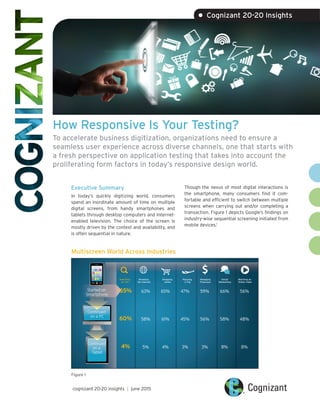
  • 1. How Responsive Is Your Testing? To accelerate business digitization, organizations need to ensure a seamless user experience across diverse channels, one that starts with a fresh perspective on application testing that takes into account the proliferating form factors in today’s responsive design world. Executive Summary In today’s quickly digitizing world, consumers spend an inordinate amount of time on multiple digital screens, from handy smartphones and tablets through desktop computers and Internet- enabled television. The choice of the screen is mostly driven by the context and availability, and is often sequential in nature. Though the nexus of most digital interactions is the smartphone, many consumers find it com- fortable and efficient to switch between multiple screens when carrying out and/or completing a transaction. Figure 1 depicts Google’s findings on industry-wise sequential screening initiated from mobile devices.1 cognizant 20-20 insights | june 2015 • Cognizant 20-20 Insights Multiscreen World Across Industries Started on Smartphone Continued on a PC Continued on a Tablet Searching for info Shopping online Planning a Trip Managing Financees Social Networking Watching an Online Video Browsing the internet 65% 63% 65% 47% 59% 66% 56% 60% 58% 61% 45% 56% 58% 48% 4% 5% 4% 3% 3% 8% 8% Figure 1
  • 2. cognizant 20-20 insights 2 Though screen sequence varies with each industry, the need to follow users — not devices — is becoming the rule rather than the exception, guiding consumer-facing companies to a new paradigm of user experience that focuses on screens. Google’s recent move to make Chrome its default browser across screens, as well as Apple’s Continuity initiative2 as seen on the iOS 8 and OS X Yosemite platforms, reconfirm the importance of the world of multiscreens. This white paper offers guidance on ways QA organizations can more effectively test new responsive designed applications to ensure a con- sistency of user experience across form factors and screen sizes. Responsive Web Design With the multiscreen environment gaining signifi- cance, responsive Web design (RWD), based on HTML 5 and JQuery, is gaining popularity. While companies in businesses as varied as informa- tion/media, energy/utilities, insurance, manu- facturing/logistics and healthcare have already commenced their RWD journeys, leading players in the retail and banking/financial services sectors are earnestly charting plans to migrate their large existing code base to RWD as they embrace the new era of digital experience. RWD is a simple, single-source-code approach to development that targets multiscreen delivery based on the media query (or screen width). Based on this screen width, the browser content not only customizes itself, but also can be customized end to end such as to show or hide content. Figure 2 illustrates how the app layout can be customized to accommodate different screen sizes.3 Layout Based on Media Query Sizing Up RWD Breakpoints Header Nav Main Aside Footer Header Nav Main Aside Footer Desktop Mobile Tablets Mobile @media only screen and (min-device-width : 768px) and (max-device-width: 1024px) { /* Styles*/ } 1 2 3 4 5 @media only screen and (min-device-width : 320px) and (max-device-width: 480px) { /* Styles*/ } 1 2 3 4 5 Common Breakpoints Target Devices Smartphones Smartphones Tablets, Nook/Kindle Tablets, low-resolution laptops and desktops Tablets, laptops, desktops Laptops and desktops 1281px1025px801px600px480px320px Min-device-width Figure 2 Figure 3 Typically, customization happens at breakpoints. Desktops, tablets and smartphones are considered to be the design standard breakpoints (see Figure 3). Through fluidic design concepts, RWD pages can be sized to accommodate any screen size among the breakpoints.
  • 3. RWD QA Responsive Web Design Pages Integration Testing Cross-Browser & Critical Business Flows Regression Cycle Performance/ Accessibility Testing Production Go Live ■ Secondary Devices (Smartphones & Tablets)■ Primary Devices (Desktop) ■ ■ ■ ■ ■ ■ cognizant 20-20 insights 3 Impact of RWD on Testing RWD charts a new dimension in application devel- opment and testing. The target application is meant for the desktop, tablet and smartphone, and hence it demands careful identification of test cases and a smarter design approach. Though the application’s content may be the same, the placement within the layout or menu typically varies based on the device’s screen width. As a best practice, it is crucial to tag the test cases and, if need be, the test steps to the breakpoints. RWD projects are usually executed with a two-tier approach, emphasizing user interface (UI) elements and layout. In this process, the wireframes and HTML design and layout are created first, followed by the integration of the system. This approach mandates that testers should be involved in the earlier phases of devel- opment to ensure the correctness of UI as per the defined breakpoints. During this first phase, the screens are validated for the respective pixel matrix of the identified breakpoints. Content delivery is dependent on the media query – not the user agent – so the majority of UI-specific testing can be performed on the desktop browser by resizing. After ironing out the initial UI issues with reference to the breakpoints, it is recommended to verify the screens on the actual smartphone browsers. This is because a smartphone browser does not work the same way as a desktop browser does. Given the fluidic design of the Web pages, the right selection of mobile devices plays a vital role to identify bugs associated with the logic built in for breakpoints. Ideally, the selection of devices is based on the defined breakpoints, and the market share of the device and mobile OS version. Given the same content is verified on multiple browsers during the UI validation phase, powerful browser utility tools are required to reduce the testing effort. System Integration Testing Approach Figure 4 The second phase of testing is when the built HTML pages are integrated to deliver function- alities. Since the source code is similar among various breakpoints, it is recommended that end-to-end functional testing is conducted on the desktop, while regression testing or a day-in-the- life scenario is tested on the other breakpoints. However, the testing approach can be revalidated by carefully identifying the integration failure across breakpoints through appropriate metrics. In addition to UI and integration testing, the single-code-base nature of RWD projects places performance testing on center stage. Although there are many development guidelines such as the mobile-first approach to make responsive pages lightweight, it is crucial to validate per- formance KPIs, especially on smartphones. It is recommended that three-staged performance testing of responsive Web pages be carried out on a smartphone to enable the ultimate seamless user experience. The New Dimension of Automation Testing Similar to any smartphone or a tablet applica- tion, in a responsive design there is a need to perform repeated testing across a wide range of device combinations. In addition to smartphones and tablets, it is also necessary to run the same
  • 4. test cases across various combinations including Microsoft Windows, Apple Mac and browsers such as Google Chrome, Apple Safari, Microsoft Internet Explorer and Mozilla Firefox. With these exhaustive combinations to be verified for the same code base, QA organizations should consider automating the effort to boost their return on investment. However, the success of automation is highly dependent on the test tool of choice. The automation tool landscape is highly polarized to support either desktop or smartphone browsers. In RWD, however, it is important that the target tool supports browsers for either platform. Another key deciding factor for the selection of the apt automation tool is the fact that the script is reusable between mobile and desktop browsers. Technically, industry-standard tools support automation through image or optical character recognition (OCR) techniques or object identification. Image or OCR tools automation scripts are reusable to a large extent across devices and can easily verify the UI elements that include text overlap and wrong image dimensions – elements that are crucial in an RWD project. However, such tool(s) might not be efficient if they are unable to scale images for different screen resolutions. In the case of object-based tools, execution is primarily driven through the objects and can be used for functional verification, whereas UI validation might not be efficient. A text overlap situation or the layout (where an object is placed in the page) might prove difficult to be validated if proper frameworks are not implemented. In either case, it is necessary to ensure that the scripts offer easy maintenance and seamless UI element validation. Although automation brings efficiency and reduces RWD project costs, successful adoption of such tools depends on the particular tool chosen and the elements that require verification in various breakpoints. Looking Forward In many ways, RWD may seem similar to tradition- al Web development. However, the single code base across desktops, tablets and smartphones demands that QA organizations embrace a fresh perspective to testing – from test case design to tool selection. While the two-tier approach for development requires tools that can be adopted in the early development phases, RWD’s fluidic design will succeed only if the right automation tool is selected. In RWD projects, focused test design, UI testing, integration testing, performance, automation and careful implementation of best practices can deliver increased efficiency, enabling QA teams to meet timelines and cost savings estimates. cognizant 20-20 insights 4 Footnotes 1 The New Multi-screen World: Understanding Cross-platform Consumer Behavior, Slide 20, https://ssl.gstatic.com/think/docs/the-new-multi-screen-world-study_research-studies.pdf. 2 Continuity is Apple’s umbrella-term for key features that allow OS X and iOS to “connect like never before.” 3 http://www.smashingmagazine.com/2013/05/29/the-state-of-responsive-web-design/.
  • 5. About Cognizant Cognizant (NASDAQ: CTSH) is a leading provider of information technology, consulting, and business process outsourcing services, dedicated to helping the world’s leading companies build stronger busi- nesses. Headquartered in Teaneck, New Jersey (U.S.), Cognizant combines a passion for client satisfac- tion, technology innovation, deep industry and business process expertise, and a global, collaborative workforce that embodies the future of work. With over 100 development and delivery centers worldwide and approximately 217,700 employees as of March 31, 2015, Cognizant is a member of the NASDAQ-100, the S&P 500, the Forbes Global 2000, and the Fortune 500 and is ranked among the top performing and fastest growing companies in the world. Visit us online at www.cognizant.com or follow us on Twitter: Cognizant. World Headquarters 500 Frank W. Burr Blvd. Teaneck, NJ 07666 USA Phone: +1 201 801 0233 Fax: +1 201 801 0243 Toll Free: +1 888 937 3277 Email: inquiry@cognizant.com European Headquarters 1 Kingdom Street Paddington Central London W2 6BD Phone: +44 (0) 20 7297 7600 Fax: +44 (0) 20 7121 0102 Email: infouk@cognizant.com India Operations Headquarters #5/535, Old Mahabalipuram Road Okkiyam Pettai, Thoraipakkam Chennai, 600 096 India Phone: +91 (0) 44 4209 6000 Fax: +91 (0) 44 4209 6060 Email: inquiryindia@cognizant.com ­­© Copyright 2015, Cognizant. All rights reserved. No part of this document may be reproduced, stored in a retrieval system, transmitted in any form or by any means, electronic, mechanical, photocopying, recording, or otherwise, without the express written permission from Cognizant. The information contained herein is subject to change without notice. All other trademarks mentioned herein are the property of their respective owners. About the Author Subbiah Muthiah is an Associate Director within Cognizant’s Quality Engineering & Assurance (QE&A) Practice’s Technology Center of Excellence (CoE), where he is responsible for techno-business develop- ment and building quality assurance for digital services, connected devices, wearables and telematics. Subbiah has more than 14 years of relevant industry experience with in-depth knowledge across the mobile stack — from the application to protocol layer. He holds a bachelor’s degree in engineering from Annamalai University, Chennai, Tamil Nadu, India. Subbiah can be reached at Subbiah.Muthiah@cognizant.com.