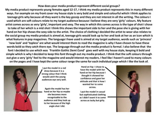
Question 2.
How does your media product represent different social groups?
My media product represents young females aged 12-17, I think my media product represents this in many different
  ways. For example on my front cover my house style is very bold and simple and colourful which I think applies to
  teenage girls why because all they want is the key gossip and they are not interest in all the writing. The colours I
  used which are soft colours relate to my target audience because I believe they are very ‘girly’ colours. My feature
artist comes across as very ‘girly’, important and sexy. The way in which this comes across is the type of shot I chose
   to take of her which is a mid shot I think this shows the important side to her and the pose she is giving with her
  hand on her hip shows the sexy side to the artist. The choice of clothing I decided the artist to wear also relates to
the social group my media product is aimed at, teenage girls would look up to her and look at her as an icon which is
 what features in pop magazines. The language I have used is aimed at my target audience, words such as ‘princess’
    ‘new look’ and ‘topless’ are what would interest them to read the magazine is why I have chosen to have these
  words bold so they catch there eye. The language through out the media product is formal. I also believe that the
   font I decided to use which was ‘Franklin Gothic Demi Cond‘ goes well with my house style, keeping it bold and
 simple which is why I decided to keep this font through out my media product. I think that the soft colours through
 out give a very ‘girly’ feel to the magazine and would interest my readers. I feel like I haven’t used to many colours
     on the pages and I have kept the same colour range the same for each individual page which I like the look of.

                              I put the model in a red       Hand on hip- I chose to
                                 dress because it is a      have the model with her
                             strong colour that I think     hand on her hip because I
                               would catch the young         thought it showed her
                             audiences eye very well.       confidence and gave her
                                                            attitude and that is how I
                                                               wanted her to come
                                                                     across.
                                Again the model has her
                               hand on her hip so maybe      I put the model in casual
                                   she becomes more         but sophisticated clothing
                                   recognisable to the      as I didn’t want it to come
                               audience and they look up     across as tacky but girly.
                               to her because of the high
                                     angle shot I did.

Question2 d

  • 1.
    Question 2. How doesyour media product represent different social groups?
  • 2.
    How does yourmedia product represent different social groups? My media product represents young females aged 12-17, I think my media product represents this in many different ways. For example on my front cover my house style is very bold and simple and colourful which I think applies to teenage girls why because all they want is the key gossip and they are not interest in all the writing. The colours I used which are soft colours relate to my target audience because I believe they are very ‘girly’ colours. My feature artist comes across as very ‘girly’, important and sexy. The way in which this comes across is the type of shot I chose to take of her which is a mid shot I think this shows the important side to her and the pose she is giving with her hand on her hip shows the sexy side to the artist. The choice of clothing I decided the artist to wear also relates to the social group my media product is aimed at, teenage girls would look up to her and look at her as an icon which is what features in pop magazines. The language I have used is aimed at my target audience, words such as ‘princess’ ‘new look’ and ‘topless’ are what would interest them to read the magazine is why I have chosen to have these words bold so they catch there eye. The language through out the media product is formal. I also believe that the font I decided to use which was ‘Franklin Gothic Demi Cond‘ goes well with my house style, keeping it bold and simple which is why I decided to keep this font through out my media product. I think that the soft colours through out give a very ‘girly’ feel to the magazine and would interest my readers. I feel like I haven’t used to many colours on the pages and I have kept the same colour range the same for each individual page which I like the look of. I put the model in a red Hand on hip- I chose to dress because it is a have the model with her strong colour that I think hand on her hip because I would catch the young thought it showed her audiences eye very well. confidence and gave her attitude and that is how I wanted her to come across. Again the model has her hand on her hip so maybe I put the model in casual she becomes more but sophisticated clothing recognisable to the as I didn’t want it to come audience and they look up across as tacky but girly. to her because of the high angle shot I did.