
Recommended
More Related Content
What's hot
What's hot (19)
Viewers also liked
Viewers also liked (15)
Similar to Serif font contents page
Similar to Serif font contents page (20)
More from christianandrei
More from christianandrei (16)
Recently uploaded
Recently uploaded (16)
Serif font contents page
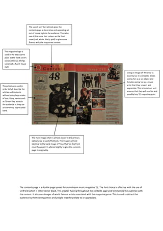
- 1. The use of serif font almost gives the contents page a decorative and appealing set out of house style to the audience. They also use all the same font colours as the front cover (red, white, black, gold) to give some fluency with the magazines context. The magazine logo is used in the exact same place as the front covers construction as it helps construct a fluent house style Using an image of ‘Rihanna’ is essential as it is versatile. Males seeing her as a sex object and females seeing her as a music These texts are used in artist that they respect and order to full describe the appreciate. This is important as it articles and contents ensures that they will read on and without using large scales possibly buy ‘Q’ magazine again. of text. Using names such as ‘Green Day’ attracts the audience as they are an extremely appreciated band. The main image which is almost placed in the primary optical area is used effectively. The image is almost identical to the band image of ‘Take That’ on the front cover however it is altered slightly to give the contents page its originality. The contents page is a double page spread for mainstream music magazine ‘Q’. The font choice is effective with the use of serif text which is either red or black. This creates fluency throughout the contents page and familiarizes the audience with the content. It also uses images of world famous artists associated with the magazine genre. This is used to attract the audience by them seeing artists and people that they relate to or appreciate.
- 2. Images such as the green leaves in the background create fluency throughout the magazine as its also used on the front cover. Serif font is used in order to show consistency in the magazines house style. It’s used to give the magazine a decorative and unique style which is appealing to potential future audiences. Using band/artist names on the side is used in bold red writing in order to attract the audience in an informative manner for e.g. showing them that there is material in the magazine about these appreciated artists. The main image is dominant in its scale and shows up on the majority of the single sided contents page. This is used effectively as images drag in audiences massively. The contents page for the uncut magazine is a single sided page and contains little detail compared to the ‘Q’ magazine piece. It is barely informative and only gives minor detail to the magazines context for e.g. certain articles on artists.