1. The target audience to the ‘Uncut’ magazine is an audience of 25-65 year olds and more favourably
the older section of the age contrast. We know this by the main image of the use ‘The Kinks’, a
famous band from the 1960s. This also sets the genre of rock music to be featured and analysed by
the production team and the magazines audiences. The use of rock music creates dominance of the
male gender to be the common audience of the magazine; we know this from the stereotype of rock
appreciators being individual, promiscuous males on the economic scale of c1-e.
The use of their condensed house style is essential in the production of the magazine. This is due to
the constant structure of individual pages throughout the series of magazines. For e.g. the primary
optical area uses an image of a famous individual and below it show the large bold serif font saying
‘Uncut’. Another example is the use of the serif bright fonts in the terminal area giving an insight to
the contents to the audience. This happens in every week’s edition as it is essential to construct
consistence and fluency throughout the unit in order for the audience to feel comfortable and
familiar with piece they’re observing and the sequence they’ll read it in.
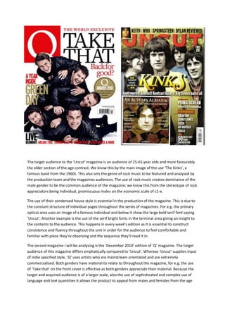
The second magazine I will be analysing is the ‘December 2010’ edition of ‘Q’ magazine. The target
audience of this magazine differs emphatically compared to ‘Uncut’. Whereas ‘Uncut’ supplies input
of indie specified style, ‘Q’ uses artists who are mainstream orientated and are extremely
commercialised. Both genders have material to relate to throughout the magazine, for e.g. the use
of ‘Take that’ on the front cover is effective as both genders appreciate their material. Because the
target and acquired audience is of a larger scale, also the use of sophisticated and complex use of
language and text quantities it allows the product to appeal from males and females from the age
2. region of 20-60 years of age. The mainstream large audience allows the class to differ and therefore
allows the magazine to appeal the classes of c1-e.
The Guttenberg principle is a emphatic influence on modern magazine production. Both of these
magazines use this principal which consists of primary optical area (top left), the terminal area
(bottom right), weak fallow area (bottom left) and strong fallow area (top right) and the axis of
orientation which is the reading direction of starting at the top left and ending in the bottom right of
the page.
The masthead use and construction on both magazines are extremely similar. On the front cover of
‘Q’ magazine red is used for the masthead to stand out magnificently. This helps with the
construction as the band picture slightly overlaps. The reds connotations of red alongside the
purposely untidy layout is effective as it shows the audience it isn’t a boring read and has some
interesting unique material. The front cover to the ‘uncut’ magazine has an almost identical
construction and layout as the photo of the band overlaps the masthead.