Raebareli Girl Whatsapp Number 📞 8617370543 | Girls Number for Friendship
Evaluation 5 cover page
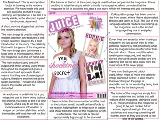
1. The Masthead: This is an important
factor in drawing in the readers
attention. We have made this bold
and colourful so that it is eye
catching, and positioned it so that it is
easily visible, in the standard top-left
hand corner placement.
The banner at the top of the cover page is used to draw people into the magazine. I have
decided to advertise a quiz which is inside my magazine, which connotes that the
magazine is full of activities and also a true story, which will interest and grip the readers.
Colloquial language has been used on
the front cover, where I have abbreviated
Britain's got talent to BGT. The use of this
language attracts readers into picking up
the magazine, as it is the kind of
language they use in everyday
conversation.
A short, concise slogan that catches
the readers attention
The main image is used to catch the
readers attention and features a well
known celebrity, covered by a brief
introduction to the story. The celebrity
fits in with the genre of the magazine.
The main image also dominates a
large area of the magazine, which in
my magazine is on the left hand side.
Cover lines are essential when making a
magazine, as you do not want to miss
potential readers by not advertising what
else the magazine has to offer other than
the main story. I have used this when
creating my magazine, and kept the
stories short and simple so they are eye
catching and do not take away from the
main focus of the cover page.
The main colours used are pink
purple and white, and by using these
throughout the magazine it gives a
more structured approach. It also
means that they are of stereotypical
colours, therefore another hint at the
target audience. The use of 3 colours
means the reader will not be
distracted.
An exclusive is a definite for a pop
magazine due to there being quite a
few around, you need to sell it to your
readers, and a way to do this is to
include exclusive information or
images on certain celebrities, which
the readers will trust they will not find
elsewhere.
There is no background colour
used, which helps to make the celebrity
image stand out further. It also means
that everything on the page is
readable, and is not wasted by being took
away from by the background.
I have included the issue number and the cost
at the bottom, small, but will be identifiable to
the reader, helping them to keep track of issues
and show them the price of the magazine which
is affordable. The barcode is placed
appropriately, big enough to be scanned.
The footer of the magazine simply lists
other celebrities and artists that will
feature of the magazine. Using the word
PLUS, makes it feel like the magazine is
going to be jam packed full of
extra’s, again drawing in the target
audience and ensuring something will
interest them as they are bound to like