
Recommended
More Related Content
Similar to Offer valid in-store & online on select styles through 51120.docx
Similar to Offer valid in-store & online on select styles through 51120.docx (20)
More from cherishwinsland
More from cherishwinsland (20)
Recently uploaded
Recently uploaded (20)
Offer valid in-store & online on select styles through 51120.docx
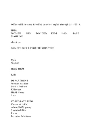
- 1. Offer valid in-store & online on select styles through 5/11/2018. HM& WOMEN MEN DIVIDED KIDS H&M SALE MAGZINE check out 20% OFF OUR FAVORITE KIDS TEES Men Women Home H&M Kids DEPARTMENT Women Fashion Men’s Fashion Kidswear H&M Home Sale CORPORATE INFO Career at H&M About H&M group Sustainability Press Investor Relations
- 2. Corporate Governance FOLLOW US Newsletter Facebook Twitter Instagram YouTube Google+ Pinterest MOBILE H&M iPhone App H&M Android App SC1SC Madison Crawford Screen Design and Graphics Stark May 5th, 2018 User Testing Everyone I asked to take the test has been to my “clients” location or bought from their website so it was easy to ask for their opinions with them knowing what it was about and what I was looking for. None of the individuals have an art background so I felt they would all have new and different answers versus asking another art oriented person.
- 3. 1. What makes this website standout? 2. What in the website would stop you from buying our product? 3. Is the point of the website clear? 4. Are you able to navigate easily? 5. How did the color scheme make you feel? 6. Does the page layout make legibility easy? 7. Does the design of the page seem simple and clear or empty space? Denise 1. What makes this website standout? The color behind the pictures 2. What in the website would stop you from buying our product? Would need to see prices of products 3. Is the point of the website clear? Yes very clear 4. Are you able to navigate easily? Yes, I like the double navigation 5. How did the color scheme make you feel? calm 6. Does the page layout make legibility easy? Yes very organized 7. Does the design of the page seem simple and clear or empty
- 4. space? Simple! Amber 1. What makes this website standout? The subtle color 2. What in the website would stop you from buying our product? Maybe more pictures 3. Is the point of the website clear? yes 4. Are you able to navigate easily? yes 5. How did the color scheme make you feel? calm 6. Does the page layout make legibility easy? yes 7. Does the design of the page seem simple and clear or empty space? Simple, I think anything else would be too much Makayla 1. What makes this website standout? The black and white with the color 2. What in the website would stop you from buying our product? If it had high prices 3. Is the point of the website clear? yes 4. Are you able to navigate easily? yes
- 5. 5. How did the color scheme make you feel? happy 6. Does the page layout make legibility easy? Yes its very organized 7. Does the design of the page seem simple and clear or empty space? Simple Jeff 1. What makes this website standout? Color contrasts and font 2. What in the website would stop you from buying our product? Not for me 3. Is the point of the website clear? yes 4. Are you able to navigate easily? yes 5. How did the color scheme make you feel? happy 6. Does the page layout make legibility easy? Yes 7. Does the design of the page seem simple and clear or empty space? Clear Mani 1. What makes this website standout? The color scheme and font style 2. What in the website would stop you from buying our product? If there was a lack of
- 6. information 3. Is the point of the website clear? Yes very much so 4. Are you able to navigate easily? Yes clear and organized 5. How did the color scheme make you feel? Calm and happy 6. Does the page layout make legibility easy? Yes very clear 7. Does the design of the page seem simple and clear or empty space? Simple and clear. I like that its modern. Shawheen 1. What makes this website standout? The font 2. What in the website would stop you from buying our product? Lack of info 3. Is the point of the website clear? yes 4. Are you able to navigate easily? yes 5. How did the color scheme make you feel? Intrigued 6. Does the page layout make legibility easy? yes 7. Does the design of the page seem simple and clear or empty space? Simple and clear
- 7. Zachary Pruitt, Friend and College Student. 1. I feel a sense of ease, the colors mesh well together and moving throughout the website is easy. 2. Very legible, it’s easy to understand the website and the colors contrasted nicely. 3. The interface was ordered nicely, and the transitions were simple and smooth. 4. I felt like it was an efficient directory to seek whatever I may look for. 5. Yes, the original layout was disruptive and confusing. 6. Nothing in the website was distracting, it was structured neatly. 7. Yes, it felt like a simplistic guide with a well-organized layout. Brian Steininger, Father and Cyber Specialist (Military) 1. I feel that the website exhibits quality and that is an expectation that I would have of Yale. 2. Very easy to understand and very well laid out. 3. Super easy to read and navigate, the flow was natural, and the color scheme was a nice touch of simplicity. 4. I felt the purpose was to give the viewer the expectations of what a Yale student would learn and apply at the university. 5. A definite improvement to the original website; much more conducive and adds an overall sense of continuity for the website an also an overall more professional design. 6. Nothing was distracting to me in the website; the layout was
- 8. simple, and the color scheme kept a nice flow. 7. Without a doubt, well scripted and upfront. I had a real sense of what to expect from the opening page design. Cherith Steininger, Mother and Lead supervisor for Online curriculum website 1. This website makes me intrigued and wanting to explore. 2. I have very bad eyes and this website color choices and boldness made it easy for me to read and follow the flow 3. I feel as though I know exactly what to press to get the information I need and submit my required information 4. The purpose of this website is to inform me about the Yale school of art and their history and mission and to give me information on applying to the school and the ability to contact for further information 5. Absolutely! I don’t even know what the original website is for 6. The username/password background color, while part of the color palate, is a bit distracting. That same color looks very well placed inside the Y logo options, but as a solid background it is super bright. 7. I feel like the website designer had a clear vision and kept to the theme and flow that was intended. This website looks professional and artistic, which is what I would expect from an Ivy league school such as Yale. Colton Teets, Friend and Graphic Designer 1. The website is inviting and gives me a feeling of youth. 2. Legibility of the website is laid out nicely. The website interface flow’s nicely. My eye follows the web design well, and I can take in the information well. 3. I defiantly enjoy design. I’m not sure that having a yellow background as the web page, creates a website design that is enjoyable for all ages, however the style and visual aspect of the design seems great for college students especially. 4. The only thing that was distracting for me, but not really is the yellow background. The reason that I say that is only
- 9. because we aren’t used to seeing websites with that color. For me, it brings appeal to the design, however I could also see how as more pages are created, more information could potentially get lost. 5. Yes, I do feel like the website has a clear direction. Especially compared to the original. I really enjoy the use of images and graphics to help balance out the text. 6. Your website made me feel intrigued and wanting to know more. The yellow and blue had a very classic almost historic vibe going that made me think about the legacy of Yale. 7. Much better than the original which was hard to read. The blue pops on the golden yellow color and I didn’t have any issues reading the fonts. Charlotte Kovanda, Aunt and Graphic Designer 1.) How does this website make you feel? Your website made me feel intrigued and wanting to know more. The yellow and blue had a very classic almost historic vibe going that made me think about the legacy of Yale. 2.) How was the websites overall legibility? Much better than the original which was hard to read. The blue pops on the golden yellow color and I didn’t have any issues reading the fonts. 3.) How does the websites user interface flow? It seems very simple and easy to navigate. I know exactly where I can go to get to certain information. It feels intuitive. 4.) What purpose does the website (seem) to serve? It seems to be a history of Yale art school and also sort of a recruitment tool. 5.) Do you believe this mock up is an improvement to the original site? Yes! Much better. I couldn’t even read the full site. Their mobile site is a mess and nearly eligible.
- 10. 6.) Was anything distracting within the website? I don’t think so. 7.) Do you feel like this website has a clear direction? Yes. It’s more streamlined and easier to follow. It’s still visually captivating but no visuals are distracting. It presents a clear message Levi Schofield, Cousin and Marketing coordinator for digital content 1. Gives me the sense of sophistication and prestigious arts. 2. Much easier to read and understand the content compared to the original. 3. Simple, but easy to navigate and very clean and professional. 4. To give an overview of the Yale school of arts, to future students. 5. Absolutely, the old website is chaotic and hard to follow in every sense, this redesign helps to create order. 6. Minor problems with some of the red colors, but overall nothing to concerning. 7. Yes, this website helps to showcase the prestigious school, and recruit future members all while respecting the traditions of the school. HM& HH H MM M
- 11. & && & Black Red Fonts Minion Pro Anton Avenir Next Yanone Kaffeesatz Rammetto One American Typewriter Cinzel PT Sans Size Anton Yanone Kaffeesatz
- 12. Cinzel Minion Pro Pt 36 Pt 20 Pt 14 Pt 12 HM& WOMEN MEN DIVIDED KIDS H&M SALE MAGZINE WOMEN MEN check out W4 Assignment 1AlkhalifahW3 Assignment 2 2Untitled- 1Screen Shot 2018-05-01 at 9.38.22 PMScreen Shot 2018-05-01
- 13. at 9.36.32 PMScreen Shot 2018-05-01 at 9.36.01 PMUntitled- 1Frontweb sc