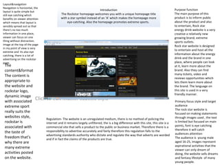
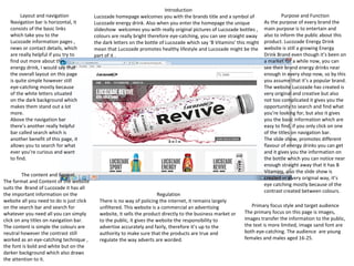
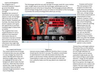
Call Girls Aslali 7397865700 Ridhima Hire Me Full Night
Introduction
1. Click to edit Master subtitle style
Introduction
The Rockstar homepage welcomes you with a unique homepage title
with a star symbol instead of an ‘A’ which makes the homepage more
eye-catching. Also the homepage promotes extreme sports.
Layout&navigation
Navigation is horizontal, the
layout is quite simple but
still eye catching which
benefits on viewer attention
which means that layout is
sensibly spread out so that
there's no too much
information in one place,
viewer can focus on one
thing without distraction.
image at the top of the page
in my point of view is very
extreme and its also eye
catching, there is a lot of
advertising on the rockstar
page.
The
content&format
The content is
appropriate to
the website and
rockstar logo,
dynamic image
with associated
extreme sport
really suits the
websites style,
rockstar is
associated with
the taste of
freedom that’s
why there are
many extreme
activities posted
on the website.
Regulation- The website is an unregulated medium, there is no method of policing the
internet and it remains largely unfiltered, the is a big difference with this site, this site is a
commercial site that sells a product to the public or business market. Therefore there is a
responsibility to advertise accurately and fairly therefore this regulation falls to the
advertising standards authority who dictate and regulate the way that adverts are worded
and if in fact the claims of the products are true.
Purpose function
The main purpose of this
product is to inform public
about the product and also
to entertain, Rock star
energy drink website is a very
creative a relatively new
growing brand, extreme
sports outlets.
Rock star website is designed
to entertain and host all the
information about the energy
drink and the brand in one
place, where people can look
at it, learn more about the
brand. Also they can find
many tickets, video and
reviews opportunities which
lets them learn more about
the brand. The language on
this site is used in a very
friendly manner.
Primary focus style and target
audience
The rock star website is
focused on making statements
through images used , the text
is limited but focused on main
points, font is eye catching
therefore it will catch
audiences attention
The audience is young male
aged 16-25, images represent
aspirational activities that the
viewer can only dream of
doing, the website sells dreams
and fantasy lifestyle of many
young people.
2. Layout and navigation
Navigation bar is horizontal, it
consists of the basic links
which take you to the
Lucozade information pages ,
news or contact details, which
are really helpful if you try to
find out more about this
energy drink, I would say that
the overall layout on this page
is quite simple however still
eye-catching mostly because
of the white letters situated
on the dark background which
makes them stand out a lot
more.
Above the navigation bar
there’s another really helpful
bar called search which is
another benefit of this page, it
allows you to search for what
ever you’re curious and want
to find.
Introduction
Lucozade homepage welcomes you with the brands title and a symbol of
Lucozade energy drink. Also when you enter the homepage the unique
slideshow welcomes you with really original pictures of Lucozade bottles ,
colours are really bright therefore eye-catching, you can see straight away
the dark letters on the bottle of Lucozade which say ‘B Vitamins’ this might
mean that Lucozade promotes healthy lifestyle and Lucozade might be the
part of it .
Purpose and Function
As the purpose of every brand the
main purpose is to entertain and
also to inform the public about this
product. Lucozade Energy Drink
website is still a growing Energy
Drink Brand even though it’s been on
a market for a while now, you can
see their brand energy drinks near
enough in every shop now, so by this
you assume that it’s a popular brand.
The website Lucozade has created is
very original and creative but also
not too complicated it gives you the
opportunity to search and find what
you’re looking for, but also it gives
you the basic information which are
easy to find, if you only click on one
of the titles on navigation bar.
The slide show, promotes different
flavour of energy drinks you can get
and it gives you the information on
the bottle which you can notice near
enough straight away that it has B
Vitamins also the slide show is
created in a very original way, it’s
eye catching mostly because of the
contrast created between colours.
The content and Format
The format and Content of the website
suits the Brand of Lucozade it has all
the important information on the
website all you need to do is just click
on the search bar and search for
whatever you need all you can simply
click on any titles on navigation bar.
The content is simple the colours are
neutral however the contrast still
worked as an eye-catching technique ,
the font is bold and white but on the
darker background which also draws
the attention to it.
Regulation
There is no way of policing the internet, it remains largely
unfiltered. This website is a commercial an advertising
website, it sells the product directly to the business market or
to the public, it gives the website the responsibility to
advertise accurately and fairly, therefore it’s up to the
authority to make sure that the products are true and
regulate the way adverts are worded.
Primary focus style and target audience
The primary focus on this page is images,
images transfer the information to the public,
the text is more limited, image sand font are
both eye-catching. The audience are young
females and males aged 16-25.
3. Layout and Navigation
The navigation bar is
horizontal however it doesn’t
go across the whole
homepage it stops half way
through.
Navigation bar consists of
information such as contact
details or news. On the Right
side corner you can notice
links to Twitter, Facebook and
YouTube, this shows that the
brand is popular and it gives
the opportunity to visit their
Facebook page or follow them
on twitter.
The navigation bar is very
simple therefore it’s not so
difficult to find important
information that you’re
interested in the text is limited
but it consist of only the most
important and interesting
information that might help
you find out a bit more about
the brand.
Introduction
The Homepage welcomes you with the logo of emerge create din a very creative
style, straight away as you enter the home page, website gives you the
opportunity to win some trip to Hong Kong. The homepage promotes different
kind of emerge energy drinks, as you can notice on the bottom of the homepage,
it promotes the variety of energy drinks which you can buy.
Purpose and Function
The main purpose of this
product is to inform the
public about the products
and the variety the website
offers you, emerge energy
drink mostly concentrates on
advertisement of their
products, however it also
gives you the opportunity to
win a trip of Hong Kong,
Which is really eye-catching.
Website gives you the
opportunity to find the
information by simply
clicking on the navigation
bar, you can like their
website on Facebook or
follow Emerge on Twitter.
When you enter the website,
Emerge offers you to watch
a slide show, which in my
opinion is very creative.
The content and Format
The content and format of Emerge
is Simple but also very eye-catching
in a way. Emerge has chosen the
colours like Red which draws the
attention straight away, they use it
as a highlight of the text or the
background which makes the text
stand out, I think that they tried to
achieve that, make the important
information stand out like for
example the announcement of the
trip to Hong Kong.
Regulation
Internet remains largely unfiltered, therefore there is no way
of policing the internet in any way, This website concentrates
on advertisement it also sells the product directly to the
public or the business market, therefore it gives the website
responsibility to make sure that the products are fair and
true, authority makes sure the way adverts are created and
worded.
Primary focus and target audience
The primary focus on this website
are images and colours, the colours
are very bright definitely not
neutral, colours such as red are
used which really stands out, the
font is bold and big to catch public’
attention , Image son this website
give you more information than
text in my opinion, the images are
edited to become very creative and
original. The main target audience
are young adults between the age
of 16-25
4. Purpose-the purpose of this product is to promote the brand and
also to attract costumers the more familiar the costumers are with
the brand the more likely to buy the product. Another purpose of
this T-shirt design is to persuade the audience to buy this
particular product. Also this design informs the audience about
the opportunity to buy this product, the idea of being able to buy
a T-shirt can also excite the audience.
The layout is quite simple but also eye-catching, the green colour
is a dominant colour and is the first thing that you notice, The
green letter M stand for ‘Monster’ and is the brands Logo , the T-
shirt is black , a logo is placed in the centre turned side ways
covering a title of the brand , The writing is very original and self
designed which means that the brand came up with the idea of
the style of the writing it self.
The primary focus which means the first thing our eyes drawn to
is the big Green Letter M, The colour Green is edited so that it’s
very Bright and therefore eye-catching .
The target audience aimed for this product would be any people
over the age of 16, children are not allowed to drink energy drinks
because it might be harmful for them . However the target
audience for this product would be young adults aged 16-30 who
are looking for a bit of excitement in their lives and are interested
not only in drinking the brands drink but also is interested in
buying other goods such as T-shirts and event tickets, that is truly
a perfect audience for the brand. The gender or a marital status
of the person does not matter, lifestyle and income does because
the brand wants you to be able to afford to buy their goods, but
they also wants their audience to enjoy and have fun.
5. The main purpose of this T-shirt design is to promote the brand and
make sure most people know about it, to gain audience or clients
the brand needs to thing about the way in which they could get this
attention one of those ways is to design a T-shirt with brands logo
on it . The layout is interesting and eye-catching the logo of the
brand is placed in the centre of the T-shirt, the colours used are red
which acts as a dominant colour and draws audience’s attention,
colours which are very bright such as red are used to draw
attention onto a particular product, if you want someone to notice
something important you’d probably most likely to use colours
which are standing out such as red or orange. The only writing
which is presented on this T-shirt design is the name of the brand,
the writing looks and is very original it uses different sized letters
which is very eye-catching and therefore interesting, when
something draws our attention or looks interesting we are more
likely to try to find out more about, so the T-shirt design also acts as
an advertisement of the brand .
The primary focus of this product is the logo which is very bright
because of the eye- catching colours used to present it, the
different letter sized logo is the first thing which we notice when we
look at the T-shirt . So who is the product aimed at ? I think that the
product is looking for the target audience aged 16-25 both genders
marital status does not matter but it’s also good to have some sort
of income so that you can afford the fun trips or many products
which brand is advertising .
6. The main purpose of this T-shirt design is to promote the brand,
promoting the brand is basically means actively encourage people
to buy the product, this is what the brand is trying to achieve,
they’re trying to reach their target audience and get as many
people as they can to buy a particular product is this case, a T-shirt
which the Red Bull’s logo placed in the centre of the T-shirt. The
layout is quite simple red Bulls as the name of the company
describes represents Two Red Bulls The yellow circle I assume is a
sun and a name of the company bellow with a little registered
trade mark symbol next the big writing. The colours used are
white (T-shirt) Red and yellow, red and yellow are made to look
very bright which draws our attention straight away, Near enough
everything in the T-shirt is primary focus everything in this T-shirt
design is bright and catches out attention that’s why it’s difficult to
say what is an actual primary focus in this design. The style of the
design makes a lot of sense the design is nicely laid out and is
places in an order. The target audience for this product would be
male and female aged 16 upwards I don’t think there is an age
limit for this product. This product aims at people over the age of
16 because under 16 year olds are not allowed to buy energy
drinks it might be harmful for their body. Also I don’t think that
nay people under the age of 16 would need energy drink
considering they are children and should be full of energy, older
people who don’t have as much energy but are also old enough to
have their own income and be able to enjoy the wonderful events
which energy drink companies offer these are the right target
audience people 16+ who are looking for a bit of excitement in
life.
7. This is a energy drink event ticket, this particular one belongs to a
RockStar energy drink brand. The purpose of this ticket design is to
inform people about the festival event. Also another purpose which
might not be the main purpose of the event ticket design. The layout of
this design is very. The layout of this product is quite interesting, the
background I believe represents the festival and where it’s based, The
original rock stars logo is placed at the top of the event ticket, however
the main eye-catching thing is this ticket is the name of the festival which
is ‘Mayhem’ the letters of the name of the festival is designed so that it
looks quite unusual, The content is very unusual as I mentioned before
the logo is placed at the top of the biggest tittle of the event ticket and it
informs the audience who is a sponsor the festival, therefore you’re
more than likely to see a lot of rock star logos on the actual festival. The
content and format of the event ticket is very eye-catching. Rock star has
chosen the colours which draws the attention straight away, they use it
as a highlight of the text or the background which makes the text stand
out, I think that they tried to achieve that, make the important
information stand out, but also the background is quite dark which
creates the mysterious atmosphere and wants you to find out more
about it, this would encourage further research about the festival which
will attract the audience/costumers
8. The main purpose of this product is to inform public about the
product and also to entertain, Relentless is a very creative
growing brand, relentless ticket design is designed to
entertain and host all the information about the event and
the brand in one place, where people can look at it, learn
more about the brand and the event and hopefully the
creative design will attract the audience. The content of the
ticket event as I mentioned before is very creative and eye-
catching, Relentless energy drink brand informs the public
about a tour which took place in 2011. The layout of the ticket
design is quite simple although the type of writing on the
ticket design is unusual and that’s what makes the ticket look
interesting. Primary focus and target audience
The primary focus of this ticket design is the big title of
Kerrang on the top which is the name of the tour which is
sponsored by Relentless. The colours on the ticket design are
very bright which is yet again another thing which draws
attention is the writing is quite unusual, I believe designed to
match the style of the tour event ticket.
Who is the target audience? The target audience would be
anyone under the age of 18, the reason for this would be the
fact that the under 18's are not allowed to purchase festival
tickets etc the perfect target audience for this brand and this
particular product would be anyone under the age of 16
because that's when you're legally allowed to purchase any
energy drinks but also people who have an income and who
would be able to afford festivals etc.
9. The purpose of this event ticket is to promote the brand but also to
inform the public about the eventfor example what is the event about,
who is playing at the event and obviously what is the purpose of the
event and when and where is the event taking place. All the important
information are written on the event ticket this particular one is
promoting the Monster Energy Drink Brand and is informing the public
about the event. The layout and content of the event ticket is really
important, mostly because the layout and content decides weather the
audience will want to find out more about the actual event, is the
layout is boring then no-one will want to futher reaseach about the
event. The layout of this particular event ticket is very intriguing
therefore it would catch the audience's attention, The brands logo is
presented at the top, under the logo the name of the event is placed
which is the biggest writting of all on this event ticket, underneath the
title of the event there the names of the bands that are playing in this
event, every name of the band is written in different writting style,
which is what makes the event ticket more fascinating, then the bigger
writting was placed underneath the names of the band which are
giving you the important information about the dates and times and
also where is the event taking place at, at the bottom you find the
name of the website which is probably the website where you can
purchase the tickets. The style of the event ticket is formal the reason
why I think so, is because it gives all of the information about the
event and is informing you in a official manner about the event, by this
I mean that the event is definiately taking place and is promoting the
brand and is trying to attract costumers in a positive formal manner.
The primary focus in this event ticket is the biggest and brightest title
of all in this image which is the name of the event, which is I believe
aimed to be the primary focus beause of the way the entire event
ticket is laidout AfterShock is an intriguing title for a festival it
definiately catches the attention because it makes us think of
something amazing or an amazing experience of something as
unusual as AfterShock which obviously gives us the impression of
something shocking. The target audience for this event would be
anyone who is over the age of 18 with an income to afford the
opportunities which the brand is offering you. Also anyone who likes a
bit of excitment is their lives, any gender, marital status I believe
doesn't really matter becasue you can enjoy festival with your partner.
10. The purpose of this event ticket is to promote the brand but also to
inform the public about the eventfor example what is the event about,
who is playing at the event and obviously what is the purpose of the
event and when and where is the event taking place. All the important
information are written on the event ticket this particular one is
promoting the Monster Energy Drink Brand and is informing the public
about the event. The layout and content of the event ticket is really
important, mostly because the layout and content decides weather the
audience will want to find out more about the actual event, is the
layout is boring then no-one will want to futher reaseach about the
event. The layout of this particular event ticket is very intriguing
therefore it would catch the audience's attention, The brands logo is
presented at the top, under the logo the name of the event is placed
which is the biggest writting of all on this event ticket, underneath the
title of the event there the names of the bands that are playing in this
event, every name of the band is written in different writting style,
which is what makes the event ticket more fascinating, then the bigger
writting was placed underneath the names of the band which are
giving you the important information about the dates and times and
also where is the event taking place at, at the bottom you find the
name of the website which is probably the website where you can
purchase the tickets. The style of the event ticket is formal the reason
why I think so, is because it gives all of the information about the
event and is informing you in a official manner about the event, by this
I mean that the event is definiately taking place and is promoting the
brand and is trying to attract costumers in a positive formal manner.
The primary focus in this event ticket is the biggest and brightest title
of all in this image which is the name of the event, which is I believe
aimed to be the primary focus beause of the way the entire event
ticket is laidout AfterShock is an intriguing title for a festival it
definiately catches the attention because it makes us think of
something amazing or an amazing experience of something as
unusual as AfterShock which obviously gives us the impression of
something shocking. The target audience for this event would be
anyone who is over the age of 18 with an income to afford the
opportunities which the brand is offering you. Also anyone who likes a
bit of excitment is their lives, any gender, marital status I believe
doesn't really matter becasue you can enjoy festival with your partner.