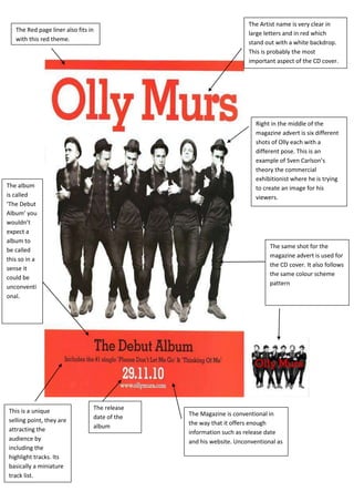
1. The same shot for the
magazine advert is used for
the CD cover. It also follows
the same colour scheme
pattern
The Magazine is conventional in
the way that it offers enough
information such as release date
and his website. Unconventional as
The release
date of the
album
This is a unique
selling point, they are
attracting the
audience by
including the
highlight tracks. Its
basically a miniature
track list.
Right in the middle of the
magazine advert is six different
shots of Olly each with a
different pose. This is an
example of Sven Carlson’s
theory the commercial
exhibitionist where he is trying
to create an image for his
viewers.
The Artist name is very clear in
large letters and in red which
stand out with a white backdrop.
This is probably the most
important aspect of the CD cover.
The Red page liner also fits in
with this red theme.
The album
is called
‘The Debut
Album’ you
wouldn’t
expect a
album to
be called
this so in a
sense it
could be
unconventi
onal.
2. This is the logo of either the copy
right company or the company
which produced the magazine
advert.
Conventions: The magazine advert has
the simplistic cover which makes the
album name and artist name stand out.
Green Day are so well known they can
have a simple cover.
Unconventional: Perhaps it is too simple
maybe not enough background
information about the band or any
deeper meaning behind Green Day. Not a
picture of the performers themselves.
The Artist name is in a extremely big font which
captures the buyer straight away. Also the white
font colour on a black background stands out
even more.
The colour scheme is
very simple black, white
and red.Album
name in
red, smaller
font size
compared
to artist
name.
The full black backdrop is very strong
and intense but it makes the artists
name and album anme stand out
and also the album logo.
3. Conventional name for a Album.
The font type is fairly modern
and fancy, the colour choice
(gold) is very catchy because its
slam in the middle of the advert
and very in your face. Perhaps
this links with Jessie J’s
personality.
This extra is for the
audience/buyer to show
the highlight song or
featuring artist in this case
is B.o.B.
Jessie also includes her
official website so her fan
base knows how to follow
her.
The gold lip art and the earring is
following the font colour, this
image of gold we automatically
relate to money and wealth.
What she is wearing and how
she looks all ads to her final
image which she wants
people to associate with her.
This is also known as
commercial exhibitionist. The
shot is a close up and she is
looking directly at the
camera.
These are either names of the
production companies who
were in synergy with each
other to create the magazine
cover.
4. The artist name stands out in
a very big white bold font
which looks quirky but
follows a pattern of other
magazine advertisements
and the CD cover.
The album name is
included in a smaller
font which emphasises
that the artist name is
the most important
feature.
The CD cover is included on the
magazine advertising to help market
it and increase awareness of the
product. Technically its two
marketing campaigns in one.
The CD cover is very similar
to the magazine advert just
with a different shot of
Marina and the text colour
is pink.
The Extra information such as the
featuring tracks ‘Hollywood, I Am Not A
Robot, Oh NO!’ and the new single
‘Shampain’ and how it is out on Itunes.
Generally a very conventional magazine
advert.
Exmaple of commercial
exhibitionist she is crating an
overall image. Close up shot
and is a example of driect
mode fo address for the
audience.
5. The lighting is
unusual as only one
side of her face is
being lit, this is
similar to the CD
cover aswell.
The Artists name is the main focus on the advert,
because of the colour scheme, white and green it
stand out the most. The writing font is in big bold
letters which also highlights its position there. The
CD cover also has the same features.
Her facial expression is very
powerful as it expresses emotion,
this covers on of Sven Carlson’s
theories, commercial
exhibitionist, where Adele is
trying to sell an image to her
audience. The shot of Adele in the
magazine advert is different to
the CD cover, but were obviously
taken at the same time and place.
The lighting creates ambiguity
because half her face is covered
by shadow. Both shots have in
common is Adele has her eyes
closed or near enough.
Adele’s website for her fan
base and information.Copy right sign and
information.