
Recommended
More Related Content
What's hot
What's hot (20)
Viewers also liked
Similar to Kerrang Magazine Contents Page Analysis
Similar to Kerrang Magazine Contents Page Analysis (20)
Recently uploaded
Recently uploaded (20)
Kerrang Magazine Contents Page Analysis
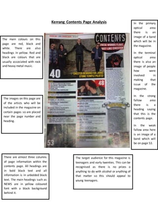
- 1. Kerrang Contents Page Analysis The main colours on this page are red, black and white. There are also headings in yellow. Red and black are colours that are usually associated with rock and heavy metal music. The images on this page are of the artists who will be included in the magazine on certain pages so are placed near the page number and heading. In the primary optical area there is an image of a band which will be in the magazine. In the terminal optical area there is also an image of people how were involved in making that issue of the magazine. In the strong fallow area there is a heading saying that this is the contents page. In the weak fallow area here is an image of a band which will be on page 53. There are almost three columns of page information within the contents page. All headings are in bold black text and all information is in unbolded black text. The main headings such as NEWS are in yellow coloured font with a black background behind it. The target audience for this magazine is teenagers and early twenties. This can be recognised as there is no prizes o anything to do with alcohol or anything of that matter so this should appeal to young teenagers.