Bobbie goods coloring book 81 pag_240127_163802.pdf
P%20progress
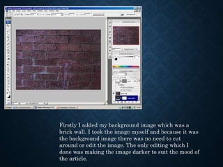
1. Firstly I added my background image which was a
brick wall. I took the image myself and because it was
the background image there was no need to cut
around or edit the image. The only editing which I
done was making the image darker to suit the mood of
the article.
2. I then added the first of
three boxes these boxes
are going to be
overlapped by an image
to create a border.
I also texturized the box
to add a rough effect to
the box.
3. I then added two images over the
two texturized boxes to create the
effect of a border.
4. I then cut out and placed the main image, which is of a teacher from in the
documentary.
5. The main text box was then added, this box had the same
texture as the other border boxes. I also then added a stroke
effect to create a border. I used the colour white as it is the best
contrasting colour.
6. I then added my title. The title consisted of a
textured style which gave a blurred line effect
to the title.
7. I then added a similar texturized box which worked as a border for the timing
of the documentary.
8. Finally I added the article which reviewed the documentary. I used
white text to stand out on the black background.