
Recommended
More Related Content
Viewers also liked
Viewers also liked (14)
Similar to Blog diary presentation double page spread
Similar to Blog diary presentation double page spread (20)
Blog diary presentation double page spread
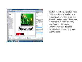
- 1. To start of with I did the band the Guardians. Here after placing in the article, it was time to do the images. I had to import them and rearrange to places were they best fitted on the spread. Unfortunately due to some complications I could no longer use this band.
- 2. So I then changed to do a story on a different artist. I added the articles into rows of 3. Placed the strip behind the title going with the colour red as the colour scheme follows on from the front cover.
- 3. After looking through images of the artist too see which one I would like to use as the final one. I chose this one where it has a plain brick wall as a background. So I decided to change the background to a more vibrant and appealing colour.
- 4. Before placing him onto the new background I had to cut him out and erase around him carefully and neatly.
- 5. Once I placed him onto the new background I started to use the effects the blur the back ground slightly as it looked uneven I also went on the curve tool to enhance the colour.
- 6. I then again added the article and changed the font colour, structure and title of article. I went with this different direction because I thought it looks a lot more interesting and professional.
- 7. In the end this is what my product looked like.