
Recommended
More Related Content
Similar to Task 4 product research
Similar to Task 4 product research (20)
More from Cameron Barnes
More from Cameron Barnes (20)
Recently uploaded
Recently uploaded (20)
Task 4 product research
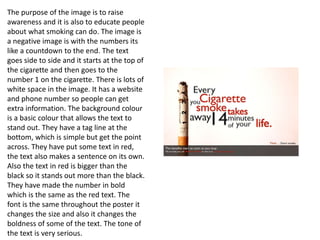
- 1. The purpose of the image is to raise awareness and it is also to educate people about what smoking can do. The image is a negative image is with the numbers its like a countdown to the end. The text goes side to side and it starts at the top of the cigarette and then goes to the number 1 on the cigarette. There is lots of white space in the image. It has a website and phone number so people can get extra information. The background colour is a basic colour that allows the text to stand out. They have a tag line at the bottom, which is simple but get the point across. They have put some text in red, the text also makes a sentence on its own. Also the text in red is bigger than the black so it stands out more than the black. They have made the number in bold which is the same as the red text. The font is the same throughout the poster it changes the size and also it changes the boldness of some of the text. The tone of the text is very serious.
- 2. The text talks about the image. There is lots of white space in the image. All the text is in white and is the same font and size. The text fits in well with the image. They have the word ‘Smokefree’ to make it stand out from the rest. This is because they want you to research into the matter further. The background of the image has been made blurry so you can only see the main part of the image. The images is very negative as it is showing a person smoking with a mutation starting to grow it. It is a very gruesome image but it could work for people who smoke as they could see how disturbing the image is and quit smoking from jus the image. The campaign is aiming to show the impact of toxic ingredients in cigarettes can have an effect on you. The tone of the text is serious and is trying to show what can happen if you continue to smoke. It uses words like cancer and mutation which shows the serious of the matter.
- 3. The poster is saying that if you are trying to die than there are quicker ways to do it than harming your body and taking the long slow way. They ask a question to try and get the viewer more involved in the poster. The reason of this campaign is to show that if you smoke that slowly over time you will die and they are saying that a bullet will take your life quick but smoking will take a long period of time in which it can do lots of things to your body which can then lead to your death. The words quick and slow have got a glow to the words to make them stand out so people read it and notice it. There is not much text but what is there gets the point across. The company phone number and there slogan at the bottom of the poster. The image is making a statement showing that both ways will end your life but one will take less time than the other. The words under the image are smaller than the ones in the image.
- 4. The first bit of text has been made a lot bigger than the rest as well as making it bold. They have also added a smoke feel to the text to make it stand out even more. The second bit of text is much smaller but is just as serious as the first line. It is describing what is happening in the image for the people who may not know. The text has also been made bold. This campaign is showing that smokers are not only having to spend lots of money on there cigarettes but are also giving something that can cost them there life in lung cancer. Its saying is $16 worth getting lung cancer and potentially your life. Having the quit line at the bottom of the image is trying to persuade the smoker to quit before it is to late. It also has the company how made the poster logo. There is a website you can visit to find more information especially if this is happening to you. The tone of the text is scary as this could happen at any point. You could just be smoking and all of a sudden this happens. The image is very dark just like the text but is true at the same time. The background of the image has been blurred so you only see the main part of the image.
- 5. The image within the campaign is very graphical as it has blood flowing from the cigarette. The campaign is meant to show the risks of smoking and shows what can happen when you do it. The campaign is to make smokers aware of how much potential damage they are doing to there lungs every time the smoke. It is meant to be showing the toxics from smoking cigarettes entering the blood. This campaign was aimed at addicted smokers. The image is very serious and from a non smoker point of view it is scary to think that this could happen to people who do smoke. They have researched there quote to make sure that is correct. The text is in the same font and is the same size except the bit under the quote. It has the company logo in the bottom right. The poster is also trying to show links between smoking and having strokes. A person who saw this campaign said she would give up just from looking at the image.
- 6. This advertisement explicitly illustrates the message of quitting smoking. They do this through the emotion of the character, the symbol of a gun formed by the cigarettes. The anger and frustration show on the person and the symbol of the gun work together to inform the audience that by smoking you are only killing yourself. It is also showing that smoking affects your mental state and only results in madness which you can see from the image. The image is a scary image but it is trying to scare people who smoke as it wants people to stop so making them scared from the image may lead to them stopping. There are not many colours in the image except the black background and the colour of the t-shirt the person is wearing. But the black background makes sense as it fits in with what the image is trying to portray. It makes you feel a sense of nothingness. The bold contact number of the quit line. It stands out and is made clear for people to see. They also have there logo at the bottom. Under the logo is the website that you can visit for more information.
- 7. This campaign promotes blindness from smoking. The image of the eye, bright red and bold message at the top, the statics and the bolded quit line information are all characteristics and features of this advertisement that work together to imply the message. The quote on the top is backed up by the image to further explain to the audience what can happen to you if you don’t stop smoking. The statistics also inform the viewer about the consequences of blindness which is cause by smoking. They have made the email address in bold to make it stand out. This poster compared to the other ones I have looked at has more text and is not just about the image but about the text as well. The text is clear and easy to read in a font that is easy to read. All the text is in the same font just some is bold and bigger. They have made the word can bigger to make it stand out. Also using the colour red which is seen as danger fits in well with the poster. As It is trying to show the dangers of smoking so using the colour red does that well.
- 8. The purpose of this poster is to say that every breath you take will take your life. From the image you can see lots of cigarettes in the hand. On his hand it says R.I.P which relates to all the cigarettes in his hand. The purpose is to try to tell smokers that with every cigarette you will have one less breath to breathe. This is aimed at teenagers as the people who made the campaign observed that most people who smoke at teenagers at schools/colleges. It is trying to show teenagers the consequences of smoking. The text is small but is all in the same font as has been made bold. Also it starts bright but the further through the statement it becomes darker to fit in with the theme as at the start your fine and then it starts to get worse and eventually can lead to your death. The company’s logo is on the poster. The R.I.P is written in the ash from the cigarettes it is also over his hands. This is to make it stand out and makes it look serious compared to the text at the bottom and also it is a lot bigger compared to the other text. They are trying to raise awareness as well in this poster as they are trying to inform you about what smoking can do if you don’t quit.
- 9. The purpose of this poster is to show that smoking will consume you and eventually it will cost your life. The first quote has parts of the letters missing which fits in well with the poster as it is like the smoke it taking away parts of the words as well as your life. It is also in bold and is big so it stands out. The text at the bottom is in the same font and bold but is smaller. The stat at the bottom is very worrying for a person not only the amount of cigarettes but also they price you are paying for that many when you could be spending on more important things. The company logo is on the poster so that you can check them out. The person face of the cigarette changes the smaller the cigarette goes. It starts with a fine face but when it is lit it becomes more concerned. With the smoke coming of the top the face becomes worried that something bad is happening and then finally the face looks scared and looks like they are running out of time. Also the cigarettes show a story as well as each one gets smaller it is like a person life with each one they take there life becomes shorter.
- 10. This poster is about how second smoke can harm children. It shows it by having a hand of smoke gripping hold of the child. Also the child has bruises on his arms to show that he is not happy and is being harmed in some way. The colour of the shirt is the same colour as the smoke hand this could represent that the child is inhaling the smoke and his chest is being infected by tons of smoke and it is having an effect on the child. The child also looks scared and worried but he also looks lost meaning that he doesn’t know what to do and how to stop the pain. He looks like he is helpless. On the poster there is the company logo in the top right corner and there is also a logo in the bottom right as well. They have been put in a brighter shade of white to make them stand out more to the regular text. The text is all in the same font but some is bigger like the title of the text and also the word breathe is made bigger to make it stand out next to the phone number at the bottom. With the phone number there is a website address for people to go to find more information. They start the text with a fact to get the attention of the viewer. The grey background fits in well with the colour of the smoke.