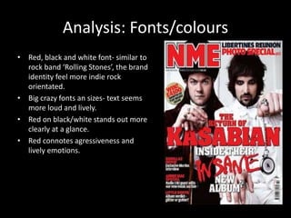
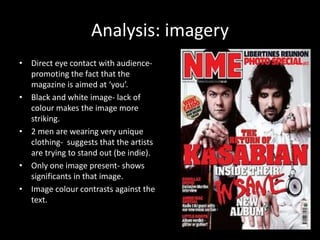
2. Introduction
• NME is a music magazine
• Mainly contains indie rock sub genre
• Published by NME
3. Target audience
• They aim at less mainstream groups.
(alternate or niche)
• Teenagers- middle aged adults
• Mainly male gender
• People interested in less well known music
artists and general cult rock music.
4. Analysis: main features
• Masthead- abreviation, making it
more memorisable to the audience.
• Puff/pug- circle colour is different to
house style, which allows it to be
seen out more easily.
• Splash “insane” connotes madness
and being different/ loud
• Cover lines consist of artist names as
titles.
5. Analysis: Fonts/colours
• Red, black and white font- similar to
rock band ‘Rolling Stones’, the brand
identity feel more indie rock
orientated.
• Big crazy fonts an sizes- text seems
more loud and lively.
• Red on black/white stands out more
clearly at a glance.
• Red connotes agressiveness and
lively emotions.
6. Analysis: imagery
• Direct eye contact with audience-promoting
the fact that the
magazine is aimed at ‘you’.
• Black and white image- lack of
colour makes the image more
striking.
• 2 men are wearing very unique
clothing- suggests that the artists
are trying to stand out (be indie).
• Only one image present- shows
significants in that image.
• Image colour contrasts against the
text.