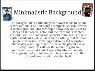
The document discusses several key elements of film magazine covers:
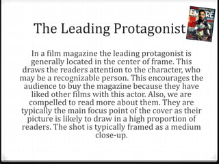
- The leading protagonist is generally located in the center of the frame to draw readers' attention to the recognizable actor and encourage people to buy the magazine or learn more about them.
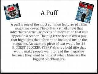
- "Puffs" are small circles that advertise particular pieces of information inside the magazine in bold text to pique readers' interest.
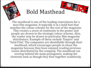
- The masthead, typically in a bold font matching the color scheme, creates continuity and draws readers to particular magazine distributors like "Empire" and "Total Film".
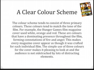
- The color scheme uses three primary colors that match the tone of the featured film to make each cover feel crafted for that individual movie.