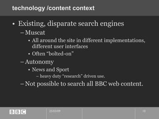
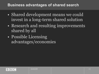
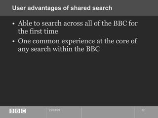
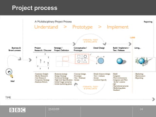
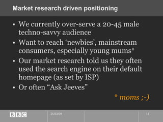
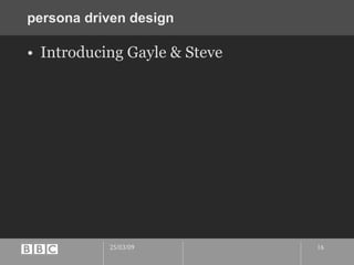
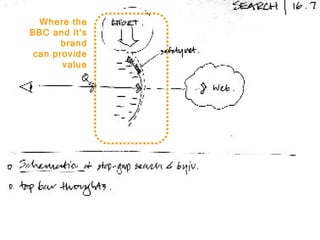
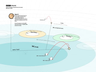
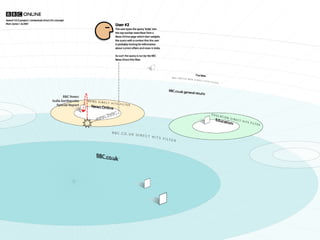
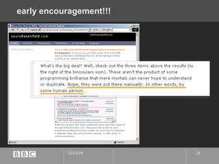
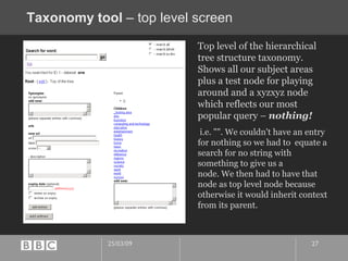
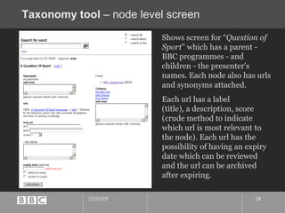
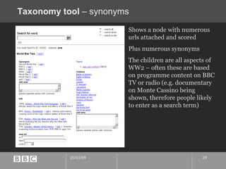
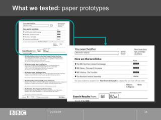
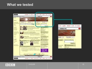
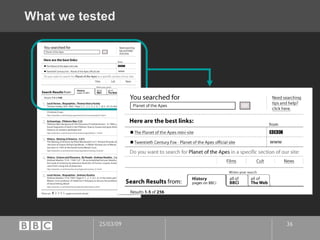
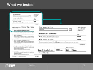
Case Study BBCi Search Why search is not a technology problem
me.   What do I do? I work for the BBC Q -What’s your perception of what the BBC do? I work in the New Media dept. Information Architect? Interference Architect! Previously: Creative director at Sapient London Creative director / launch designer of BBC News Online, London Times and Sunday Times Even further back Wasn’t an IA – I was just an ‘A’ What am I going to talk about? Why search is not a technology problem.
Some context
Search is strategic to us. business imperative
Henley centre study:  online life
Project context The “BBCi” initiative
Pre-BBCi  – “geocities”
User perception
BBCi perceptual model aimed for
technology /content context Existing, disparate search engines Muscat All around the site in different implementations, different user interfaces Often “bolted-on” Autonomy  News and Sport heavy duty “research” driven use. Not possible to search all BBC web content.
Business advantages of shared search  Shared development means we could invest in a long-term shared solution Research and resulting improvements shared by all Possible Licensing advantages/economies
User advantages of shared search Able to search across all of the BBC for the first time One common experience at the core of any search within the BBC
How we started
Project process
Market research driven positioning  We currently over-serve a 20-45 male techno-savvy audience Want to reach ‘newbies’, mainstream consumers, especially young mums* Our market research told us they often used the search engine on their default homepage (as set by ISP) Or often “Ask Jeeves” *  moms ;-)
persona driven design  Introducing Gayle & Steve
“ Use-models”
use-models Where the BBC and it’s brand can provide value
use-models Hideous Assumptions Ahoy !!!!
use-models
Which turned into…
use-models
use-models
early encouragement!!!
Building taxonomy from user-centred seeds  Limited time and resources to build a taxonomy Focussed on analysing the  most entered search terms from our logs  as a starting point to give most value.
Taxonomy tool
Taxonomy tool  – top level screen Top level of the hierarchical tree structure taxonomy. Shows all our subject areas plus a test node for playing around and a xyzxyz node which reflects our most popular query –  nothing! i.e. "". We couldn't have an entry for nothing so we had to  equate a search for no string with something to give us a  node. We then had to have that node as top level node because  otherwise it would inherit context from its parent.
Taxonomy tool  – node level screen Shows screen for “ Question of Sport ” which has a parent - BBC programmes - and children - the presenter's names. Each node also has urls and synonyms attached.  Each url has a label  (title), a description, score (crude method to indicate which url is most relevant to the node). Each url has the  possibility of having an expiry date which can be reviewed  and the url can be archived after expiring.
Taxonomy tool  – synonyms Shows a node with numerous urls attached and scored Plus numerous synonyms The children are all aspects of WW2 – often these are based on programme content on BBC TV or radio (e.g. documentary on Monte Cassino being shown, therefore people likely to enter as a search term)
Taxonomy building process
Taxonomy/editorial team
UI design and testing  Round and round and round…
Iterative design development 5 rounds of user-testing and iterative design over a 2 month period We probably could have cut it down if we had done more research upfront We started getting ‘diminishing returns’ Avoiding Non-designer Kneejerk Great to invite marketers and managers to tests, gets them bought into UCD brilliantly Manage their ‘breakthroughs’ –  “sleep on it!”
What we tested:  paper prototypes
What we tested
What we tested
What we tested
What we were looking for The search is supposed to allow users to… Zoom in (refine search) Step sideways (to another BBC content area “scope”) Zoom out (widen to BBCi or Web scope) Do users understand these options? Can they navigate through them? Do they want them?
Key findings
“Best links” area The title was clear. The www icon was better. But still not perfect. “ A site that's not to do with the BBC. Not run by them. It would be nice to see the whole name: www.NIassembly.gov.uk” User no. 4 , Pippa Key findings
“Best links” area The position of the icons confused one user (novice).  “ Don't know what they are doing there. You'd expect to just click on the words on the left and get what you want. Is it just a link to return to the BBC easily?” User no. 4 , Pippa Key findings
Zooming in Some users understood that searching is a dialogue… “ Finding the right search word is very frustrating. I think one thing, but the computer thinks differently.” User no. 4 , Pippa Key findings
Zooming in … going from general to specific. “ I'd expect to be asked to be more specific.  It would prompt you type in more words -- recipes? flowers? boat show? Whatever…” User no. 5, Laura Key findings
Zooming in So encourage dialogue: be polite and positive, however general the initial query was “ It would need to make you feel that you got it right, even though you weren't specific enough. It should make you feel you're on the right track.” User no. 2 , Gillian Key findings
Zooming in or stepping sideways? Users tended to view the “specific sections” links as a way to zoom in. They thought about the links in that section in terms of their search domain, not in terms of BBC organisational structure. They don’t know anything much about BBC organisational structure. “ See all the regions -- all the different divisions they have. Listed A-Z... Regions of Northern Ireland” User no. 1, Fred Key findings
Zooming in or stepping sideways? The “specific section links” area didn’t seem specific enough… “ I'm normally quite rushed on the web. I haven't got time to concentrate. So the specifics section should say all the main headings for the subject (Vikings). Boats, gods, battles, food… The specifics section would not help you out.  It doesn't tell you that it can look for  specific  specifics.” User no. 3 , Emma Key findings
Stepping sideways The planet of the apes search worked best because the sideways steps (film, cult, news) clearly refined the search. “ You'd get used to that idea of the buttons…” User no. 3 , Emma Key findings
Zooming out Users can’t articulate what a search engine does but they know what to expect when they see the term. “ Oh!  I didn't think it as a search engine. Yes I know I said it would search the web. But I didn't click!” User no. 2 , Gillian Key findings
Live!
Searching across all the BBC
Searching just BBC News
Searching the UK Web
More Lou!
lessons learnt... post-live assessment  Marketing campaign starts April 20 th Started a V1.5 testing and design blitz in early February 2 weeks, 3 user-tests with 2 days to iterate design in-between each!
V1.5
v1.5 Whole team contributed to the design. Posted out new designs every evening Covered walls Fashion! Operating system ‘trends’ getting more important.
What  we  learnt from the post-live testing People did NOT see the best links!!! All that effort, all the value… useless if UI hides it… Numbering is a curse It was contributing to skipping the good stuff. “Relevance” is irrelevant People loved the tabs once they found them. But they only found them on the 3 rd  or 4 th  visit.
Design lessons The tyranny of the search engine idiom Migrate habits Get team to collaborate on use-models early – generates understanding early Gives whole team something to go back and question fundamentals usefully The whole team and the business understands where the value is The taxonomy The human factor
Conclusion
My Soylent Green Moment… Oh my God, Search IS PEOPLE!!!
Q&A
Thanks! Hope it was useful/interesting… http://www.blackbeltjones.com/presentations/asist2002/

From 2002: BBCi Search design case-study

  • 1.
    Case Study BBCiSearch Why search is not a technology problem
  • 2.
    me. What do I do? I work for the BBC Q -What’s your perception of what the BBC do? I work in the New Media dept. Information Architect? Interference Architect! Previously: Creative director at Sapient London Creative director / launch designer of BBC News Online, London Times and Sunday Times Even further back Wasn’t an IA – I was just an ‘A’ What am I going to talk about? Why search is not a technology problem.
  • 3.
  • 4.
    Search is strategicto us. business imperative
  • 5.
  • 6.
    Project context The“BBCi” initiative
  • 7.
    Pre-BBCi –“geocities”
  • 8.
  • 9.
  • 10.
    technology /content contextExisting, disparate search engines Muscat All around the site in different implementations, different user interfaces Often “bolted-on” Autonomy News and Sport heavy duty “research” driven use. Not possible to search all BBC web content.
  • 11.
    Business advantages ofshared search Shared development means we could invest in a long-term shared solution Research and resulting improvements shared by all Possible Licensing advantages/economies
  • 12.
    User advantages ofshared search Able to search across all of the BBC for the first time One common experience at the core of any search within the BBC
  • 13.
  • 14.
  • 15.
    Market research drivenpositioning We currently over-serve a 20-45 male techno-savvy audience Want to reach ‘newbies’, mainstream consumers, especially young mums* Our market research told us they often used the search engine on their default homepage (as set by ISP) Or often “Ask Jeeves” * moms ;-)
  • 16.
    persona driven design Introducing Gayle & Steve
  • 17.
  • 18.
    use-models Where theBBC and it’s brand can provide value
  • 19.
  • 20.
  • 21.
  • 22.
  • 23.
  • 24.
  • 25.
    Building taxonomy fromuser-centred seeds Limited time and resources to build a taxonomy Focussed on analysing the most entered search terms from our logs as a starting point to give most value.
  • 26.
  • 27.
    Taxonomy tool – top level screen Top level of the hierarchical tree structure taxonomy. Shows all our subject areas plus a test node for playing around and a xyzxyz node which reflects our most popular query – nothing! i.e. "". We couldn't have an entry for nothing so we had to equate a search for no string with something to give us a node. We then had to have that node as top level node because otherwise it would inherit context from its parent.
  • 28.
    Taxonomy tool – node level screen Shows screen for “ Question of Sport ” which has a parent - BBC programmes - and children - the presenter's names. Each node also has urls and synonyms attached. Each url has a label (title), a description, score (crude method to indicate which url is most relevant to the node). Each url has the possibility of having an expiry date which can be reviewed and the url can be archived after expiring.
  • 29.
    Taxonomy tool – synonyms Shows a node with numerous urls attached and scored Plus numerous synonyms The children are all aspects of WW2 – often these are based on programme content on BBC TV or radio (e.g. documentary on Monte Cassino being shown, therefore people likely to enter as a search term)
  • 30.
  • 31.
  • 32.
    UI design andtesting Round and round and round…
  • 33.
    Iterative design development5 rounds of user-testing and iterative design over a 2 month period We probably could have cut it down if we had done more research upfront We started getting ‘diminishing returns’ Avoiding Non-designer Kneejerk Great to invite marketers and managers to tests, gets them bought into UCD brilliantly Manage their ‘breakthroughs’ – “sleep on it!”
  • 34.
    What we tested: paper prototypes
  • 35.
  • 36.
  • 37.
  • 38.
    What we werelooking for The search is supposed to allow users to… Zoom in (refine search) Step sideways (to another BBC content area “scope”) Zoom out (widen to BBCi or Web scope) Do users understand these options? Can they navigate through them? Do they want them?
  • 39.
  • 40.
    “Best links” areaThe title was clear. The www icon was better. But still not perfect. “ A site that's not to do with the BBC. Not run by them. It would be nice to see the whole name: www.NIassembly.gov.uk” User no. 4 , Pippa Key findings
  • 41.
    “Best links” areaThe position of the icons confused one user (novice). “ Don't know what they are doing there. You'd expect to just click on the words on the left and get what you want. Is it just a link to return to the BBC easily?” User no. 4 , Pippa Key findings
  • 42.
    Zooming in Someusers understood that searching is a dialogue… “ Finding the right search word is very frustrating. I think one thing, but the computer thinks differently.” User no. 4 , Pippa Key findings
  • 43.
    Zooming in …going from general to specific. “ I'd expect to be asked to be more specific. It would prompt you type in more words -- recipes? flowers? boat show? Whatever…” User no. 5, Laura Key findings
  • 44.
    Zooming in Soencourage dialogue: be polite and positive, however general the initial query was “ It would need to make you feel that you got it right, even though you weren't specific enough. It should make you feel you're on the right track.” User no. 2 , Gillian Key findings
  • 45.
    Zooming in orstepping sideways? Users tended to view the “specific sections” links as a way to zoom in. They thought about the links in that section in terms of their search domain, not in terms of BBC organisational structure. They don’t know anything much about BBC organisational structure. “ See all the regions -- all the different divisions they have. Listed A-Z... Regions of Northern Ireland” User no. 1, Fred Key findings
  • 46.
    Zooming in orstepping sideways? The “specific section links” area didn’t seem specific enough… “ I'm normally quite rushed on the web. I haven't got time to concentrate. So the specifics section should say all the main headings for the subject (Vikings). Boats, gods, battles, food… The specifics section would not help you out. It doesn't tell you that it can look for specific specifics.” User no. 3 , Emma Key findings
  • 47.
    Stepping sideways Theplanet of the apes search worked best because the sideways steps (film, cult, news) clearly refined the search. “ You'd get used to that idea of the buttons…” User no. 3 , Emma Key findings
  • 48.
    Zooming out Userscan’t articulate what a search engine does but they know what to expect when they see the term. “ Oh! I didn't think it as a search engine. Yes I know I said it would search the web. But I didn't click!” User no. 2 , Gillian Key findings
  • 49.
  • 50.
  • 51.
  • 52.
  • 53.
  • 54.
    lessons learnt... post-liveassessment Marketing campaign starts April 20 th Started a V1.5 testing and design blitz in early February 2 weeks, 3 user-tests with 2 days to iterate design in-between each!
  • 55.
  • 56.
    v1.5 Whole teamcontributed to the design. Posted out new designs every evening Covered walls Fashion! Operating system ‘trends’ getting more important.
  • 57.
    What we learnt from the post-live testing People did NOT see the best links!!! All that effort, all the value… useless if UI hides it… Numbering is a curse It was contributing to skipping the good stuff. “Relevance” is irrelevant People loved the tabs once they found them. But they only found them on the 3 rd or 4 th visit.
  • 58.
    Design lessons Thetyranny of the search engine idiom Migrate habits Get team to collaborate on use-models early – generates understanding early Gives whole team something to go back and question fundamentals usefully The whole team and the business understands where the value is The taxonomy The human factor
  • 59.
  • 60.
    My Soylent GreenMoment… Oh my God, Search IS PEOPLE!!!
  • 61.
  • 62.
    Thanks! Hope itwas useful/interesting… http://www.blackbeltjones.com/presentations/asist2002/