SlideShare a Scribd company logo
1 of 4
First I chosen one of my original images to use as a               I used the magic wand tool to cut out the
cover image and put it onto a page in Photoshop.                   image and remove the background so that I
                                                                   just had the head/body left.


                            I tried to choose a colour that worked with the colours of
                            the clothes and that made the magazine look more real.
When choosing the title of the magazine I used                     For my cover line I decided to put it in a box to
a colour that would stand out and look good.                       make it stand out and also I chose no more than 5
                                                                   colours for the colour scheme.


                         The cover line is in the middle of the page and it is in bigger text
                         as it is one of the main stories and links to the cover image.
Other cover lines are smaller to the right of the                      Cover lines do not cover over the face and they
page in the same font with matching colours.                           are in fonts and colours that match each other.


                                         The first edition is written on it and also the
                                         barcode is placed to the right of the cover.
The final cover page includes
                                                                 only 4 colours which are
                                                                 Red, Grey, Black and White.
                                                                 All of the cover lines are
                                                                 spread out onto each side of
                                                                 the image with none of
                                                                 them going over the face.
                                                                 The title of the magazine is
                                                                 bold and clear to read and it
                                                                 is positioned behind the
                                                                 cover image, it also has a
                                                                 drop shadow on the title so
                                                                 that it stands out more and
                                                                 it makes the text look a lot
                                                                 better. The date of the
magazine and the first edition text is at the top on each side just under the title. The bar at
the bottom with a cover line on it has a black box behind it to block out the image and
focuses more on the text. The cover lines with boxes behind are the ones that stand out most
as they are more important and are bigger stories. The barcode is in the corner of the page
as it isn’t as important as the text and it doesn’t cover over the main part of the image. The
person in the image is looking straight at the camera when the image was taken so there is
eye contact with the reader so it makes it more appealing and makes the reader want to pick
it up and look at it.

More Related Content

What's hot

Music magazine Codes & Convention
Music magazine Codes & ConventionMusic magazine Codes & Convention
Music magazine Codes & ConventionJcFoolsOnParade
 
Contents review 1
Contents review 1 Contents review 1
Contents review 1 DennisRapson
 
Evaluation media xoxo
Evaluation media xoxoEvaluation media xoxo
Evaluation media xoxoDennisRapson
 
Magazine cover analysis Kerrang! magazine
Magazine cover analysis Kerrang! magazineMagazine cover analysis Kerrang! magazine
Magazine cover analysis Kerrang! magazinegemma-louise
 
Pop magazine cover analysis 1
Pop magazine cover analysis 1Pop magazine cover analysis 1
Pop magazine cover analysis 1Charis Creber
 
Conventions of front cover
Conventions of front coverConventions of front cover
Conventions of front coverLaura-G
 
Analysis of professional content pages
Analysis of professional content pagesAnalysis of professional content pages
Analysis of professional content pagesHelenStoba
 
Drawn design sheets
Drawn design sheetsDrawn design sheets
Drawn design sheets014326
 
7. double page spread worksheet
7. double page spread worksheet7. double page spread worksheet
7. double page spread worksheetFinleyAlbone
 
Music Magazine What I Did
Music Magazine What I DidMusic Magazine What I Did
Music Magazine What I Didhanspanner
 
Double page spread analysis
Double page spread analysisDouble page spread analysis
Double page spread analysismwalker33
 

What's hot (20)

Music magazine Codes & Convention
Music magazine Codes & ConventionMusic magazine Codes & Convention
Music magazine Codes & Convention
 
Book Cover Evaluation
Book Cover EvaluationBook Cover Evaluation
Book Cover Evaluation
 
Contents review 1
Contents review 1 Contents review 1
Contents review 1
 
Evaluation media xoxo
Evaluation media xoxoEvaluation media xoxo
Evaluation media xoxo
 
Front page2
Front page2Front page2
Front page2
 
Magazine cover analysis Kerrang! magazine
Magazine cover analysis Kerrang! magazineMagazine cover analysis Kerrang! magazine
Magazine cover analysis Kerrang! magazine
 
Pop magazine cover analysis 1
Pop magazine cover analysis 1Pop magazine cover analysis 1
Pop magazine cover analysis 1
 
Conventions of front cover
Conventions of front coverConventions of front cover
Conventions of front cover
 
Analysis of professional content pages
Analysis of professional content pagesAnalysis of professional content pages
Analysis of professional content pages
 
Drawn design sheets
Drawn design sheetsDrawn design sheets
Drawn design sheets
 
7. double page spread worksheet
7. double page spread worksheet7. double page spread worksheet
7. double page spread worksheet
 
Contents page
Contents pageContents page
Contents page
 
Article Analysed
Article AnalysedArticle Analysed
Article Analysed
 
Contents 1
Contents 1Contents 1
Contents 1
 
Double page anylisis
Double page anylisisDouble page anylisis
Double page anylisis
 
Blog part 1
Blog part 1Blog part 1
Blog part 1
 
Media 10
Media 10Media 10
Media 10
 
Music Magazine What I Did
Music Magazine What I DidMusic Magazine What I Did
Music Magazine What I Did
 
Double page spread analysis
Double page spread analysisDouble page spread analysis
Double page spread analysis
 
Magazine analysis
Magazine analysisMagazine analysis
Magazine analysis
 

Viewers also liked (19)

Brain storm
Brain stormBrain storm
Brain storm
 
Evaluation question 2
Evaluation question  2Evaluation question  2
Evaluation question 2
 
Photoshop screenshots cover page
Photoshop screenshots cover pagePhotoshop screenshots cover page
Photoshop screenshots cover page
 
Photo shoot plans
Photo shoot plansPhoto shoot plans
Photo shoot plans
 
Case study notes vibe magazine
Case study notes   vibe magazineCase study notes   vibe magazine
Case study notes vibe magazine
 
Proposal
ProposalProposal
Proposal
 
Proposal
ProposalProposal
Proposal
 
Doc analysis 4
Doc analysis 4Doc analysis 4
Doc analysis 4
 
Quark screenshots
Quark screenshotsQuark screenshots
Quark screenshots
 
Doc analysis 6
Doc analysis 6Doc analysis 6
Doc analysis 6
 
Doc analysis 1
Doc analysis 1Doc analysis 1
Doc analysis 1
 
Presentation1
Presentation1Presentation1
Presentation1
 
Evaluation q6
Evaluation q6Evaluation q6
Evaluation q6
 
Case study notes
Case study notesCase study notes
Case study notes
 
Evaluation question 1
Evaluation question 1Evaluation question 1
Evaluation question 1
 
Doc analysis 2
Doc analysis 2Doc analysis 2
Doc analysis 2
 
Evaluation question 3
Evaluation question 3Evaluation question 3
Evaluation question 3
 
Tv scheduling
Tv schedulingTv scheduling
Tv scheduling
 
Codes and conventions of newspaper advertisements
Codes and conventions of newspaper advertisementsCodes and conventions of newspaper advertisements
Codes and conventions of newspaper advertisements
 

Similar to Front cover screen shots

Analysing Magazine Contents Pages
Analysing Magazine Contents PagesAnalysing Magazine Contents Pages
Analysing Magazine Contents PagesMattHartup
 
Powerpoint on magazines
Powerpoint on magazinesPowerpoint on magazines
Powerpoint on magazinesben_dickinson
 
Analysis of professional magazine covers
Analysis of professional magazine coversAnalysis of professional magazine covers
Analysis of professional magazine coversJessikahBaard
 
Zac mediai
Zac mediaiZac mediai
Zac mediaiZaCk321
 
Music magazine evaluation and research
Music magazine evaluation and researchMusic magazine evaluation and research
Music magazine evaluation and researchrushelle016
 
Presentation2
Presentation2Presentation2
Presentation2Rochella
 
Textual analysis
Textual analysisTextual analysis
Textual analysisAmyDoyle_
 
Print rotation powerpoint
Print rotation powerpointPrint rotation powerpoint
Print rotation powerpointLuke Ross
 
Print rotation powerpoint
Print rotation powerpointPrint rotation powerpoint
Print rotation powerpointLuke Ross
 
Final analysis
Final analysisFinal analysis
Final analysisluketanner
 
Final analysis
Final analysisFinal analysis
Final analysisluketanner
 
Analysis of college magazine
Analysis of college magazineAnalysis of college magazine
Analysis of college magazinePhillLecorgne
 

Similar to Front cover screen shots (20)

Analysing Magazine Contents Pages
Analysing Magazine Contents PagesAnalysing Magazine Contents Pages
Analysing Magazine Contents Pages
 
Radial Analysis
Radial AnalysisRadial Analysis
Radial Analysis
 
Film magazine analysis
Film magazine analysisFilm magazine analysis
Film magazine analysis
 
Film magazine analysis
Film magazine analysisFilm magazine analysis
Film magazine analysis
 
Powerpoint on magazines
Powerpoint on magazinesPowerpoint on magazines
Powerpoint on magazines
 
15 analysis'
15 analysis'15 analysis'
15 analysis'
 
Analysis of professional magazine covers
Analysis of professional magazine coversAnalysis of professional magazine covers
Analysis of professional magazine covers
 
Magazine evaluation
Magazine evaluationMagazine evaluation
Magazine evaluation
 
Zac mediai
Zac mediaiZac mediai
Zac mediai
 
Music magazine evaluation and research
Music magazine evaluation and researchMusic magazine evaluation and research
Music magazine evaluation and research
 
Presentation2
Presentation2Presentation2
Presentation2
 
Q1
Q1Q1
Q1
 
Media evaluation
Media evaluationMedia evaluation
Media evaluation
 
Media Evaluation
Media EvaluationMedia Evaluation
Media Evaluation
 
Textual analysis
Textual analysisTextual analysis
Textual analysis
 
Print rotation powerpoint
Print rotation powerpointPrint rotation powerpoint
Print rotation powerpoint
 
Print rotation powerpoint
Print rotation powerpointPrint rotation powerpoint
Print rotation powerpoint
 
Final analysis
Final analysisFinal analysis
Final analysis
 
Final analysis
Final analysisFinal analysis
Final analysis
 
Analysis of college magazine
Analysis of college magazineAnalysis of college magazine
Analysis of college magazine
 

More from bethwhitehead95

More from bethwhitehead95 (12)

Evaluation question 4
Evaluation question 4Evaluation question 4
Evaluation question 4
 
Types of documentaries
Types of documentariesTypes of documentaries
Types of documentaries
 
Codes and conventions of radio trailers
Codes and conventions of radio trailersCodes and conventions of radio trailers
Codes and conventions of radio trailers
 
Bbc move to manc research
Bbc move to manc researchBbc move to manc research
Bbc move to manc research
 
Doc analysis 5
Doc analysis 5Doc analysis 5
Doc analysis 5
 
Doc analysis 3
Doc analysis 3Doc analysis 3
Doc analysis 3
 
Doc analysis 2
Doc analysis 2Doc analysis 2
Doc analysis 2
 
conventions of a documentary
conventions of a documentaryconventions of a documentary
conventions of a documentary
 
Proposal
ProposalProposal
Proposal
 
Topic
TopicTopic
Topic
 
Evaluation q7
Evaluation q7Evaluation q7
Evaluation q7
 
Contents page screen shots
Contents page screen shotsContents page screen shots
Contents page screen shots
 

Front cover screen shots

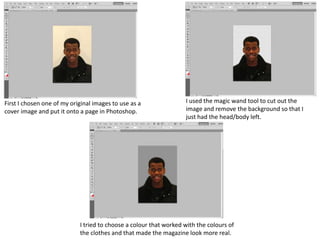
  • 1. First I chosen one of my original images to use as a I used the magic wand tool to cut out the cover image and put it onto a page in Photoshop. image and remove the background so that I just had the head/body left. I tried to choose a colour that worked with the colours of the clothes and that made the magazine look more real.
  • 2. When choosing the title of the magazine I used For my cover line I decided to put it in a box to a colour that would stand out and look good. make it stand out and also I chose no more than 5 colours for the colour scheme. The cover line is in the middle of the page and it is in bigger text as it is one of the main stories and links to the cover image.
  • 3. Other cover lines are smaller to the right of the Cover lines do not cover over the face and they page in the same font with matching colours. are in fonts and colours that match each other. The first edition is written on it and also the barcode is placed to the right of the cover.
  • 4. The final cover page includes only 4 colours which are Red, Grey, Black and White. All of the cover lines are spread out onto each side of the image with none of them going over the face. The title of the magazine is bold and clear to read and it is positioned behind the cover image, it also has a drop shadow on the title so that it stands out more and it makes the text look a lot better. The date of the magazine and the first edition text is at the top on each side just under the title. The bar at the bottom with a cover line on it has a black box behind it to block out the image and focuses more on the text. The cover lines with boxes behind are the ones that stand out most as they are more important and are bigger stories. The barcode is in the corner of the page as it isn’t as important as the text and it doesn’t cover over the main part of the image. The person in the image is looking straight at the camera when the image was taken so there is eye contact with the reader so it makes it more appealing and makes the reader want to pick it up and look at it.