1. Ben Everitt
UNIT 18: Evaluation
In unit 18 we have been developing our own water product which we had to pitch to the class as if
we were selling it professionally. Our initial ideas were to develop a water product which promotes
living young and being dynamic which suits our name.
However, before starting this we spent a couple of weeks studying how loads of different adverts
are designed around their audience and purpose. We first looked at how magazine and TV adverts
are designed to suit their purpose and also their audience.
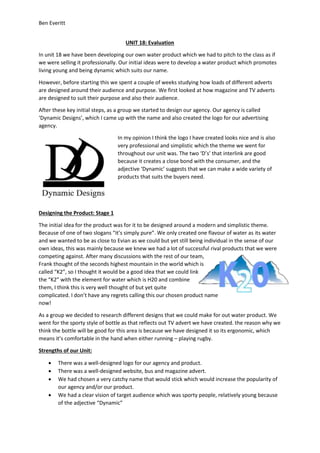
After these key initial steps, as a group we started to design our agency. Our agency is called
‘Dynamic Designs’, which I came up with the name and also created the logo for our advertising
agency.
In my opinion I think the logo I have created looks nice and is also
very professional and simplistic which the theme we went for
throughout our unit was. The two ‘D’s’ that interlink are good
because it creates a close bond with the consumer, and the
adjective ‘Dynamic’ suggests that we can make a wide variety of
products that suits the buyers need.
Designing the Product: Stage 1
The initial idea for the product was for it to be designed around a modern and simplistic theme.
Because of one of two slogans “it’s simply pure”. We only created one flavour of water as its water
and we wanted to be as close to Evian as we could but yet still being individual in the sense of our
own ideas, this was mainly because we knew we had a lot of successful rival products that we were
competing against. After many discussions with the rest of our team,
Frank thought of the seconds highest mountain in the world which is
called “K2”, so I thought it would be a good idea that we could link
the “K2” with the element for water which is H20 and combine
them, I think this is very well thought of but yet quite
complicated. I don’t have any regrets calling this our chosen product name
now!
As a group we decided to research different designs that we could make for out water product. We
went for the sporty style of bottle as that reflects out TV advert we have created. the reason why we
think the bottle will be good for this area is because we have designed it so its ergonomic, which
means it’s comfortable in the hand when either running – playing rugby.
Strengths of our Unit:
There was a well-designed logo for our agency and product.
There was a well-designed website, bus and magazine advert.
We had chosen a very catchy name that would stick which would increase the popularity of
our agency and/or our product.
We had a clear vision of target audience which was sporty people, relatively young because
of the adjective “Dynamic”