1. Genre Poster Analysis
Things I liked:
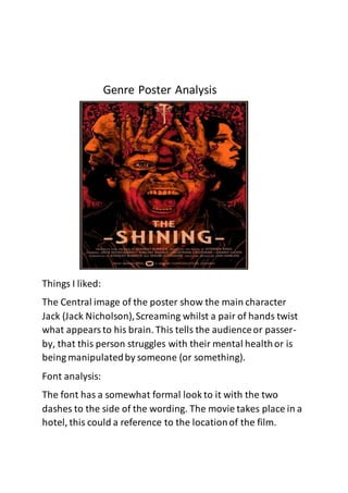
The Central image of the poster show the main character
Jack (Jack Nicholson),Screaming whilst a pair of hands twist
what appearsto his brain. This tells the audienceor passer-
by, that this person struggles with their mental healthor is
being manipulatedby someone (or something).
Font analysis:
The font has a somewhat formal look to it with the two
dashes to the side of the wording. The movie takes place in a
hotel, this could a reference to the locationof the film.
2. Things I liked:
This movie poster has similaritiesto my own plot and poster.
Cabinfever takes place in a wooded location(as my movie).
The poster instantly gives off creepy vibes with the tall
ominoustrees encircling the wooden decrepit shack. The
light coming from the widows appears from behindfrom
3. behindthe shack, hinting that the shack has more to it than
meets the eye.
Font Analysis:
The font appearsto be being drawn into the house.
Things I liked:
The Forest is the most similardesign to my poster. With light
shining through the mist and the trees and the main
character standing central drawing attention
Font Analysis:
4. The font as slight almost indistinguishablecracks which gives
it an ‘overgrown’ look