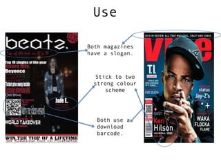
2. Develop
My magazine starts to look different as my colour
scheme is different, their mail colour is a more
vibrant red where as mine is more of a burgundy
colour.
Another slight difference is the fact that the
professional magazine has an artificial
background whereas my background is the original
background for the picture.
Also another little difference is that the
professional magazine have spread out their
captions and mine are in a list form down one side.
3. Challenge
My magazine looks totally different as the
professional magazine has a big main image where as
mine is only small and doesn’t take up as much space.
also their image is a close up where as mine is a
long shot.
Another difference is my masthead is thin and theirs
is very bold but theirs is blocked out by some of
their main image and mine is easily seen and easily
read.
Finally another big difference is that I have a lot
more captions on my front page and the
professional has less but scattered everywhere.