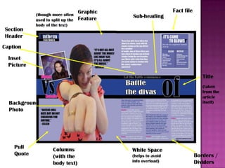
Masthead

Flash

Selling Line
Banner
Feature
Article Photo

Anchorage
Headline

Kickers
Cover Lines
Graphic
Feature

Date Line
with web
address
Bar Code
Menu Strip
This is the magazine I have produced for my final task.
The magazine I was producing at first, was purely based on Pop, However some of
the style and content I was producing was a Pop magazine with little elements Indie.
The colour format I had used throughout the magazine were the colours black, white,
purple. I also used pink and yellow in some parts of the magazine.
For my masthead I created one using the colours black and white text, white
outlining was used for the A, while black outlining was used for the rest of the
masthead text. I had also framed the masthead text using black and purple colour
blocking this was used so it was to stand out to the audience. This is because the
masthead is the first part of a magazine a person would come across. The main
feature image that has been used for the cover has been used for the cover is linked
to the main feature article. This is because the action pose the model has links with
the word battle.
With kickers and cover lines I used an image from my photography as my graphic
feature and with a kicker of the name of my artist and then the cover line album
review. This is so that the content of the magazine fits with the audience
questionnaire I created.
The audience question are was also used as a reference to create my menu strip.
The content that was requested by the audience is used throughout in this
magazine. An explanation on this will be explained in the section.
When it comes to the genre of music that you are trying to sell, you need to be able
to have an audience age range and price and the style and content in the magazine.
My product is aimed for older teen girls which is 15+. The interview for my double
page spread has music artists that are around the same age as the target audience,
this is so that they can relate to them and make a connection.
Section
Header

Stand-out
quote

Main Feature
(with inset
pictures)

Issue and
Dateline

Border / Divider

Section
Headers
Numbered
itemised list

Pictorial
inset (of
highlights &
exclusives)

Subscription
box
Front Cover Copy

Page
numbers
(with headers
resembling
kickers and
cover lines)
The contents page uses the same colour scheme as the cover. There is an
editorial page giving a brief of what the issue of the magazine is about. While there
is an image of two models, this is a link to the main feature article, another is of the
same model but a separate article about them. This is for an album review, which
stated before about me referring back to my audience questionnaire.
For each of the page numbered headings they have been made to draw the reader
in. This is to show the audience that their opinion counts and that only the content
they ask for will be shown in this product. The layout of the page is packed with
information however, I have laid it out so that the text and images are not over
crowded. Also the colour layout of this page has been presented as sophisticated
but fun and bold.
Most of the magazines content is made up of reviews, fashion ,shopping, film and
tv.
Section
Header

(though more often
used to split up the
body of the text)

Graphic
Feature

Fact file

Sub-heading

Caption

Inset
Picture
Title
(taken
from the
article
itself)

Background
Photo

Pull
Quote

Columns
(with the
body text)

White Space
(helps to avoid
info overload)

Borders /
Dividers
With my double page spread, I have created the article
battle of the divas in which two artists go head to head with
each other, to see who comes out on top. I have based the
interview around girls the same age as the readers as they
will be able to understand and relate to what the artists say.
Another point to be made is that children listen and absorb
everything that is told to them, which as they are teens they
will still have this but not as much as children. There is a
part in the interview where they talk about money is not the
main factor of producing their music, where in some artists
that is the biggest factor alongside sexualisation. Which in
this magazine doesn’t show this and believe that girls
should be themselves and not be drawn into that side of
publishing.

Question 1

  • 2.
    Masthead Flash Selling Line Banner Feature Article Photo Anchorage Headline Kickers CoverLines Graphic Feature Date Line with web address Bar Code Menu Strip
  • 3.
    This is themagazine I have produced for my final task. The magazine I was producing at first, was purely based on Pop, However some of the style and content I was producing was a Pop magazine with little elements Indie. The colour format I had used throughout the magazine were the colours black, white, purple. I also used pink and yellow in some parts of the magazine. For my masthead I created one using the colours black and white text, white outlining was used for the A, while black outlining was used for the rest of the masthead text. I had also framed the masthead text using black and purple colour blocking this was used so it was to stand out to the audience. This is because the masthead is the first part of a magazine a person would come across. The main feature image that has been used for the cover has been used for the cover is linked to the main feature article. This is because the action pose the model has links with the word battle. With kickers and cover lines I used an image from my photography as my graphic feature and with a kicker of the name of my artist and then the cover line album review. This is so that the content of the magazine fits with the audience questionnaire I created. The audience question are was also used as a reference to create my menu strip. The content that was requested by the audience is used throughout in this magazine. An explanation on this will be explained in the section. When it comes to the genre of music that you are trying to sell, you need to be able to have an audience age range and price and the style and content in the magazine. My product is aimed for older teen girls which is 15+. The interview for my double page spread has music artists that are around the same age as the target audience, this is so that they can relate to them and make a connection.
  • 4.
    Section Header Stand-out quote Main Feature (with inset pictures) Issueand Dateline Border / Divider Section Headers Numbered itemised list Pictorial inset (of highlights & exclusives) Subscription box Front Cover Copy Page numbers (with headers resembling kickers and cover lines)
  • 5.
    The contents pageuses the same colour scheme as the cover. There is an editorial page giving a brief of what the issue of the magazine is about. While there is an image of two models, this is a link to the main feature article, another is of the same model but a separate article about them. This is for an album review, which stated before about me referring back to my audience questionnaire. For each of the page numbered headings they have been made to draw the reader in. This is to show the audience that their opinion counts and that only the content they ask for will be shown in this product. The layout of the page is packed with information however, I have laid it out so that the text and images are not over crowded. Also the colour layout of this page has been presented as sophisticated but fun and bold. Most of the magazines content is made up of reviews, fashion ,shopping, film and tv.
  • 6.
    Section Header (though more often usedto split up the body of the text) Graphic Feature Fact file Sub-heading Caption Inset Picture Title (taken from the article itself) Background Photo Pull Quote Columns (with the body text) White Space (helps to avoid info overload) Borders / Dividers
  • 7.
    With my doublepage spread, I have created the article battle of the divas in which two artists go head to head with each other, to see who comes out on top. I have based the interview around girls the same age as the readers as they will be able to understand and relate to what the artists say. Another point to be made is that children listen and absorb everything that is told to them, which as they are teens they will still have this but not as much as children. There is a part in the interview where they talk about money is not the main factor of producing their music, where in some artists that is the biggest factor alongside sexualisation. Which in this magazine doesn’t show this and believe that girls should be themselves and not be drawn into that side of publishing.