
Recommended
More Related Content
What's hot
What's hot (19)
Similar to Evaluation – forms and conventions
Similar to Evaluation – forms and conventions (20)
More from chazbing
Recently uploaded
Recently uploaded (20)
Evaluation – forms and conventions
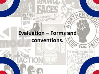
- 1. Evaluation – Forms and conventions.
- 2. Recognition of real magazine features. Date and Slogan price Masthead There are conventional features of real magazines on the pages of my magazine. For example, the masthead is at the top of my cover, and larger than other text, with a slogan to further strengthen realism. The cover also contains a barcode and price and date for a more realistic look, along with stylistic features such as cover lines and screamers. Cover line/Screamer Cover star Barcode The contents page also has real magazine conventions consisting of Contents heading, structured page numbers and synopsis’ and the use of a website as well as a background image and another themed relevant image. Page numbers Contents heading and details. Website
- 3. Real magazine features – double page spread. Centred Heading My double page spread also has conventional, real magazine features including page numbers, centred heading , columns and drop caps. These features make the page stylistically comparative to that of a real magazine. Drop caps Page number. Page number Columned layout of text
- 4. Recognition in Sub-Genre. My chosen sub-genre was Mod Music, and I implemented features into my magazine throughout to make sure I was hitting the right content of the genre. Firstly the use of the mise-en- scene of scooters reinforces the sub-genre of Mod music as scooters are predominantly associated with the music and people. I used the scooter image on all three pages to reinforce this connection. The cover star is also recognisable within the genre as the green parker, stance and pose resembles that of a mod. Throughout all pages, the mod target is a design feature, famously used by Mod bands such as The Who. This again connects the magazine to the genre as the colours and the target all relate back to the genre.
- 5. Challenging of conventions. I challenged some generic conventions of the Mod music magazine. I implemented a green coloured mod target colourer, that is within the mod scene but not the associated magazine. The colour gives the double page spread an more sophisticated look and feel. I also decided not to take many conventional photos including groups of people, as many are individuals who freely explore what the mod scene has to offer. The front cover background photo of Sam connotes this individuality.