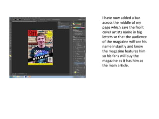
1. I have now added a bar
across the middle of my
page which says the front
cover artists name in big
letters so that the audience
of the magazine will see his
name instantly and know
the magazine features him
so his fans will buy the
magazine as it has him as
the main article.
2. I have now changed my
puff/pug as I felt that
this new shape applied
more to the rock theme
of my magazine so I
changed the shape from
a star shape to a black
circle with a white ring
surrounding it as I felt
that this applied more to
the rock genre that my
magazine is following.
3. I have also decided to
change the colour of
my footer on my page
and the colour of the
text that is in the
footer as in my
research into
magazines I saw a
similar header with
yellow text and a red
background on an
NME magazine. I
decided to use this as
I felt that yellow text
on a red background
stands out which will
mean my audience
will see it and be
attracted to the
bright colours of my
magazine.
4. I have removed the brick
wall background from my
main image and I have
replaced it with a
brighter background so
the text and image stand
out more on my
magazine which allows
the