
Recommended
More Related Content
What's hot
What's hot (20)
Viewers also liked
Viewers also liked (20)
Similar to Contents page analysis billboard magazine
Similar to Contents page analysis billboard magazine (20)
Recently uploaded
Recently uploaded (20)
Contents page analysis billboard magazine
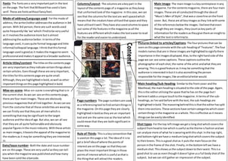
- 1. Fonts- The fontsare a veryimportantpartin the text on the page.The font thatBillboard hasusedisSans serif.These are fontswithoutfancyfeet. Mode of address/Language used- Forthe mode of address,the writer/editoraddressesthe audience in3rd person.With3rd person,there are such wordsused quite frequentlylike 'we'whichIfindtobe veryuseful as it involvesthe audiencemore butisalmost addressingthe audience better. Intermsof the language used,itusesquite formal languageandlittle informal/colloquial language.Ithink thatthisformal language usedisgoodas it makesthe magazine seem professionalandmakesitappeal toa broaderaudience. Article titles/content- The titlesonthe contentspage are veryimportantastheyindicate certainthingsabout certainarticles.Eventhoughthese are veryimportant, the titlesforthiscontentspage are quite small. Although,theyare highlightedinbold,aswell asother importantthingsonthispage highlightedinbold. Mise-en-scene- Mise-en-scene iseverythingthatisin the current shot.Aswe can see onthiscontentspage, there are four mainimages.These are obviously previousmagazinesthatall linktogether.Aswe cansee fromthe costume thatall these celebritiesare wearing, we can firstlysee thattheyare all menwhichis somethingthatmaybe significant tothe target audience andthe ideaof age.But also,we can all see that theyare all quite fashionableandobviously popularfiguresinthe musicindustry.Withthese artists as mainimages,itbooststhe appeal of the magazine to the readersas it maybe somethingtheyare interested in. Date/issue number- Boththe date and issue number are on thispage.These are veryuseful astheycan tell youwhenthe magazine waspublishedandhowmany have beensoldlike abarcode. Columns/Layout- The columnsare akeypart in the layoutof the contentspage of a magazine astheykeep that uniformedlookof the magazine.Inthiscase,we can see that the columnsforthe textare well spacedwhich meansthat the creatorshave utilisedthatspace andthey have utiliseditwell.Theyhave alsousedcolumnstospace out some of the featuresinthe magazine asall the featuresare differentwhichmakesthe texteasiertoread for the readerand easiertounderstand. Main image- The mainimage isa keycentrepiece inany magazine.Forthe contentsmagazine,there are fourmain images.These are all conductedthroughthe ideaof "Music's Men of Style",thatwasa coverline onthe front cover.But, these are all keyimagesasthey linkwithsome of the referencesbelowthe images. Ibelievethateven thoughtheyare images,theycountaskeyparts of informationforthe readersastheygive themaninsightto whatthe textisreferringto. Pictures linked to articles/Captions- The fourpicturesthatcan be seenonthispage connote withthe sub-headingof "Features".The four modelsnamesthatare in these imagesare highlightedtosignifythere importance inthe imagesdisplayed.Also,tothe righthandside of the page we can see some captions.These captionsoutlinethe photographerof eachshot,the name of the artist andwhat theyare wearing.Thisisa goodfeature as itmay be somethingthatthe audience isinterestedinbutitisalsoaccreditingthe person responsible forthe images,like aneditorialletterwould. Page numbers- The page numbersare used as a referencingtool tofindcertainthingsin the magazine.Onthispage theyare clearly highlightedinboldastheyare an important tool and are the same size as the textwhich couldmeanthat theyare bothsignificantin some way. Main heading/Sub-heading- Similartothe frontcover andthe Masthead,the mainheadingissituatedtothe side of the page.Again, thisisthe editorutilisingthe space thathe has onthe page butI believeitaddsa unique touchtothe magazine.Intermsof the sub- headings,asI've said before withthe text,the sub-headingsare highlightedinbold.The reasoningbehindthisisthatthe editorhassplit themintosections.These sectionshave certaincategorieswhich cover certainthingsinthe magazine as a whole.Thisiseffective asit means thingscan be easilyidentified. Shot types- Forthe top leftimage we geta longshotwhichcoversthe subjectfromheadto toe whichisuseful asthe theme isfashionandwe can analyse more of what he iswearingwiththisshpt.Inthe top right, and bottomrightwe have a mediumlongshotwhichcoversthe subject to theirknees.Thisisagood shotas it putsthe mainfocuson the personinthe frame of the shot.Finally,inthe bottomleftwe have a mediumshot.Thisshowsusthe subjectdowntotheirwaist.Thisisa goodshot to use as eventhoughitdoesn'tgive usa full bodyshotof the subject, butwe can still gatheran impression of the subject. Rule of Thirds- Thisisa keyconventionthat isusedon thispage a lot.The ideaof it isto geta brief ideaof where the pointsof interestare onthe page so thattheycan place the most importantthingsinthose pointsof interestwhichisuseful asthatis the thingthat will attractthe readers.