1. Focus Group
What Mast Head do you think best suites the magazine taking into account
the sub-genre and target audience?
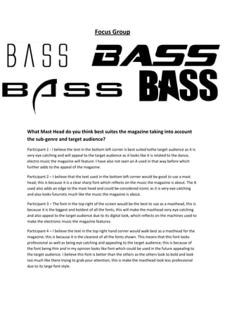
Participant 1 - I believe the text in the bottom left corner is best suited tothe target audience as it is
very eye catching and will appeal to the target audience as it looks like it is related to the dance,
electro music the magazine will feature. I have also not seen an A used in that way before which
further adds to the appeal of the magazine.
Participant 2 – I believe that the text used in the bottom left corner would be good to use a mast
head; this is because it is a clear sharp font which reflects on the music the magazine is about. The A
used also adds an edge to the mast head and could be considered iconic as it is very eye catching
and also looks futuristic much like the music the magazine is about.
Participant 3 – The font in the top right of the screen would be the best to use as a masthead, this is
because it is the biggest and boldest of all the fonts, this will make the masthead very eye catching
and also appeal to the target audience due to its digital look, which reflects on the machines used to
make the electronic music the magazine features.
Participant 4 – I believe the text in the top right hand corner would walk best as a masthead for the
magazine; this is because it is the cleanest of all the fonts shown. This means that this font looks
professional as well as being eye catching and appealing to the target audience; this is because of
the font being thin and in my opinion looks like font which could be used in the future appealing to
the target audience. I believe this font is better than the others as the others look to bold and look
too much like there trying to grab your attention, this is make the masthead look less professional
due to its large font style.