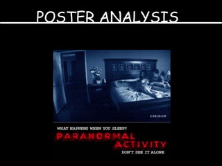
2. picture PICTURE IN GENERAL The picture is a snapshot of actual footage within the film. This is clever, as it gives the viewer a small insight of what is happening, therefore inclining the viewer towards the film. The poster is very basic, but clever. The basic form of the poster works well, as it shows how some terrifying things can happen to common people. The blandness and simplistic nature of poster is clever again because it shows to the audience that no special effects have been used, again highlighting the fact that this can happen to normal people. The eye-contact of the people in the bed looking towards something conveys that something supernatural is there, and again draws the viewer in.
3. TEXT AND FONT The text is very simple but effective. It has the standard horror look font, which creates a scary looking effect. The font and text is in red which has connotations of blood, death and vengeance, along with supernatural connotations, implying that all these things can happen in the film. The font is very clear and concise, making it easy for the audience to read. Also the fact that it’s in capitals suggests it’s being shouted at creating an ominous and supernatural effect. ‘ What happens when you sleep’ is effective as it makes the situations to the audience more relatable, furthermore enhancing the ominous effect.
4. MISE EN SCENE The mise en scene is very simple but again effective. The fact there is a bed in the snap-shot, suggests that these things can happen to normal people.