Book Paid In Vashi In 8976425520 Navi Mumbai Call Girls
Media Evaluation - Question 7
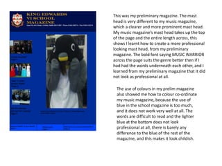
1. This was my preliminary magazine. The mast
head is very different to my music magazine,
which a clearer and more prominent mast head.
My music magazine’s mast head takes up the top
of the page and the entire length across, this
shows I learnt how to create a more professional
looking mast head, from my preliminary
magazine. The bold font saying MUSIC WARRIOR
across the page suits the genre better then if I
had had the words underneath each other, and I
learned from my preliminary magazine that it did
not look as professional at all.
The use of colours in my prelim magazine
also showed me how to colour co-ordinate
my music magazine, because the use of
blue in the school magazine is too much,
and it does not work very well at all. The
words are difficult to read and the lighter
blue at the bottom does not look
professional at all, there is barely any
difference to the blue of the rest of the
magazine, and this makes it look childish.
2. In this magazine I used colours far better, I
colour coded the red and black, around the
mast head and main line of the magazine.
This looks much more professional.
Also the bordering of my magazine is much
better, before where it was difficult to tell
where the magazine split into different
sections, it is much easier to see on this
magazine. The colour on the titles of the
articles also really stand out and make it
even clearer.
3. School (preliminary) magazine
Music Magazine
Images here
have been
edited and
manipulated
Images here
have been
merely
copied over
from their
original copy
Image is
only on
1/3 of
page, not
cut off so
page has
distinct
sections
This image takes
up the entire
front page and
looks much
more
professional,
this is what a
usual music
magazine looks
like, and the
reason I
conformed to
this was
because my
preliminary
music magazine
showed me that
it looked best.