1. Publication title
To create my masthead I will use Adobe Photoshop as it is the ideal software to use when creating my
magazine cover page, contents page and double page spread. It is also the software that I will use to
create my headline. To create my masthead I used two websites called Da Font and Urban Fonts. As I
was experimenting which font and name would be best suited for my magazine I thought it would be best
to use two possible mastheads and three fonts form these two website
Mastheads 1
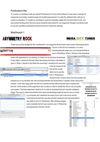
These are my first designs for the masthead for my magazine the font that I have used is Necrotype which
I found on the Da Font website, it is a free
downloading site where you can download fonts to
use in Photoshop. When I clicked on the download
button this appeared on my desktop, it shows me my previous downloads.
In this folder I needed to find the folder Necrotype and click in the folder to
open it. When I clicked in the folder the next thing I needed to do was click
in the ttf version of the
font as this would
allow me to use this
font in Photoshop. I
clicked on this version of the font and another tab
showed up on my desktop, this was showing what the font looked like in capitals, lower case and in
number. I was very happy with how this font looked and the effect that had been created with
the font. At the bottom of the page there was a button to click to install this font on my computer
and system. The final stage that I need to do in order to download this font was the validation
stage. This was to make sure that the font I was downloading would not send a virus or crash
my computer, all I needed to do was to put a tick in the box to let the
computer know that this was the font that needed to be checked before I
was able to use it in Photoshop. After all these stages
were complete the font was ready to use in Photoshop
and appeared in the list of fonts.
2. Mastheads 2
These are the second mastheads that I have created for my magazine. The
font that I have used is Base O2 and it was from the site Urban Fonts. The way I downloaded this font was
the exact same way that I had downloaded the font from Da Font. I still needed to click on the download
button which is placed underneath the font. After clicking on this font I got the same tab that opened up on
my desktop showing all, of my recent downloads in this folder I could
see my previous font download and that it
had downloaded successfully. In this
folder I needed to find the folder Base02
and when I clicked on the folder I received
the same options asking which version I wanted to download, I knew I
wanted to download the same
version as I had done for the Necrotype font which
was the ttf version as this would work in Photoshop.
When I clicked in the ttf version a new tab showed
up on my desktop showing me what the font would
look like in capitals, lower case and numbers. I
really like this font compared to the other two that I
had produced as I thought that the effect that was
used was fantastic and it was a really clear and easy to read and ideal for my
target audience. The final stage that was required in
order to download the font after I clicked the install font
button was to allow the computer to do a validation so
that the font that I was downloading would not send a
virus to my computer or crash it. After this validation was
completed this font was successfully downloaded to
Photoshop and it appeared in my list of fonts.
3. Mastheads 3
These are the final ideas for my masthead that I have designed. The font that I have used is the same that
the band the Rolling Stones and their magazine use. This already does not make it a very suitable font as
it is already being used and it will be likely that someone will recognise this font as it is not an original and
has been copied from an existing magazine.
However to download this font to Photoshop I
followed the exact
same process that I
have used to
download the previous two fonts. The website that I downloaded this font from
was Urban Fonts and it is a website that I trust and I
would use in the future. When I clicked in the download
button it brought me straight to the same folder
that I have been taken to each time I have wanted
to download a font from a website. The folder that I
4. needed to click on in order to download this font was called royalacidbath which is a completely different
name than was given on the website. When I clicked on the folder it still asked my which version of this
font I wanted to download which was still the ttf version. After I had selected this version it showed me
what the font looked like in capitals, lower case and numbers. As I was happy with how this font looked
and thought how well it would look as my masthead I clicked the install button and then it wanted to do a
font validation to make sure that the font I was downloading would not send my computer a virus or crash
my computer. After it had completed the validation the rolling rocker font was successfully downloaded to
my list of fonts in Photoshop.
Final Masthead
5. This is the design that I am going to use for my masthead as I really like it as it is simple and effective. The
font uses a very good effect and it did not take me a long time to create because it was fairly simple to use.
I am pretty sure that I will be able to create this again when it comes to making my actual cover page. I will
also use this font style on all of my pages as it will continue the house style throughout the magazine which
will make it look professional and it will make the reader think that the editor has spent a lot of time thinking
and planning the house style of this magazine.
The reason why I have gone for a very simple font is the fact that I do not want the masthead to be the
main dominance of the magazine as I want it to share the cover with the main image that I am going to
use. I will make sure that it will stand out to the audience and inform the reader as to what the magazine is
called, but I also feel that the main image is an important part of a magazine also, if the magazine has a
high quality image then it is likely catch the reader’s attention whereas a picture in low quality will not
please the reader and will not encourage them to look at the picture, read the article that the picture is
advertising or buy the magazine.