SlideShare a Scribd company logo
1 of 3
Both the use of image and theme of text and colour convey the genre of this article. The models are older than average, and this point is reinforced by the old western text, and vintage feel. Therefore suggesting the target audience for this piece to be for example age 30-50. Use of colour is consistent throughout, white text and a almost sepia toned background. This gives a professional feel , and is something I want to achieve in my own piece. This is an example of a simplistic colour pallete.  The image is fairly unconventional, as it has two points of interest which are almost separate images due to the page separation. This means the audience is drawn to both sides at the top, where the faces are, then follow down to the article. The large, bold title grabs the readers attention, and is almost similar to a cover.  All text then follows on the next page, in a fairly compact box – allowing for the image to still be the majority of the pages content. The mise-en-scene of decaying, rusty windows and walls ties in with the ‘vintage’ feel of the text and image. For example, the cover line is almost in the style of a ‘Western’ font – which is reinforced by the cowboy hat worn by the model, and also the wooden walls as seen in Western films. Therefore, use of mise-en-scene is important in this piece. The models seem to be portrayed as very laid back, the sunglasses have connotations of holidays and relaxing, and the fact that their focus is not on camera gives the impression that they’re not really bothered, and not posing – instead just chilling. Although, we still get a vibe of confidence from the image, as both body languages are strong and confident, even though they are not looking at the camera. It almost gives the impression that they are too ‘cool’ for any of this.
This double page spread from NME magazine gives the effect of the audiences attention being drawn straight to Lily Allen, the model in this article. This is done by deliberate choice of a black and white background, making her red shirt stand out and thus drawing our attention. Besides the shirt, Lily fits in with the theme of the rest of the page, for example her dark hair and eyeliner contrast with her pale skin in order to replicate the effect of the text on the paper. Sticking to the 3 colour palette of black, white and red, small splashes of red are used in the article to highlight areas of interest – but besides this the page is black and white, Elements of the ‘male gaze’ are played with in this DPS. For example, according to Marjorie Ferguson’s categorisation, Lily has an ‘Invitational’ look, therefore appealing to a heterosexual male audience, as well as females. A mid shot is used so that her fashion/style can be displayed, as it supports her ‘look’ of a punk/rock/indie style.  I like the use of layers in this piece, for example, the title is layered over the top of Lily’s arm, and so on. This gives the effect of everything being merged together, in order to create an overall image – as if the text and image are together in real life. The ransom note style of text is an interesting effect, as it is bold and striking, yet not boring and plain. It is easy to read, whilst at the same time being fairly artistic and unconventional. I hope to break the standard title convention when producing my own DPS, however using an original idea of my own. The quote from the article in large newspaper letters makes for a interesting draw-in line for the article. The fact that the text spreads over the two pages means that once the attention has been taken away from Lily, it will then be focused on it. The statement it makes is quite inviting to read on, in order to find out what it means. Therefore, I think this an effective approach. The pose Lily is in suggests confidence, and when teamed with the quote next to her, it gives the impression she has a point to prove, something to say. I like the way images, text and mise-en-scene can compliment each other in order to give an overall picture, and this is done is this piece well – the plain, simple background and bold text suggest this a no-nonsense article, and instead just what the artist has to say. This adds sincerity to her interview, and therefore makes the magazine more credible.
The artist is repeated along the top third of the page in a variety of different poses. This is to reinforce the point that she is the next best thing, and again to further satisfy the male gaze. These images have a black and white effect applied to them, and this makes them less relevant, but still a decorative feature.  The image used of Salange Knowles is a full body shot. This is perhaps to flaunt her legs, which are emphasised by high heels in order to satisfy the male gaze. A short dress is used to make this image even more sexual, and again a ‘invitational’ expression. This makes the article appeal to men as well as women, as women are inspired whereas men are visually pleased. The fact that the image is in a burst of colour on a fairly dull, de-saturated page means attention is immediately drawn to it, and therefore this is the main point of interest, inviting the audience to read further. As the line to the left if her says ‘FORGET HER SISTER’, in this case fellow artist Beyoncé, the image suggests that she is trying to make an impression, and perhaps prove herself. Therefore she is very dolled up and glamorous, and attempting to win over potential fans.  The colour palette used for the page is mainly black and white, with splashes of teal for the header and important pieces of text. The strip separating the text and top third images works well, as it gives almost a virtual platform for the model to stand on. This is something I must consider if using body shots, as the artist cannot just stand in mid air on the page, as it will look unprofessional. Compared to other articles I have analysed, this one seems to be above average with the amount of text used. The image only fills a slim area of the two pages, and therefore text surrounding her must be more filling. In order to fill some blank areas of page, enlarged quotes are used, as these are another point of interest, and add a different element to the page than simply the image and article alone would. From these DPS’s I have noticed that areas are never really left blank, unless a minimalistic approach is being employed, therefore I shall adopt these techniques when creating my own piece.

More Related Content

What's hot

Magazine Cover Analysis
Magazine Cover AnalysisMagazine Cover Analysis
Magazine Cover Analysis
Fran Davies
 
Analysis of my own magazine
Analysis of my own magazineAnalysis of my own magazine
Analysis of my own magazine
asmediaf13
 
How did you attract/address your audience?
How did you attract/address your audience?How did you attract/address your audience?
How did you attract/address your audience?
FreyaSpiers
 
Pop music magazine cover annotations
Pop music magazine cover annotationsPop music magazine cover annotations
Pop music magazine cover annotations
xv_Identity
 

What's hot (20)

Music magazine contents analysis
Music magazine contents analysisMusic magazine contents analysis
Music magazine contents analysis
 
ANALYSIS OF FRONT COVERS
ANALYSIS OF FRONT COVERSANALYSIS OF FRONT COVERS
ANALYSIS OF FRONT COVERS
 
Magazine annotations
Magazine annotationsMagazine annotations
Magazine annotations
 
Music Magazine - Textual Analysis
Music Magazine - Textual AnalysisMusic Magazine - Textual Analysis
Music Magazine - Textual Analysis
 
Magazine cover analysis
Magazine cover analysisMagazine cover analysis
Magazine cover analysis
 
Magazine Cover Analysis
Magazine Cover AnalysisMagazine Cover Analysis
Magazine Cover Analysis
 
Semiotic analysis of a magazine cover
Semiotic analysis of a magazine coverSemiotic analysis of a magazine cover
Semiotic analysis of a magazine cover
 
Analysis of my own magazine
Analysis of my own magazineAnalysis of my own magazine
Analysis of my own magazine
 
front cover
front coverfront cover
front cover
 
Front cover analysis
Front cover analysisFront cover analysis
Front cover analysis
 
media mag anal isis
media mag anal isis media mag anal isis
media mag anal isis
 
Front Cover Analysis
Front Cover AnalysisFront Cover Analysis
Front Cover Analysis
 
Analysis of NME magazine cover,contents and spread
Analysis of NME magazine cover,contents and spreadAnalysis of NME magazine cover,contents and spread
Analysis of NME magazine cover,contents and spread
 
Music magazine contents analysis
Music magazine contents analysisMusic magazine contents analysis
Music magazine contents analysis
 
How did you attract/address your audience?
How did you attract/address your audience?How did you attract/address your audience?
How did you attract/address your audience?
 
Codes and convention of double page spread
Codes and convention of double page spread Codes and convention of double page spread
Codes and convention of double page spread
 
Textual analysis 1
Textual analysis 1Textual analysis 1
Textual analysis 1
 
Music magaine
Music magaineMusic magaine
Music magaine
 
Genre research 1
Genre research 1Genre research 1
Genre research 1
 
Pop music magazine cover annotations
Pop music magazine cover annotationsPop music magazine cover annotations
Pop music magazine cover annotations
 

Viewers also liked

Media box workshop
Media box workshopMedia box workshop
Media box workshop
cjdenholm
 
Struktur dan pertumbuhan tumbuhan bagan media
Struktur dan pertumbuhan tumbuhan bagan mediaStruktur dan pertumbuhan tumbuhan bagan media
Struktur dan pertumbuhan tumbuhan bagan media
Indra Theking
 
Evaluation Activity 1
Evaluation Activity 1Evaluation Activity 1
Evaluation Activity 1
alexpocock1
 

Viewers also liked (16)

Media box workshop
Media box workshopMedia box workshop
Media box workshop
 
Employee Benefits in a post consultation world
Employee Benefits in a post consultation worldEmployee Benefits in a post consultation world
Employee Benefits in a post consultation world
 
Presentation Q1 2011
Presentation Q1 2011Presentation Q1 2011
Presentation Q1 2011
 
Struktur dan pertumbuhan tumbuhan bagan media
Struktur dan pertumbuhan tumbuhan bagan mediaStruktur dan pertumbuhan tumbuhan bagan media
Struktur dan pertumbuhan tumbuhan bagan media
 
Digital approach
Digital approachDigital approach
Digital approach
 
Presentation of 4th quarter 2010
Presentation of 4th quarter 2010Presentation of 4th quarter 2010
Presentation of 4th quarter 2010
 
Apuntes performance
Apuntes performanceApuntes performance
Apuntes performance
 
Evaluation Activity 1
Evaluation Activity 1Evaluation Activity 1
Evaluation Activity 1
 
Lotc manifesto
Lotc manifestoLotc manifesto
Lotc manifesto
 
Gestion Conocimiento Empresa2.0 B
Gestion Conocimiento Empresa2.0 BGestion Conocimiento Empresa2.0 B
Gestion Conocimiento Empresa2.0 B
 
Teaching Moments in the OR
Teaching Moments in the ORTeaching Moments in the OR
Teaching Moments in the OR
 
Informed consent
Informed consentInformed consent
Informed consent
 
Employee Benefits in a post consultation world
Employee Benefits in a post consultation worldEmployee Benefits in a post consultation world
Employee Benefits in a post consultation world
 
Kanban in Operations
Kanban in OperationsKanban in Operations
Kanban in Operations
 
Api pour les nuls
Api pour les nulsApi pour les nuls
Api pour les nuls
 
Types of networks
Types of networksTypes of networks
Types of networks
 

Similar to Double Page Spread Analysis (20)

Analysis of double page spreads
Analysis of double page spreadsAnalysis of double page spreads
Analysis of double page spreads
 
Analysis of double page spreads
Analysis of double page spreadsAnalysis of double page spreads
Analysis of double page spreads
 
Analysis of double page spreads
Analysis of double page spreadsAnalysis of double page spreads
Analysis of double page spreads
 
Analysis of double page spreads
Analysis of double page spreadsAnalysis of double page spreads
Analysis of double page spreads
 
Analysis of three double page spreads from music magazines
Analysis of three double page spreads from music magazinesAnalysis of three double page spreads from music magazines
Analysis of three double page spreads from music magazines
 
Double page spread research
Double page spread researchDouble page spread research
Double page spread research
 
Double page spread research
Double page spread researchDouble page spread research
Double page spread research
 
Dps
DpsDps
Dps
 
Dps
DpsDps
Dps
 
Magazine resarch powerp 2
Magazine resarch powerp 2Magazine resarch powerp 2
Magazine resarch powerp 2
 
Double page spread
Double page spreadDouble page spread
Double page spread
 
SIMILAR PRODUCT RESEARCH (SPR) OF 3 FEATURE ARTICLES
SIMILAR PRODUCT RESEARCH (SPR) OF 3 FEATURE ARTICLESSIMILAR PRODUCT RESEARCH (SPR) OF 3 FEATURE ARTICLES
SIMILAR PRODUCT RESEARCH (SPR) OF 3 FEATURE ARTICLES
 
Analysis' of magazines
Analysis' of magazines Analysis' of magazines
Analysis' of magazines
 
Magazine resarch powerp 2 final
Magazine resarch powerp 2 finalMagazine resarch powerp 2 final
Magazine resarch powerp 2 final
 
Analyses of double page spreads
Analyses of double page spreadsAnalyses of double page spreads
Analyses of double page spreads
 
Magazine analysis
Magazine analysisMagazine analysis
Magazine analysis
 
Textual analysis
Textual analysisTextual analysis
Textual analysis
 
Magazine Textual Analysis
Magazine Textual AnalysisMagazine Textual Analysis
Magazine Textual Analysis
 
Vibe magazine
Vibe magazineVibe magazine
Vibe magazine
 
A2exsw
A2exswA2exsw
A2exsw
 

Double Page Spread Analysis

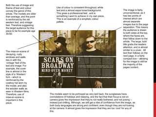
  • 1. Both the use of image and theme of text and colour convey the genre of this article. The models are older than average, and this point is reinforced by the old western text, and vintage feel. Therefore suggesting the target audience for this piece to be for example age 30-50. Use of colour is consistent throughout, white text and a almost sepia toned background. This gives a professional feel , and is something I want to achieve in my own piece. This is an example of a simplistic colour pallete. The image is fairly unconventional, as it has two points of interest which are almost separate images due to the page separation. This means the audience is drawn to both sides at the top, where the faces are, then follow down to the article. The large, bold title grabs the readers attention, and is almost similar to a cover. All text then follows on the next page, in a fairly compact box – allowing for the image to still be the majority of the pages content. The mise-en-scene of decaying, rusty windows and walls ties in with the ‘vintage’ feel of the text and image. For example, the cover line is almost in the style of a ‘Western’ font – which is reinforced by the cowboy hat worn by the model, and also the wooden walls as seen in Western films. Therefore, use of mise-en-scene is important in this piece. The models seem to be portrayed as very laid back, the sunglasses have connotations of holidays and relaxing, and the fact that their focus is not on camera gives the impression that they’re not really bothered, and not posing – instead just chilling. Although, we still get a vibe of confidence from the image, as both body languages are strong and confident, even though they are not looking at the camera. It almost gives the impression that they are too ‘cool’ for any of this.
  • 2. This double page spread from NME magazine gives the effect of the audiences attention being drawn straight to Lily Allen, the model in this article. This is done by deliberate choice of a black and white background, making her red shirt stand out and thus drawing our attention. Besides the shirt, Lily fits in with the theme of the rest of the page, for example her dark hair and eyeliner contrast with her pale skin in order to replicate the effect of the text on the paper. Sticking to the 3 colour palette of black, white and red, small splashes of red are used in the article to highlight areas of interest – but besides this the page is black and white, Elements of the ‘male gaze’ are played with in this DPS. For example, according to Marjorie Ferguson’s categorisation, Lily has an ‘Invitational’ look, therefore appealing to a heterosexual male audience, as well as females. A mid shot is used so that her fashion/style can be displayed, as it supports her ‘look’ of a punk/rock/indie style. I like the use of layers in this piece, for example, the title is layered over the top of Lily’s arm, and so on. This gives the effect of everything being merged together, in order to create an overall image – as if the text and image are together in real life. The ransom note style of text is an interesting effect, as it is bold and striking, yet not boring and plain. It is easy to read, whilst at the same time being fairly artistic and unconventional. I hope to break the standard title convention when producing my own DPS, however using an original idea of my own. The quote from the article in large newspaper letters makes for a interesting draw-in line for the article. The fact that the text spreads over the two pages means that once the attention has been taken away from Lily, it will then be focused on it. The statement it makes is quite inviting to read on, in order to find out what it means. Therefore, I think this an effective approach. The pose Lily is in suggests confidence, and when teamed with the quote next to her, it gives the impression she has a point to prove, something to say. I like the way images, text and mise-en-scene can compliment each other in order to give an overall picture, and this is done is this piece well – the plain, simple background and bold text suggest this a no-nonsense article, and instead just what the artist has to say. This adds sincerity to her interview, and therefore makes the magazine more credible.
  • 3. The artist is repeated along the top third of the page in a variety of different poses. This is to reinforce the point that she is the next best thing, and again to further satisfy the male gaze. These images have a black and white effect applied to them, and this makes them less relevant, but still a decorative feature. The image used of Salange Knowles is a full body shot. This is perhaps to flaunt her legs, which are emphasised by high heels in order to satisfy the male gaze. A short dress is used to make this image even more sexual, and again a ‘invitational’ expression. This makes the article appeal to men as well as women, as women are inspired whereas men are visually pleased. The fact that the image is in a burst of colour on a fairly dull, de-saturated page means attention is immediately drawn to it, and therefore this is the main point of interest, inviting the audience to read further. As the line to the left if her says ‘FORGET HER SISTER’, in this case fellow artist Beyoncé, the image suggests that she is trying to make an impression, and perhaps prove herself. Therefore she is very dolled up and glamorous, and attempting to win over potential fans. The colour palette used for the page is mainly black and white, with splashes of teal for the header and important pieces of text. The strip separating the text and top third images works well, as it gives almost a virtual platform for the model to stand on. This is something I must consider if using body shots, as the artist cannot just stand in mid air on the page, as it will look unprofessional. Compared to other articles I have analysed, this one seems to be above average with the amount of text used. The image only fills a slim area of the two pages, and therefore text surrounding her must be more filling. In order to fill some blank areas of page, enlarged quotes are used, as these are another point of interest, and add a different element to the page than simply the image and article alone would. From these DPS’s I have noticed that areas are never really left blank, unless a minimalistic approach is being employed, therefore I shall adopt these techniques when creating my own piece.