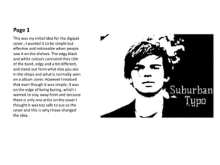
1. Page 1
This was my initial idea for the digipak
cover , I wanted it to be simple but
effective and noticeable when people
saw it on the shelves. The edgy black
and white colours connoted they title
of the band, edgy and a bit different,
and stand out form what else you see
in the shops and what is normally seen
on a album cover. However I realised
that even though it was simple, it was
on the edge of being boring, which I
wanted to stay away from and because
there is only one artist on the cover I
thought it was too safe to sue as the
cover and this is why I have changed
the idea.
2. New Page 1
This is the new page 1. Although I have
kept the images in black and white to
keep it simple but effective I have kept
the logo in colour so that it is easy to
see and to stands out s that when you
are buying the album, you see the
name of the band first. The front page
shows all of the band members,
showing them being relaxed and
funny, connecting with the audience
so that they feel as if they are also
normal even though they are in a
band. This front page really shows the
type of people in the band, their
personalities and that they have a silly
side as well!
3. Page 2
This is the inside page of the album,
again a simple design but really
showing the main singer in the band
so that people know instantly who’s
album it is. It is also a nice image to
have and for the fans is a nice image to
keep of their favourite band! This
again shows his relaxed side which
people may not see when they listen
to only their songs or when they are
performing on stage!
4. Page 3
Page 3 is there the CD is going to sit,
this page has the images of the other
band members, this again was done
with no colour so that even though it
is simple it would be effective and be a
nice image for the fans to have!
This again shows the band in a way
that the audience may have not seen
before, it makes them seem more
relaxed and funny, showing that they
are not always serious and do have fun
and are friends rather than only
singers that sing together and aren't
really friends.
5. Page 4
The Page 4 of my album is different to
the rest of the album because it has
colour! I wanted this to be a surprise
as the audience they looked at the
back of the album, it also gives the
band a different look, rather than a
biut plain and typical of a boy band,
this gives truth to the name of the
band, and shows that they are called
what they are called because they are
different and aren’t like anyone else in
the industry right now.