1. …Induction 3: JUSTIFICATION FOR TV Logo
The TV programme that my logo is for – the
setting, the characters and the type of
storylines the programme might have. My
programme is based on the school life of badly
misbehaved students and teachers who cannot
control them. The show is mainly based in school
however; the storyline can follow the students
home and into their social lives outside of school.
The main characters of the programme will be old
teenagers with maybe a few re occurring younger
teenagers. The type of storylines the programme
might have will usually be to do with the social life
whether its to do with drugs, alcohol, partying etc.
HOW YOU MADE THE LOGO (USE THE
NEW TOOL AND EFFECT TERMS YOU
HAVE LEARNED)
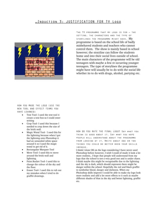
• Text Tool I used the text tool ti
create a text box so I could enter
writing
• Crop Tool I used this because I
needed to crop down the size of
the brick wall.
• Magic Wand Tool I used this for HOW DO YOU RATE THE FINAL LOGO? Say what you
the lightning because when I got think is good about it. Say what you hope
the lightning onto Photoshop it people will understand about the programme
had an unneeded white space from looking at it. Write about one or two
around it so I used the magic things you could do better when your skills
wand to get rid of it. improve.
• Rectangular Marquee Tool I think I done OK on the logo considering I have never used
• Move Tool I used this to move Photoshop before however, I wish I could of made it look a lot
around the brick wall and more realistic,. I hope that people will understand from my
lightning. logo that the school is not a very good one and is under chaos.
• Paint Bucket Tool I used this to I think maybe this might be recognisable due to the lightning
change the colour of the sky and and the sky is dark, which should represent there might be
the floor. danger within the school. Hopefully the red and black graffiti
• Eraser Tool I used this to rub out to symbolise blood, danger and darkness. When my
my mistakes when I tried to do Photoshop skills improve I could be able to make my logo look
graffiti drawings. more realistic and add a lot more effects to it such as maybe
different shades of blue in the sky and better lightning, graffiti
etc.