
Recommended
More Related Content
What's hot
What's hot (20)
Similar to Digipak Analysis
Similar to Digipak Analysis (20)
Recently uploaded
Recently uploaded (20)
Digipak Analysis
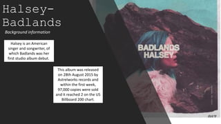
- 1. Halsey- Badlands Background information Halsey is an American singer and songwriter, of which Badlands was her first studio album debut. This album was released on 28th August 2015 by Astrelworks records and within the first week, 97,000 copies were sold and it reached 2 on the US Billboard 200 chart.
- 2. This album is clearly within the indie-pop genre, we can tell the genre as the album cover is kept looking rather simplistic, in the terms that they have stuck to the same colour theme: pink, blue and white. However, whilst simplistic, these colours are bold and light- which give positive connotations. Although, the title of the album connotes to us that the 'Badlands' is her mind, due to the font being written boldly on the top of her head. Similarly to why the artist is positioned in the middle of the album. Which also explains why the front cover is empty- its representing her mind. This metaphor allows the audience to synthetically personalise with the artist and understand the meanings behind the album. Additionally, the bold font allows the name of the album and artist to stand out. However, the colour of the font is a faded white and so it fades into the picture of the artist, which draws more attention to Halsey. The album also has a rugged/distressed look to it around the edges of the album, which follow conventions of the indie-pop genre, where it is a little more edgy than general pop.
- 3. The inside cover features another picture of the front, so they recognise the album from the inside too. The colours are once again blue, pink, white/grey and brown. Meaning the theme has stuck throughout the digipak- sticking to the generic conventions. The disk matches the artists outfit that she is wearing in the front picture, showing that the album is her own and she relates to it. It also looks like it has a description of the album or a message from the artist included in the inside, whereby, Halsey is reaching out to her audience.
- 4. The back cover of this album follows the same theme as the front cover, whereby, the same colours, blue, white and brown are used. This is so you can tell what album it is as they link. The font used is very basic, similar to the font on the front cover. The basic font makes it easier to read for the audience, and it is all written boldly in capital letters, so although it is basic- it will catch the audiences' eyes. The bottom of the album includes information about the record label, including their logo. It mentions the producers of the album, copyright laws and any other important information. These are always seen on the back of album covers. The image on the back cover also has a distressed look to it, where it looks like it has been hand-cut. Which the front cover also has the same distressed/rugged look to it- so once again the album follows the same theme closely. A barcode is also featured at the bottom of the cover, which is conventionally used in every album cover so they can sell in stores.
- 5. Reflection Through analysing this digipak I learnt many different conventional techniques that I can embed into my own digipak. I learnt that to make a digipak visually pleasing for the audience you have to stick to the same sort of theme, and that would contribute to making it more successful.