Empire Magazine Analysis
•Download as PPT, PDF•
0 likes•279 views

Our second Empire Magazine analysis! :)

Recommended
More Related Content
What's hot
What's hot (20)
Similar to Empire Magazine Analysis
Similar to Empire Magazine Analysis (20)
More from Starstruck
Recently uploaded
Recently uploaded (20)
Empire Magazine Analysis
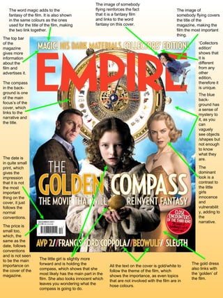
- 1. The date is in quite small print, which gives the impression that it is not the most important thing on the cover, it just follows the normal conventions. The price is small too, which, the same as the date, follows conventions and is not seen to be the main importance on the cover of the magazine. The image of somebody flying reinforces the fact that it is a fantasy film and links to the word fantasy on this cover. The word magic adds to the fantasy of the film. It is also shown in the same colours as the ones used for the title of the film, making the two link together. All the text on the cover is gold/white to follow the theme of the film, which shows the importance, as even topics that are not involved with the film are in hose colours. The compass in the back- ground is one of the main focus’s of the cover, which links to the narrative and the title. The little girl is slightly more forward and is holding the compass, which shows that she most likely has the main part in the film. She also looks innocent which leaves you wondering what the compass is going to do. The dominant look is a contrast to the little girls innocence and vulnerability, adding to the narrative. The image of somebody flying covers the title of the magazine, making the film the most important thing. The gold dress also links with the ‘golden’ of the film. The blue back-ground has a sense of mystery to it, as you can vaguely see objects /shapes but not enough to know what they are. The top bar of the magazine gives more information about the film and advertises it. ‘ Collectors edition’ shows that it is different from any other edition, therefore it is unique.