Bar chart
•Download as PPTX, PDF•
0 likes•18 views

Explicit explanation of IELTS Writing TAsk 1

Recommended
More Related Content
Recently uploaded
Recently uploaded (20)
Featured
Featured (20)
Bar chart
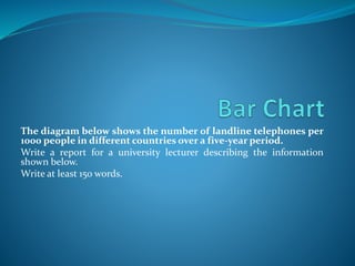
- 1. The diagram below shows the number of landline telephones per 1000 people in different countries over a five-year period. Write a report for a university lecturer describing the information shown below. Write at least 150 words.
- 3. Sample Answer The graph shows the number of telephones owned per thousand of the population in different countries over a five-year period. Overall, the number of phone owners per thousand of the population varied considerably. However, numbers tended to fall in countries with the highest level of phone ownership, whereas numbers generally rose in countries which had fewer phone owners in 2000. By far the highest level of phone ownership was in Singapore, where just under 430 people per thousand were owners in 2004. This figure is slightly lower than the 2000 figure of around 460 per thousand. In Brunei Darussalam the second highest levels of phone ownership were recorded, and the numbers fluctuated around the 250 per thousand level across the five years. Countries like Cambodia and Vietnam had much lower levels of phone ownership and these increased up to 2004, rather than decreasing. In the remaining countries, the number of landline phone owners remained below the 100 per thousand level between 2000 and 2004.