
Recommended
More Related Content
Viewers also liked
Viewers also liked (8)
Similar to Pre-production: Colour scheme plans for my magazine
Similar to Pre-production: Colour scheme plans for my magazine (20)
More from Rora412
More from Rora412 (14)
Recently uploaded
Recently uploaded (20)
Pre-production: Colour scheme plans for my magazine
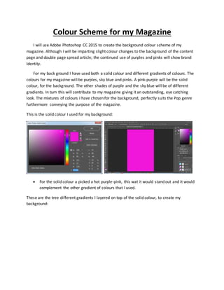
- 1. Colour Scheme for my Magazine I will use Adobe Photoshop CC 2015 to create the background colour scheme of my magazine. Although I will be imparting slight colour changes to the background of the content page and double page spread article; the continued use of purples and pinks will show brand Identity. For my back ground I have used both a solid colour and different gradients of colours. The colours for my magazine will be purples, sky blue and pinks. A pink-purple will be the solid colour, for the background. The other shades of purple and the sky blue will be of different gradients. In turn this will contribute to my magazine giving it an outstanding, eye catching look. The mixtures of colours I have chosen for the background, perfectly suits the Pop genre furthermore conveying the purpose of the magazine. This is the solid colour I used for my background: For the solid colour a picked a hot purple-pink, this wat it would stand out and it would complement the other gradient of colours that I used. These are the tree different gradients I layered on top of the solid colour, to create my background:
- 2. First I layered the darker colour of purple in the middle of the page. Then I layered the lighter purple colour at the top of the page. Lastly I layered the blue colour at the bottom of the page. I did this making sure that also the pink could be seen.
- 3. The rest of my magazine will have a similar colour scheme to the front cover. The different between the rest of my magazine and my front cover is that: the rest of my magazine will not have blue and the dark purple in the background. It will only be a mixture of purples and pink. I will not be changing the colour scheme of my magazine. Additionally the background will contrast with my images allowing them to stand out, making my magazine more noticeable to my audience.