
Recommended
More Related Content
What's hot
What's hot (20)
Viewers also liked
Viewers also liked (12)
Similar to Question One
Similar to Question One (20)
Recently uploaded
Recently uploaded (20)
Question One
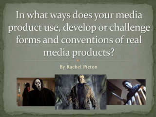
- 2. Throughout our film we use common conventions found with horror/teen slasher films. Our plot line also stands by these conventions. In our film we have a female character called Jess who is being chased by some unknown masked figure. Using dramatic irony the audience already know who the killer is as that is revealed at the end of the starting scene which could be seen to slip from convention in the case of similar films such as Scream as you don’t know the killer until the end as a way to build on tension and have a climatic ending. Although many teen slasher films do give you an idea at least of who the masked killer is, such is the case with Friday The 13th and Halloween.
- 3. As our credits start almost immediately there is not much to say in reference to before them except for the decaying hand that falls into shot with our production logo. This sets up the idea of the film being about someone being killed and also makes the film non-linear as it then jumps back a month or so as a way of telling what has happened up to this point.
- 4. Below: 00:03 Below: 00:43 Above: 01:55 I think the best parts of the film that are similar to the genre they represent are scenes such as the decaying hand, scared character in the woods and the weapon being shown. Clips shown at approximate time of being saved.
- 5. For our film’s sound we have used short sound clips of sharp, high pitched metallic music. This has connotations with horror as it is representative of metal weapons such as knives being dragged along other solid objects. Also the noise tends to be rather eerie too as it is only sort and rather quiet though with how high pitched it is in can hurt your ears whilst listening to it making your ears feel like they may be bleeding with adds to horrific atmosphere of the film.
- 6. The main connection to horror our Mise-en-scene has is the woods that Jess walks through at the start of the sequence, woods have always had a large place in horror history due to their eerie appearance and atmosphere. With one character being the killer we also have a slight costume change during the sequence when the killer has to hide the gasmask which hides her identity and black jacket and swap it for a larger winter coat, this has been used before in other films to make it seem has though a certain character has nothing to do with the murders.
- 7. The title of our film is written in red which has connotations with danger. When seen the title appears to flicker and twitch which can also be connected to horror as it has a rather unnerving and uncertain quality to it. Our production company logo sticks with horror conventions with the “Amicus” being written in dripping blood letters.
- 8. Our iconography includes the use of a weapon for the killing, in our case it’s a kitchen knife that is seen at the end of our opening sequence like the use of a knife in Scream. Also the gasmask which is used to cover the killers face and hide their identity in a similar way to Slasher films such as Friday The 13th and Halloween.