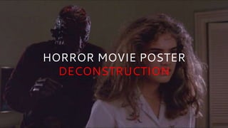
2. HORROR MOVIE POSTER
DECONSTRUCTION
Before watching a horror film people tend to judge it by
it’s trailer, but also by it’s movie poster. With it being the
first visual representation of the entire movie that is not in
moving picture, creators must design posters that tells the
film’s story in a picture(s) and a few words, as well as
trying to fright the viewer.
Here are a few movie posters from different decades to
show how creators have done this in their time periods.
3. FRIDAY THE 13TH (1980)
Text’s use of “...” for effective
pauses to catch the viewer’s
attention as well as using the Rule
of 3 as a catchy lead up to the final
line that includes the movie’s title;
the use of the word “they” makes
the viewer wonder who the text is
talking about, and what they were
warned about/why they are doomed.
Knives and blood represents danger
as well as death; the blood dripping
from the knife down to the movie
title indicates that this idea of danger,
pain and death is marked on the date of
Friday The 13th, linking to the historical
belief that this date marks bad luck in
western superstition.
The image is very interesting with the
location of the movie presented as well
as featuring the characters inside a
silhouette of the villain, the contrast
in size shows the power of the villain
since he is much greater; his lack of
detail makes the viewer fearful of the
unknown and his larger-scale
positioning on the poster indicates that
he is watching over the characters,
making them look clueless and helpless
against the villain. The glow behind the
villain could represent daylight (safety,
holiness) since the location is shown in
the nighttime, therefore the villain
(danger, evil) is in the way of the
characters’ safety and they will have to
get passed him to survive.
Red is the colour of fire and blood, and is
linked with energy, power, strength and
war.The fact that only the villain’s knife
possesses this colour shows that he has
the advantage over the other characters; the
blood from the knife dripping onto the “13”
could represent that this aspect of energy and
is unleashed on this unlucky date and perhaps
that the villain is most powerful on this day.
Red is also linked with love & passion which
proves that this colour is very emotionally
intense; it increases respiration rate and
raises blood pressure which could indicate the
movie is very dramatic and induces fear &
panic. The red theme continues to the quote
underneath which links the “terror” to the
13th and the knife; all of this red is also the
brightest use of colour on the poster,
making it one of, if not, the first thing the
viewer will be drawn to.
4. THE BLAIR WITCH
PROJECT (1999)
Top of the poster sets the movie’s
location; the ratio of the gradient is
heavily uneven with the black presenting
darkness, sadness and the unknown
(common fear in horror movies) and
consuming almost all light which
represents purity and safety; darkness &
light have long been opposing forces,
contrasting the good & evil, love & hate
or happiness & despair like the Yin Yang.
Common narrative in horror movies are
real events and a plot that is based on a
true story like this statement which talks
about the backstory of the film; this
method is used to scare the viewer even
more as movies, that are usually fictional,
become reality.
Use of the word “witch” can indicate
darkness, chaos and conflict as they do in
the famous story of Macbeth; during the
Burning Times of Europe witches were
seen as evil doers and therefore are
negative. The word “project” shows that
the characters had a particular aim,
however the statement above indicates
that something went wrong as the
characters took a “chance”.
The untidy design of this icon creates
the impression of sign for something
like a ritual which would link to the
witch aspect; the small use of red
causes the viewer to see it immediately
and as a significant icon in the movie as
well representing it as evil and
dangerous.
The image of the character links to the
statement above it as the uneven
lighting on their face can tell us it was
shot on a camera which links to the
handheld camera characteristic to the
film. The uneven lighting on the face also
relates to the consumption of safety and
light at the top of the poster; the
character’s face also looks shocked &/or
scared, sending the emotion of fear for
the viewer to feel.
A lot of the poster filled with black
negative space to represent darkness,
signifying a symbol of mystery (the
unknown) and fear, the viewer will be
forced to imagine possible dangers
awaiting in this darkness.