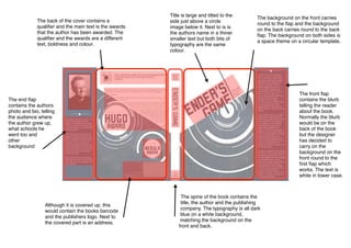
1. Title is large and tilted to the
side just above a circle
image below it. Next to is is
the authors name in a thiner
smaller text but both bits of
typography are the same
colour.
The back of the cover contains a
qualifier and the main text is the awards
that the author has been awarded. The
qualifier and the awards are a different
text, boldness and colour.
The end flap
contains the authors
photo and bio, telling
the audience where
the author grew up,
what schools he
went too and
other
background
Although it is covered up, this
would contain the books barcode
and the publishers logo. Next to
the covered part is an address.
The spine of the book contains the
title, the author and the publishing
company. The typography is all dark
blue on a white background,
matching the background on the
front and back.
The front flap
contains the blurb
telling the reader
about the book.
Normally the blurb
would be on the
back of the book
but the designer
has decided to
carry on the
background on the
front round to the
first flap which
works. The text is
white in lower case.
The background on the front carries
round to the flap and the background
on the back carries round to the back
flap. The background on both sides is
a space theme on a circular template.