1. Poster Analysed
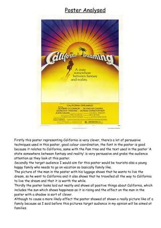
Firstly this poster representing California is very clever, there’s a lot of persuasive
techniques used in this poster, good colour coordination, the font in the poster is good
because it relates to California, same with the Pam tree and the text used in the poster ‘A
state somewhere between fantasy and reality’ is very persuasive and grabs the audience
attention as they look at this poster.
Secondly the target audience I would aim for this poster would be tourists also a young
happy family who needs to go on vacation so basically family like.
The picture of the man in the poster with his luggage shows that he wants to live the
dream, so he went to California and it also shows that he travelled all the way to California
to live the dream and that it is worth the while.
Thirdly the poster looks laid out neatly and shows all positive things about California, which
includes the sun which shows happiness as it is rising and the effect on the man in the
poster with a shadow is sort of clever.
Although to cause a more likely effect the poster showed of shown a really picture like of a
family because as I said before this pictures target audience in my opinion will be aimed at
families.