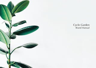
2. Introduction
As we start being more conscious about ourselves and our
health, we have also been more and more aware of our
surroundings and the health of our planet. A lot of countries
are starting to invest a lot of money and time to switch to
renewable energy as well as find alternatives to waste disposal.
The Cycle Garden is a place for people of all ages to gather
and build the future together. A small future, but definitely a
step in the right direction.
The Cycle Garden brings livelihood to a community, as well as
fresh produce and an eco-friendly way to dispose of garbage.
The brand identity should fit this goal and provide the right
colours and type to create the perfect environment for the
Cycle Garden
5. Typography
Brandon Grotesque Thin
A B C D E F G H I J K L M N O P Q R S T U V W X Y Z
a b c d e f g h i j k l m n o p q r s t u v w x y z
1 2 3 4 5 6 7 8 9 0
6. Typography
DejaVu Sans ExtraLight
A B C D E F G H I J K L M N O P Q R S T U V W X Y Z
a b c d e f g h i j k l m n o p q r s t u v w x y z
1 2 3 4 5 6 7 8 9 0
7. Colour System
After having studied and researched the different components and moods of
gardens and plants, the image board seemed to have certain reccuring colours
and combinations.
The colours follow the different natural greens that can be found in a garden and
in natural environments.