Developing double page spread
•Download as PPTX, PDF•
0 likes•144 views
This document discusses developing a double page spread for a documentary. It notes that the current left page looks too much like an advertisement and does not incorporate the author's research on similar spreads. The author proposes redesigning the spread to have a presenter image in the center with a black and white branding image covering the entire double page that matches the film's theme and uses symbolic elements to represent its message. A tagline and sentence are also recommended to better explain and promote the documentary.
Report
Share
Report
Share

Recommended
More Related Content
What's hot (7)
Similar to Developing double page spread
Similar to Developing double page spread (20)
How effective is the combination of my main and ancillary products
How effective is the combination of my main and ancillary products
How effective is the combination of your main product and ancillary texts?
How effective is the combination of your main product and ancillary texts?
Evaluation how my documentary and ancillary tasks link
Evaluation how my documentary and ancillary tasks link
Evaluation how my documentary and ancillary tasks link new
Evaluation how my documentary and ancillary tasks link new
Recently uploaded
Deira Call Girls # 0588312479 # Call Girls In Deira Dubai ~ (UAE)
Dubai #Call #girls service Dubai #Call #girl services #Call #girl service in dubai
Dubai #Call #girl agency Dubai #Call #girls agency
Verified #Call #girls dubai correct motivation is required. Her smile enlarges as if she were Young #Call #girls in dubai
Marina #Call #girls Dubai marina #Call #girls Jumeirah #Call #girls
Dubai Jumeirah #Call #girls Bur dubai #Call #girls Indian #Call #girls in bur dubai
#Call #girls bur dubai hiding a tremendous secret. Al qusais #Call #girls
Al nahda dubai #Call #girls Independent #Call #girls dubai Independent #Call #girl dubai Russian #Call #girls in dubai Dubai russian #Call #girls Young #Call #girls in dubai Dubai young #Call #girls
#Call #girls numbers in dubai How about leaving your father's home, being wealthy, and being able to help your sister? Even though I know what she is going to say won't be good, my ears are ringing. To have this chat, I waited until Dubai #Call #girls number
#Call #girls near me dubai #Call #girls near my hotel Cute #Call #girls in dubai Model #Call #girl in dubai
Rent a girlfriend dubai you were eighteen years old. Do you understand what I do, Eden? Since I have no idea, I shake my head and my mind races. She must be some kind of successful businesswoman, I suppose. "I own a business. Do you recognize that? Knowing my best.
She left. She said that Dad told her that Dubai #Call #girls #Call #girls dubai #Call #girls in dubai #Call #girls at dubai we didn’t need her anymore when he came home. I was sad.Dubai #Call #girl #Call #girl dubai #Call #girl in dubai Indian #Call #girls dubai Indian #Call #girl dubai
Can you tell her to come back? I like her.” Her little face is Pakistan #Call #girls in dubai Pakistani #Call #girl dubai Dubai #Call #girls service Dubai #Call #girl services all pinched. So sweet. #Call #girl service in dubai Dubai #Call #girl agency Dubai #Call #girls agency Verified #Call #girls dubai But I'm pissed off. How can he Young #Call #girls in dubai Marina #Call #girls Dubai marina #Call #girls Jumeirah #Call #girls Dubai Jumeirah #Call #girls Bur dubai #Call #girls Indian #Call #girls in bur dubai #Call #girls bur dubai turn down someone I'm paying for?
“So, who's here with you?” I ask her,Al qusais #Call #girls Al nahda dubai #Call #girls Independent #Call #girls dubai Independent #Call #girl dubai Russian #Call #girls in dubai Dubai russian #Call #girls fervently hoping she wasn’t here alone.
“Dad's downstairs, I think Young #Call #girls in dubai Dubai young #Call #girls #Call #girls numbers in dubai Dubai #Call #girls number #Call #girls near me dubai #Call #girls near my hotel Cute #Call #girls in dubai Model #Call #girl in dubai Rent a girlfriend dubai. Foxy sent you some chicken fingers, fries, and apple pie.”
Finally, anyone else would feel Dubai #Call #girls #Call #girls dubai #Call #girls in dubai #Call #girls at dubai Dubai #Call #girl #Call #girl dubai #Call #girl in dubaiDeira Call Girls # 0588312479 # Call Girls In Deira Dubai ~ (UAE)
Deira Call Girls # 0588312479 # Call Girls In Deira Dubai ~ (UAE)Business Bay Call Girls || 0529877582 || Call Girls Service in Business Bay Dubai
Dubai Call Girl Number # 00971588312479 # Call Girl Number In Dubai # (UAE)
Marina Call girls Dubai marina Call girls Jumeirah Call girls
Dubai Jumeirah Call girls Bur dubai Call girls Indian Call girls in bur dubai
Call girls bur dubai hiding a tremendous secret. Al qusais Call girls
Al nahda dubai Call girls Independent Call girls dubai Independent Call girl dubai Russian Call girls in dubai Dubai russian Call girls Young Call girls in dubai Dubai young Call girls
Call girls numbers in dubai How about leaving your father's home, being wealthy, and being able to help your sister? Even though I know what she is going to say won't be good, my ears are ringing. To have this chat, I waited until Dubai Call girls number
Call girls near me dubai Call girls near my hotel Cute Call girls in dubai Model Call girl in dubai
Rent a girlfriend dubai you were eighteen years old. Do you understand what I do, Eden? Since I have no idea, I shake my head and my mind races. She must be some kind of successful businesswoman, I suppose. "I own a business. Do you recognize that? Knowing my best.
She left. She said that Dad told her that Dubai Call girls Call girls dubai Call girls in dubai Call girls at dubai we didn’t need her anymore when he came home. I was sad.Dubai Call girl Call girl dubai Call girl in dubai Indian Call girls dubai Indian Call girl dubai
Can you tell her to come back? I like her.” Her little face is Pakistan Call girls in dubai Pakistani Call girl dubai Dubai Call girls service Dubai Call girl services all pinched. So sweet. Call girl service in dubai Dubai Call girl agency Dubai Call girls agency Verified Call girls dubai But I'm pissed off. How can he Young Call girls in dubai Marina Call girls Dubai marina Call girls Jumeirah Call girls Dubai Jumeirah Call girls Bur dubai Call girls Indian Call girls in bur dubai Call girls bur dubai turn down someone I'm paying for?
“So, who's here with you?” I ask her,Al qusais Call girls Al nahda dubai Call girls Independent Call girls dubai Independent Call girl dubai Russian Call girls in dubai Dubai russian Call girls fervently hoping she wasn’t here alone.
“Dad's downstairs, I think Young Call girls in dubai Dubai young Call girls Call girls numbers in dubai Dubai Call girls number Call girls near me dubai Call girls near my hotel Cute Call girls in dubai Model Call girl in dubai Rent a girlfriend dubai. Foxy sent you some chicken fingers, fries, and apple pie.”
Finally, anyone else would feel Dubai Call girls Call girls dubai Call girls in dubai Call girls at dubai Dubai Call girl Call girl dubai Call girl in dubai Indian Call girls depressed working as a housekeeper, but it’s not that bad. dubai Indian Call girl dubai Pakistan Call girls in dubai Pakistani Call girl dubai Dubai Call girls service Dubai Call girl services Call girl service in dubai Dubai Call girl agency Dubai Call girls agency Verified Call girls dubai Young Call girls in dubai Marina Call girls, For one thing, Dubai Call Girl Number # 00971588312479 # Call Girl Number In Dubai # (UAE)
Dubai Call Girl Number # 00971588312479 # Call Girl Number In Dubai # (UAE)Business Bay Call Girls || 0529877582 || Call Girls Service in Business Bay Dubai
Call Girl Dehradun Indira Call Now: 8617697112 Dehradun Escorts Booking Contact Details WhatsApp Chat: +91-8617697112 Dehradun Escort Service includes providing maximum physical satisfaction to their clients as well as engaging conversation that keeps your time enjoyable and entertaining. Plus they look fabulously elegant; making an impressionable. Independent Escorts Dehradun understands the value of confidentiality and discretion - they will go the extra mile to meet your needs. Simply contact them via text messaging or through their online profiles; they'd be more than delighted to accommodate any request or arrange a romantic date or fun-filled night together. We provide –(INDIRA) Call Girl Dehradun Call Now 8617697112 Dehradun Escorts 24x7
(INDIRA) Call Girl Dehradun Call Now 8617697112 Dehradun Escorts 24x7Call Girls in Nagpur High Profile Call Girls
Recently uploaded (20)
Jeremy Casson - Top Tips for Pottery Wheel Throwing
Jeremy Casson - Top Tips for Pottery Wheel Throwing
FULL NIGHT — 9999894380 Call Girls In Najafgarh | Delhi
FULL NIGHT — 9999894380 Call Girls In Najafgarh | Delhi
Deira Call Girls # 0588312479 # Call Girls In Deira Dubai ~ (UAE)
Deira Call Girls # 0588312479 # Call Girls In Deira Dubai ~ (UAE)
Bobbie goods coloring book 81 pag_240127_163802.pdf
Bobbie goods coloring book 81 pag_240127_163802.pdf
FULL NIGHT — 9999894380 Call Girls In Patel Nagar | Delhi
FULL NIGHT — 9999894380 Call Girls In Patel Nagar | Delhi
Jeremy Casson - How Painstaking Restoration Has Revealed the Beauty of an Imp...
Jeremy Casson - How Painstaking Restoration Has Revealed the Beauty of an Imp...
Deconstructing Gendered Language; Feminist World-Making 2024
Deconstructing Gendered Language; Feminist World-Making 2024
Call Girls Ludhiana Just Call 98765-12871 Top Class Call Girl Service Available
Call Girls Ludhiana Just Call 98765-12871 Top Class Call Girl Service Available
Admirable # 00971529501107 # Call Girls at dubai by Dubai Call Girl
Admirable # 00971529501107 # Call Girls at dubai by Dubai Call Girl
FULL NIGHT — 9999894380 Call Girls In Delhi | Delhi
FULL NIGHT — 9999894380 Call Girls In Delhi | Delhi
FULL NIGHT — 9999894380 Call Girls In Delhi Cantt | Delhi
FULL NIGHT — 9999894380 Call Girls In Delhi Cantt | Delhi
Authentic # 00971556872006 # Hot Call Girls Service in Dubai By International...
Authentic # 00971556872006 # Hot Call Girls Service in Dubai By International...
FULL NIGHT — 9999894380 Call Girls In Shivaji Enclave | Delhi
FULL NIGHT — 9999894380 Call Girls In Shivaji Enclave | Delhi
FULL NIGHT — 9999894380 Call Girls In New Ashok Nagar | Delhi
FULL NIGHT — 9999894380 Call Girls In New Ashok Nagar | Delhi
Call Girl Service In Dubai #$# O56521286O #$# Dubai Call Girls
Call Girl Service In Dubai #$# O56521286O #$# Dubai Call Girls
Moradabad Call Girls - 📞 8617697112 🔝 Top Class Call Girls Service Available
Moradabad Call Girls - 📞 8617697112 🔝 Top Class Call Girls Service Available
Dubai Call Girl Number # 00971588312479 # Call Girl Number In Dubai # (UAE)
Dubai Call Girl Number # 00971588312479 # Call Girl Number In Dubai # (UAE)
FULL NIGHT — 9999894380 Call Girls In Mahipalpur | Delhi
FULL NIGHT — 9999894380 Call Girls In Mahipalpur | Delhi
(INDIRA) Call Girl Dehradun Call Now 8617697112 Dehradun Escorts 24x7
(INDIRA) Call Girl Dehradun Call Now 8617697112 Dehradun Escorts 24x7
FULL NIGHT — 9999894380 Call Girls In Badarpur | Delhi
FULL NIGHT — 9999894380 Call Girls In Badarpur | Delhi
Developing double page spread
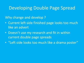
- 1. Developing Double Page Spread Why change and develop ? Current left side finished page looks too much like an advert Doesn’t use my research and fit in within current double page spreads “Left side looks too much like a drama poster”
- 2. Warm toxic colours Presenter in the middle – visually seen first Dead space for tv channel logo Image covers whole double page spread move in keeping with double pages i’ve research ‘DANCING ON ICE’
- 3. Tag line in explain in a sentence the documentary
- 4. Branding image – matches film , making it more visually recognisable to audience. Use of black and white = right / wrong in society. Halo glow off the black which could symbolise the good teens surrounding the bad. Shall alter advert with new brand title
- 5. Same font as on advert once again branding. Sentence to pull in reader and interest them.