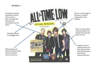
1. Analysis –
The band are looking
towards the camera
which creates a
direct message that
they want you
personally to buy the
album
The bands name is
in the biggest font
White background
allows the band / bands
names and album
name to stand out
There is a small image of
the album to make it
recognisable to the
audience
There are other album
recommendations for
people that enjoy that
genre of music
Website to let the
audience keep up to
date with any news
to do with the band
and let them
interact with them
2. Analysis –
Reviews from big
magazine companies
to attract people that
listen to the same type
of music
Website for more details
about the album
‘Special edition’ makes it
sound unique and
‘collectors edition’
makes it sound as
though only the biggest
fans would have it
Union Jack colours used to
show patriotism of Britain
Extras included to make the
audience know what they
would be missing out on
Re-mastered album
tells us that it’s even
better than before
3. Analysis –
Hardly any information
is used which makes
the audience to want
more
The four images of the
members of the band
give them their own
identity
Review by NME, a top
magazine company, to
attract NME’s audience
Acoustic instruments
show they are an
acoustic band
The three most
popular songs that
were released are
included to draw their
audience in and people
that liked those
particular songs
Light colouring of the
font and a dark
background makes the
images and writing
stand out