Z Score,T Score, Percential Rank and Box Plot Graph
Evaluation
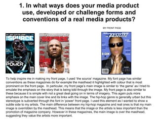
1. 1. In what ways does your media product use, developed or challenge forms and conventions of a real media products? To help inspire me in making my front page, I used ‘the source’ magazine. My font page has similar conventions as these magazines do for example the masthead it highlighted with colour that is most prominent on the front page. In particular, my front page’s main image is similar to ‘the game’ as I tried to emulate the emphasis on the story that is being told through the image. My front page is also similar to these because it is simple with not a great deal going on in terms of imagery. This again puts more emphasis on the main cover line and its links with the image. The hip-hop genre is generally urban but this stereotype is subverted through the font in ‘power’ front page. I used this element as I wanted to show a subtle side to my artists. The main difference between my hip-hop magazine and real ones is that my main image is overridden by the masthead. This means that the image or the artists is less important than the promotion of magazine company. However in these magazines, the main image is over the masthead, suggesting they value the artists more important. MY FRONT PAGE
2. DOUBLE PAGE SPREAD. My double page spread is similar to this real one because they both are relaxed against a wall. Not only this their poise Is paramount in the image because it is as if they are looking towards the text or the main article, displaying a sense of arrogance as it is ‘all about them’. Like the real double page spread I chose to take away the jewellery that was present in the front and contents page. This is because I think it shows a more educated subtle side to my artist that I wanted to express throughout the magazine. What I did differently from most hip-hop magazine double-page spreads is that I took away the colour making it black and white. This gives a cool look to the image again, linking in to me subverting the typical view of a hip-hop artist. The colours used (black red and white) are also similar to the double-page spread I emulated in order to get the best possible outcome in terms of the way I wanted my artists to be represented. MY SOUBLE-PAGE SPREAD
3. CONTENTS PAGE Once again I chose to use ‘the source’ magazine as the basis of which my contents page should follow. My contents page is similar to the one on the right as it has the ‘features’ going along the side of the page. My contents page is also similar to the one on the left as the focal point of the page is the image of ‘kanye’. However my magazine is predominantly different to these because I thought to do a contents page like this could be too simple. This is my reasoning for having more than one image, displaying a number of different events with a editorial as well. However I still stuck to the main fundamentals that all the top hip-hop magazines use and that is maintaining the font shown on the front page through to the contents page. MY CONTENTS PAGE
4. 2. How does your media product represent particular social groups? In my music magazine the stereotype of young people is subverted. This is because they are usually seen as lazy however, in my magazine the teenagers are represented as hard working and educated whilst at the same time, being fun and spontaneous. However in my main article I managed to fit in personality, with my artist using colloquial language such as ‘thang’ and ‘ain’. I also wanted to show the ambition that young people possess through my artist in the magazine. Over all I wanted to show that young people can be ambitious and focused as well as still being young and fun. The media institution I might let distribute my product is IPC media. This institution has a huge amount of other types of media which include video, magazine and newspapers like ‘The Sun’ and ‘Metro’ . I would chose this institution to distribute my media product because of their high level of experience in promoting and advertising to main stream audiences. I have a media product that caters to main stream audience through radio stations that IPC media own like astral media radio station and NME radio (which my audience will listen to) and newspapers they read like tabloid newspapers instead of broadsheet newspapers like ‘the guardian’ . The audience would already be familiar with this company and because the radio station and newspapers are good then these stand out connotation will be linked in to the music magazine. My music magazine also fits in with the history of magazines the IPC media have worked with. As IPC media generally have products that my audience listen to; they would know ho to promote my product as they have the same market segment. This is mainly why I chose IPC media as my media institution to distribute my product instead of one of the smaller, independent institutions like GMG because they may not know how to target my audience, especially because my product is for the main stream and GMG cater for niche audiences. 3. What kind of media institution might distribute your media product?
5.
6. 6. What have you learnt about technologies from the process of constructing this product? During the construction of this product I have learned the following: 1. I used adobe audition for the interview and review of my survey. 2. I used PowerPoint in order to conduct and plan my conclusion and evaluation. 3. I used blogger as a way of showing my course work . 4. I used slide share as a way of showing my evaluation, i haven't used this before and it was a good and new experience. 5. I used adobe Photoshop in order to design and produce my media product, with new skills to be more accurate such as “air brushing” and “pen tool”.
8. 7 . Looking back at your preliminary task, what do you feel you have learnt in the progression from it to the full product? preliminary task: music magazine: when comparing my preliminary task to my actual product, it is very evident that i have progressed.