
Recommended
More Related Content
Similar to graphs G1 Topic 1..pptx
Similar to graphs G1 Topic 1..pptx (20)
Recently uploaded
Recently uploaded (20)
graphs G1 Topic 1..pptx
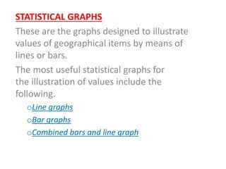
- 1. STATISTICAL GRAPHS These are the graphs designed to illustrate values of geographical items by means of lines or bars. The most useful statistical graphs for the illustration of values include the following. oLine graphs oBar graphs oCombined bars and line graph
- 2. LINE GRAPHS These are the graphs which use line (s) to illustrate the values of items to give quantitative analysis. Any line graph has two axes of the following:- -X – axis; This is also known as the base or horizontal axis. It is used principally to show the value of independent variable like date or places. -Y – axis: This is also known as the vertical axis. It is used show the values for the dependent variable of like output of crops, minerals etc.
- 4. • TYPES OF LINE GRAPHS • Simple line graph • Cumulative line graph • Divergent line graph • Group line graph • Compound line graph
- 5. • Simple line graph • It is a form of line graph, designed to have one line to illustrate the values of one item in relation to dependent and independent variables. i.e. It is designed to show the values of one item per varied date or places.
- 6. • CONSTRUCTION OF THE SIMPLE LINE GRAPH • Consider the given hypothetical data below showing maize production for country X in 0,000 metric tons (1990 – 1995).
- 7. YEAR PRODUCTION 1990 100 1991 250 1992 300 1993 150 1994 500 1995 400
- 8. • Procedure • (a) Variables identification • Dependent variable ….. production values • Independent variable ….. Date (Years). • Y – axis …… production values • X – axis ……. Years
- 9. • (b) Vertical and horizontal scales estimation Hence; VS is 1 cm to 50000 tons. Horizontal scale is up on decision Hence; 1cm represents 1 year
- 10. MAIZE PRODUCTION FOR COUNTRY X IN (0,000) Metric tons
- 11. • Scales: • VS: 1 cm to 50 tons • HS: 1cm to 1 year • Source: • Hypothetical data
- 12. • Strengths of the simple line graph • It is much easier to prepare as it involves to complicated mathematical works, and also a single line establishes the graph. • From the graph, the absolute values are extracted • It is comparatively easier to read and interpret the values • It has perfect replacement by simple bar graph • Setbacks of the simple line graph • It is a limited graphical method as only suited to represent the value for one item. • Sometimes it becomes difficult to assess the vertical scale if the variation between the highest and lowest values appear wider enough.
- 13. • Cumulative line graph • It is a form of line graph designed to show the accumulated total values at various dates or possibly places for a single item. This graphical method has no alternative graphical bar method as it can be compared to other linear graphical methods.
- 14. • Construction of the cumulative line graph • Consider the given hypothetical data below showing maize production for country X.
- 15. YEAR PRODUCTION 1990 50 1991 40 1992 90 1993 100 1994 90 1995 130
- 16. • Procedure • (a) Variables identification • Dependent variable ……….. production values • Independent variable —- Date (Years) • Y – axis ………. Production values • X – axis …………Years
- 17. • (b) Vertical and horizontal scales estimation (c) Determination of the cumulative values.
- 18. YEAR PRODUCTION CUM VALUES 1990 50 50 1991 40 90 1992 90 180 1993 100 280 1994 90 370 1995 130 500
- 19. Hence: VS; 1cm represents 50 tons Thus; the cumulative lien graph appears as follow. Cumulative line graph: Maize production for country X.
- 21. • SCALE:- • VS….. 1cm represents 50 tons • HS ….. 1cm represents 1 year • Source ….. Hypothetical data.
- 22. • Merits of the cumulative line graph • The graphical method shows cumulative values • From the graph the values can be revealed and quantitatively analyzed • Setbacks of the cumulative line graph • The graphical method is not suited to show cumulative values for more than one item, it is thus; the graphical method limited for showing the values of a single item. • It needs high skill to reveal the actual values of the item represented • It has no alternative graphical bar method
- 23. • Divergent line graph • It is a form of line graph designed to illustrate the increase and decrease of the distribution values in relation to the mean. The graph is designed to have upper and lower sections showing positive and negative values respectively. • The two portions are separated by the steady line graduated with zero value along the vertical line. The steady line also shows the average of all values.
- 24. • Construction of the divergent line graph • Consider the following tabled data which show export values of coffee for country X in millions of dollars
- 25. YEAR EXPORT VALUES (000,000 dollars) 1952 345 1953 256.5 1954 283 1955 500 1956 335 1957 330.5
- 26. • (a) Variables identification • Dependent variable ……….. Export values • Independent variable —- Date (Years) • Y – axis ………. Export values • X – axis …………Years
- 27. • (b) Computation of the arithmetic mean
- 28. • 345 + 256 + 283 + 300 + 335 + 330.5 = 1850 • Then;
- 29. • Computation of the deviation values 1952 345-308 = 37 1953 256.5 – 308 = 52.5 1954 283-308 = -25 1955 300 – 308 = -8 1956 335 – 308 = 27 1957 330.5 – 308 = 22.5
- 30. • (c) Estimation of the vertical scale.
- 31. • Thus: the vertical scale • 1cm represents 15 or -15 million dollars • (d) The graph has to be redrawn accordingly as follows:- • Source:- • Hypothetical data • Scales:- • Vertical scale 1cm represents 15 or 15 tons • Horizontal scale 1cm represents 1 year
- 32. • Merits of the divergent line graph • The graphical method is useful for showing increase and decrease of the values. • The graphical method shows the average of all values • It has perfect replacement by divergent bar graph
- 33. • Setbacks of the divergent line graph • The graphical method is not suited to show the increase and decrease values for more than one items, it is thus; the graphical method is limited to a single item. • It needs high skill to reveal the actual values of the item represented. • It is time consuming graphical method as its preparation involves a lot of mathematical works. • It requires high skill to construct the divergent line graph.
- 34. • Group line graph • It is a form of statistical line graph designed to have more than one lines of varied textures to illustrate the values of more than one items. Group line graph is alternatively known as composite, comparative, and multiple line graph.
- 35. • Construction of the group line graph • Consider the given data below showing values of export crops from Kenya (Ksh Million).
- 36. Crop/Yea r 1997 1998 1999 2000 2001 Tea 24,126 32,971 33,065 35150 34,448 Coffee 16,856 12,817 12,029 11,707 7,460 Horticultur e 13,752 14,938 17,641 21,216 19,846 Tobacco 1,725 1,607 1,554 2,167 2,887
- 37. • (a) Variables identification • Dependent variable …… export values • Independent variable …. Date (years) • Y – -axis………. export values • X – axis………..Years
- 38. • (b) Verticals identification • Dependent variable……..export values • Independent variable …… Date (Years)
- 40. • Hence; VS 1cm represents 5000 export value • Thus; the group line graph appears as follows:- • KENYA: CROPS EXPORT VALUES
- 41. • Scales:- • Vertical scale: 1cm to 5,000 export values • Source: Kenya Economic Survey 1969
- 42. • Strengths of the group line graph • It is much easier to prepare as it involves no complicated mathematical works • It is useful graphical method for showing the values of more than one cases. • From the graph, the absolute values are extracted as the values directly shown • It is comparatively easier to read and interpret the values. • It has perfect replacement by group bar graph.
- 43. • Setbacks of the group line graph • Some times; it becomes difficult to assess the vertical scale if the variation between the highest and lowest values appears wider enough • Crossing of the lines on the graph may confuse the interpreter. • A problem may arise in the selection of the varied line textures.
- 44. • Compound line graph • It is a line graph designed to have more than one lines compounded to one another by varied shade textures to show the cumulative values of more than one items. • Construction of the compound line graph • Consider the given data below showing cocoa production for the Ghana provinces in 000 tons.
- 45. YEAR/PROV TV TogolandE. province W. province Ashanti 1947/48 40 40 30 35 1948/49 50 60 45 100 1949/50 45 46 89 110 1950/51 45 47 44 124 1951/52 47 23 50 100 1952/53 51 14 57 118
- 46. • Procedure • (a) Variables identification • Dependent variable…… export values • Independent variable ….. Date (Years) • Y – -axis……….export values • X – axis………..Years
- 47. • (b) Cumulative values determination for the dates. • 1947/48 40+40+30+35 = 145 • 1948/49 50+60+45+100 = 225 • 1949/50 45+46+89+110 = 290 • 1950/51 45+47+44+124 = 260 • 1951/52 47+23+50+100 = 220 • 1952/53 51+14+57+118= 240
- 48. • (c) Vertical and horizontal scales determination
- 49. • Hence; The vertical scale, 1cm represent 50 tons • Thus the graph appear as follow:-
- 51. • Strengths of the compound line graph • It is useful graphical method for showing the cumulative values of more than one case. • Depending on the skill the interpreter has, from the graph, the absolute values are extracted as the value directly shown. • It has perfect replacement by compound bar graph • It is comparatively easier to assess the vertical scale to be used. • Setbacks of the compound line graph • It needs high skill to interpret the graph • It needs high skill to construct the graph • A problem may arise in the selection of the varied line textures.
- 52. • BAR GRAPHS • These are the graphs which use bars to illustrate the values of items to give quantitative analysis. Any bar graph has two axes • -X-axis; This is also known as the base or horizontal axis. It is used principally to show the values of independent variable like date or places. • – Y – axis; This is also known as the vertical axis. It is used show the values for the dependent variable of like output of crops, minerals etc.
- 53. • TYPES OF BAR GRAPHS • Like line graphs, bar graphs are also extremely varied as differently designed to meet varied functions. With respect to this consideration, bar graphs categorized into the following:- • Simple bar graph • Divergent bar graph • Group bar graph • Compound bar graph • Percentage bar graph • Population pyramid
- 54. • Simple bar graph • It is a form of bar graph, designed to have bars of similar texture to illustrate the values of one item in relation to dependent and independent variables. i.e. It is designed to show the values of one item per varied date or places. • Construction of the simple bar graph • Consider the given data below showing cocoa purchase by areas, in 000 metric tons (1953)
- 55. Province Purchase Ashanti 104 W-Province 39 E-Province 45 TV Togo land 22
- 56. • Procedures • (a) Variable identification • Dependent variable …… Purchase • Independent variable …. Provinces • Y – -axis………purchase values • X – axis………..Provinces • (b) Verticals identification • Dependent variable……..export values • Independent variable …… Date (Years)
- 58. • Thus; the vertical scale: 1cm represents 20,000 tons. • Bar width – 1cm • Bar space = 0.5 cm • The graph has to be constructed accordingly. • COCOA PURCHASE BY PROVINCES (1953/54
- 60. • Vertical scale; 1cm represents 20000 tons. • Strengths of the simple bar graph • It is much easier to prepare as it involves no complicated mathematical works, and also bars of similar texture established in the graph. • From the graph, the absolute values are extracted. • It is comparatively easier to read and interpret the values • It has perfect replacement by simple line graph.
- 61. • Setbacks of the simple bar graph • It is a limited graphical method as only suited to represent the values for one item • Some times; it becomes difficult to assess the vertical scale if the variation between the highest and lowest values appear wider enough. • Divergent bar graph • It is a form of bar graph designed to illustrate the increase and decrease of the distribution values in relation to the mean. The graph is designed to have upper and lower sections showing positive and negative values respectively.
- 62. • The two portions are separated by the steady lien graduated with zero value along the vertical line. The steady lien also shows the average of all values. • Construction of the divergent line graph • Consider the following tabled data which show export values of coffee for country X in millions of dollars.
- 63. YEAR EXPORT VALUES (000,000 dollars) 1952 345 1953 256.5 1954 283 1955 300 1956 335 1957 330.5
- 64. • (a) Variable identification • Dependent variable …… Export values • Independent variable …. Date (Years) • Y – -axis………. Export values • X – axis………..Years • (b) Computation of the arithmetic mean
- 66. • 345 + 256 + 283 + 300 + 335 + 330.5 + 1850
- 67. • (c) Computation of the deviation values • 1952 345 – 308 = 37 • 1953 256.5 – 308 = 52.5 • 1954 283 – 308 = -25 • 1955 300 – 308 = -8 • 1956 335 – 308 = 27 • 1957 330.5 – 308 = 22.5 • (d) Estimation of the vertical scale