
Recommended
More Related Content
Similar to Diagr-graph-presentation.ppt
Similar to Diagr-graph-presentation.ppt (20)
Recently uploaded
Recently uploaded (20)
Diagr-graph-presentation.ppt
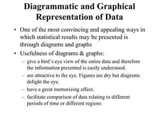
- 1. Diagrammatic and Graphical Representation of Data • One of the most convincing and appealing ways in which statistical results may be presented is through diagrams and graphs • Usefulness of diagrams & graphs: – give a bird’s eye view of the entire data and therefore the information presented is easily understood. – are attractive to the eye. Figures are dry but diagrams delight the eye. – have a great memorizing effect. – facilitate comparison of data relating to different periods of time or different regions
- 2. Types of diagrams • One dimensional diagrams eg. Line diagram, Bar diagram • Two dimensional diagrams eg. Rectangles, squares & circles. • Three dimensional diagrams eg. Cubes, cylinders & spheres. • Pictograms & Cartograms.
- 3. Line diagram • is used in case where there are many items to be shown and there is not much of difference in their values • by drawing a vertical line for each item according to the scale
- 4. Bar diagram • Most commonly used. A bar is a thick line whose length is considered and hence, called one dimensional. • There are four types of bar diagrams. – Simple bar diagram. – Sub divided bar diagram or component bar diagram. – Multiple bar diagram – Percentage bar diagram
- 5. Simple bar
- 6. Multiple bar
- 11. Pie – diagram • A circular diagram and used to present the different components of a qualitative character • The different components are represented by means of sectors of a circle. • The angles of the sectors are calculated as the fractions of 360 degree • angles of the sectors are proportional to the given quantities.
- 13. Pictogram
- 14. Graphical representation Graphs are of two types: 1) Graphs of time series or Line graphs 2) Graphs of frequency distributions: • Histogram • Frequency polygon • Frequency curve • ‘Ogives’ or cumulative frequency curves • Lorenz curve
- 15. Histogram • is a set of vertical bars whose areas are proportional to the frequencies represented • histogram the variable is taken on the X-axis and the frequencies on the Y-axis • we get a series of rectangles each having a class-interval distance as its width and the frequency distance as its height • Thus, it is two dimensional • widely used to represent frequency distribution • can not be constructed for distribution with open-end classes
- 16. Difference b/n Bar diagram & Histogram
- 17. Frequency polygon • can be obtained by joining the mid-points of the upper horizontal side of each rectangle with the adjacent ones of the histogram by means of straight lines • may also be drawn independently without drawing a histogram. • For this mid-point values are marked on a suitable scale along the ‘X’ axis and then points are plotted vertically above them at heights proportionate to the frequencies of those class intervals and then by serially joining these points by straight lines
- 18. Frequency curve • the mid points of the upper edges of the rectangle are joined by a free hand smooth curve • may not pass through all points as in the case of a frequency polygon • is a continuous curve showing the nature of distribution of observations.
- 19. Cumulative frequency curves • The free hand lines obtained by plotting cumulative frequencies, against the mid points of the class intervals • two methods of constructing – ‘less than’ method upper limits are taken on the X-axis and the cumulative frequencies on the Y- axis – ‘more than’ method lower limits of the classes are taken on the X-axis and the cumulative frequencies on the Y-axis
- 20. Lorenz curve • graphical method of studying dispersion • graphical representation of income inequality or wealth inequality. • The modification of the Ogive when the variables and the cumulative frequencies are expressed as percentages