Organic Name Reactions for the students and aspirants of Chemistry12th.pptx
Poster analysis
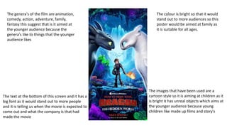
1. The colour is bright so that it would
stand out to more audiences so this
poster would be aimed at family as
it is suitable for all ages.
The text at the bottom of this screen and it has a
big font as it would stand out to more people
and it is telling us when the movie is expected to
come out and what the company is that had
made the movie
The images that have been used are a
cartoon style so it is aiming at children as it
is bright it has unreal objects which aims at
the younger audience because young
children like made up films and story's
The genera's of the film are animation,
comedy, action, adventure, family,
fantasy this suggest that is it aimed at
the younger audience because the
genera's like to things that the younger
audience likes
2. The colour of this poster is dull and dark
because this shows that there is some sort
of war happening and something
depressing is happening because we can
see a pirate ship getting destroyed by a
giant octopus.
The writing is telling us who is the main
character's and also when it is going to be
coming out also gives us more information
about who has helped with the making of
the film.
The genre of the film is comedy,
adventure, fantasy, action,
swashbuckler this suggest that it
could be targeted at middle aged
audiences because it has a gun in
the image suggesting it is violent and
children should not be watching it.
The images that have been used is
showing that the film is not for a younger
audience this is evident when we see the
gun that captain Jack Sparrow is holding
also there is also evidence to show this as
in the bottom left we can see people that
look like they might have passed away